| Author | Thread |
|
|
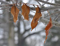
01/13/2013 01:06:21 AM · #76 |
Abstract - Week 2

|
|
|
|
01/13/2013 10:35:33 AM · #77 |
105mm - week 3
 |
|
|
|
01/13/2013 03:02:25 PM · #78 |
Week 2 - Maianbar
 |
|
|
|
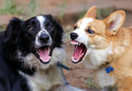
01/13/2013 04:57:22 PM · #79 |
|
|
|
01/13/2013 05:18:36 PM · #80 |
Week 2- Life in the city
 |
|
|
|
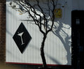
01/13/2013 07:30:10 PM · #81 |
This first example of this year actually personifies my theme of Architectural Quirks and Oddities. It's quirky and it's odd.
How could I resist this detail of one of our distinctive Victorian homes, with its lovingly carved wood, and painted just so, and then (!) embellished with every communication device known to man! Now, most, if not all, of my images will be shot from my car (as were last year's street lights) 'cause I just don't walk that far at this point and there's rarely a place in my town to park the car anyhow! Viva the red light and long lens!
Okay, 'nuff. Here goes 2013.
 |
|
|
|
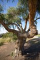
01/13/2013 07:39:17 PM · #82 |
Catching up, this Bar (Cocktail Lounge?) way out on Geary St. has it's own design tree. And yes, it's theirs. The way that tree and its shadow mimic the cocktail glass just pleased me completely, so a reach for the ever-present camera and there it is: entry #2 in Architectural Quirks & Oddities.
 |
|
|
|
01/13/2013 08:45:47 PM · #83 |
Week 2 - black and white

Out-take for Arts.
Message edited by author 2013-01-13 20:46:22. |
|
|
|
01/13/2013 09:53:43 PM · #84 |
Week 2 - Textures
 |
|
|
|
01/13/2013 10:11:41 PM · #85 |
Week 2 - In and Around Balboa Park
 |
|
|
|
01/13/2013 10:21:23 PM · #86 |
 Week 2 . I guess I'm not doing all b/w. Week 2 . I guess I'm not doing all b/w. |
|
|
|
01/14/2013 02:17:13 AM · #87 |
Week 3/52
The female Amethyst Sunbird as promised last week :)
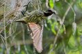
Message edited by author 2013-01-14 09:38:06. |
|
|
|
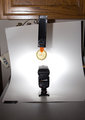
01/14/2013 04:37:04 AM · #88 |
Originally posted by MarkB:
I have updated my Week 1 & 2 images with the with the equipment and exif info as a few of you have asked about it. In case anyone was wondering why I shot them at ISO 200, tt was a mistake, never checked the setting and that is what I had last used. Had I been paying more attention I would have used ISO 100 and upped the flash power to compensate.
Here is the set-up shot.
|
Thank you Mark, that is very kind of you ... and you have week 3 ticked off with this mage, have you not? ;-) |
|
|
|
01/14/2013 04:54:55 AM · #89 |
Originally posted by Trumpeteer4:
Child Portrait
Week 1
I had forgotten that DPC didn't allow non-paying members to upload photos outside of challenges. Hope people are able to view this. |
I almost missed this one and it would have been my loss. A beautiful portrait wonderfully processed. |
|
|
|
01/14/2013 06:10:35 AM · #90 |
My week 2

Dying Arum
and I have questions for the DPC community on this shot.
1) Although I used the existing BG, I completely changed it by "smudge" and "paint" to get that effect. Would that be allowed in Advanced and/or Expert editing in a challenge?
2) I converted this in Topaz with the B&W plugin and found a "variation" (?) that I liked with the yellowish/beige/brown colour. When it came out of Topaz, it still looked Monochrome to me. When I started smudging the BG, I suddenly got streaks of the reddish colour as well as the grey. Are these just shades of the same "color" that the monochrome is, or are there new colors emerging (no idea how, but what do I know about pp?), and hence would this no longer be classified as "monochrome"?
This is the way it came out of Topaz

|
|
|
|
01/14/2013 06:20:25 AM · #91 |
Week 3 Nature
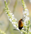
Flower Beetle |
|
|
|
01/14/2013 06:59:01 AM · #92 |
Me - Week 1
 |
|
|
|
01/14/2013 09:58:24 AM · #93 |
I wasn't going to play along, but I'm doing a portrait a week and street shot a week as it is. I might as well link to them so they're not simply wasting space on the interwebs.
Week 1.
Week 2. |
|
|
|
01/14/2013 02:15:26 PM · #94 |
Ann suggested to flip/rotate my image to make it easier on the eye.
I think this is what she suggested ... (yes Ann?)

The BG here is slightly different, it was before I did the vignette. Last night I preferred the darker version, now I am not so sure ... (grrrr I HATE being so indecisive, it annoys me no end, but what can you do? :-)) |
|
|
|
01/14/2013 02:22:50 PM · #95 |
Love week 1's portrait. Very strong, IMO. Great the way the one eye is hidden in shadows.
Not so mad about the street shot. The pole down the woman's middle and just in general, it doesn't "speak" to me.
I like both of week 2's shots. Was the flash on your right (hidden by you) to iluminate the smoke? (Just trying to learn about lighting and what better way than to try and figure out how images are made? :-) |
|
|
|
01/14/2013 02:37:57 PM · #96 |
Originally posted by kasaba:
Love week 1's portrait. Very strong, IMO. Great the way the one eye is hidden in shadows.
Not so mad about the street shot. The pole down the woman's middle and just in general, it doesn't "speak" to me.
I like both of week 2's shots. Was the flash on your right (hidden by you) to iluminate the smoke? (Just trying to learn about lighting and what better way than to try and figure out how images are made? :-) |
Yes, it was hidden. I had a full blue gel on the flash, and the smoke looked amazing in color, but I couldn't get the rest of the colour right in the scene. The street lights on my street aren't a consistent colour, so it throws patterns all over the place.
It was a 1 second exposure with rear sync flash at 120mm, full power. Had a partial snoot on the flash to minimize it hitting me.
Here's an outtake from the smoking session. More of the same, but vastly different smoke plume. The flash blasted my hand, so I opted not to use this one for my photo of the week. |
|
|
|
01/14/2013 02:55:27 PM · #97 |
Originally posted by Venser:
Here's an outtake from the smoking session. More of the same, but vastly different smoke plume. The flash blasted my hand, so I opted not to use this one for my photo of the week. |
Ahhh, very pretty plume indeed. Maekes the whole scene look different. Could you not have darkened the hand in PP?
I think the one you chose makes smoking look far more unhealthy. the outake makes it look "pretty". Different messages. |
|
|
|
01/14/2013 04:04:16 PM · #98 |
wk 3 - Maianbar
 |
|
|
|
01/14/2013 06:59:18 PM · #99 |
2/52. Another attempt at the bottles, Thanks for all your helpful feedback, Im taking them all on board and trying to learn from them.
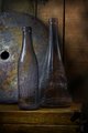 |
|
|
|
01/14/2013 09:14:05 PM · #100 |
2/52
 |
|
Home -
Challenges -
Community -
League -
Photos -
Cameras -
Lenses -
Learn -
Help -
Terms of Use -
Privacy -
Top ^
DPChallenge, and website content and design, Copyright © 2001-2026 Challenging Technologies, LLC.
All digital photo copyrights belong to the photographers and may not be used without permission.
Current Server Time: 04/25/2026 05:09:13 PM EDT.


