|
| Author | Thread |
|
|
07/10/2013 03:39:48 PM · #1 |
Let's start by taking a look at the top ten from the Fine Arts Exhibit I and Exhibit II
1st Place
I. II. II.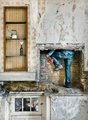
2nd Place
I.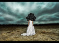 II. II.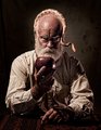
3rd Place
I.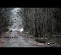 II. II.
4th Place
I. II. II.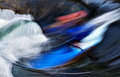
5th Place
I.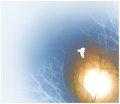 II. II.
6th Place
I.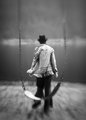 II. II.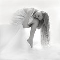
7th Place
I.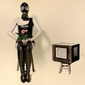 II. II.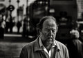
8th Place
I.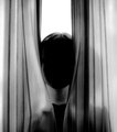 II. II.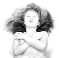
9th Place
I. II.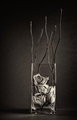
10th Place
I.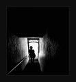 II. II.
----
Message edited by author 2013-07-10 15:40:29. |
|
|
|
07/10/2013 03:40:49 PM · #2 |
Originally posted by posthumous:
And the Juried Awards and Honorable Mentions for the Fine Arts Challenge: Exhibit 1 are:
Shared First Place:
 “Aging” — wheeledd “Aging” — wheeledd
"...a picture for today's life, daring, the "decrepit" man is hard to look at and yet very attractive. I just like this one a lot as a piece of art for this day and age."
"It made me want to see the series as a whole. I also see this as somewhat humorous. The "tucking" of the twig and berries, the "Will you take the damn picture already..." demeanor, the smooth gravity of the flesh... This here is a brave man to put it all out there, well almost all of it out for us to behold and contemplate."
"It is utterly without affectation, and it's utterly *real*: I'd love to see the rest of the series... the entire scene reeks of Scandinavia, the furnishings/decor aspect of it, and I'd be surprised if this weren't set in Finland, Sweden, somewhere like that.
...it resonates with a growing concern/empathy of mine for the plight/situation/condition of the aged among us, the slow, inevitable breakdown of the body and its functions.
I find it a wildly compassionate image, and an image that makes no attempt to convince us, through any form of trickery, that it is "art"."
"Re: this photo being "without affectation" -- that may be true, but it is not without artifice. In fact, it's quite artificial. The subject is clearly arranged, positioned and on display. He looks downward precisely so you can look at him more easily. It reminds me of the paintings of Lucien Freud, in which the eyes are not given their usual sharpness and catchlights.
It's a very estranging and disturbing premise. One gets the voyeuristic feeling of a Diane Arbus photo, but without the assuredness that the subject is in his natural environment. It feels to me like a satire of portraiture, a commentary on its dehumanization, and if that's all it was, I wouldn't want to see it ribbon. However, the subject is *not* dehumanized, precisely because the photo makes us so aware of what it's doing... in other words, precisely because of its "naked" artifice. That's why I don't feel Freud's paintings are dehumanizing. The only thing they really abolish is the illusion of eye contact, our fake sense of connection."
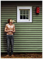
 "The Patient" — xion "The Patient" — xion
"The most enigmatic and compelling entry here. Manner and processing subordinated to the demands of the image. As a result, we have what there is: pure, hard object-image free of decorum, embellishment or any other diversions. The title is simple and credible, while leaving some to the imagination."
"I love a picture that makes me ask "what the hell IS that thing???" having teeth where I expect an ear to be gives this a very powerful conceptual impact, suggesting some sort of weird metaphor and also making me question why I assume an ear to be there in the first place. I love being disoriented."
"It's human, it isn't. It's alive but maybe dead. It's skin or maybe leather. It reminds me that the human body is strong...we cut it open, fix things, remove things, and we keep on living. It may be ugly, but without the ugly, how do we appreciate the beauty and resilience of just being human. The pure joy of just being alive and well. We humans are tough creatures, this image reminds me of that."
Third Place:
  “Hand Painted” — tehben “Hand Painted” — tehben
"Nothing static about this five-petalled discharge of empathy. The photo is easy enough to love at first sight; the ease, however incidental, appears tempered by the progressed state of the fruit, the barren twigs to which it is attached, the waxen glow of the skin, as well as the undefined splotches of blood-red and black adorning it. In this light, even the gesture transforms as if into a woeful longing…
As it is, much simply "works" here. The stopped energies make for a balanced composition. Both highlight intensity and blocked shadows only add credibility to a shot which relates, quite directly and convincingly, an agitation of the senses."
"I like the colors and composition. It's a fun image."
"Different. Quirky. It looks like an intentional mistake, and the colours are a riot. Love the focus."
"I think it's a fun sort of image...almost like the camera were in the hands of a child curious about what something looks like photographed... The colors make me happy."
Honorable Mentions — Listed in no particular order:

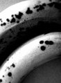 “freeform study” — chromeydome “freeform study” — chromeydome
"I can imagine this one as a very large print, where people would look at it and say, is that a couple bananas? Or, are those slugs? It tickles my fancy, it's a simple composition that works in my mind."
"I do enjoy looking at it and enjoy the flow of the forms."
 “Q” — keyz “Q” — keyz
"I love the bokeh snow and the rich tones."
"It's one of the better pictures in the challenge when you look at them technically. It also reminded me of Star Trek..."
"I love me some snow bokeh."
 “The Lady in the Lamp” — Judi “The Lady in the Lamp” — Judi
"I love the quirkiness..."
“The Twilight Zone” — JaimeVinas
"it's purely metaphorical, a very "literary" image... It has a very post-apocalyptic feel to it, particularly with the sickly color of the sky. The centeredness of the image seems right to me, it adds to the totally in-your-face, matter-of-factness of this utterly surreal image. It's mutated, it's insectile, it's creepy, and the pure glossiness of the dress is integral to the impact."
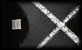 “Word” — EstimatedEyes “Word” — EstimatedEyes
"It works in my mind as a graphic design, and in a way I can imagine that it has an interesting message for the thinking in this day and age. But at the same time it is also ambiguous enough that it leaves me wondering, and I like that."
"I just thought it was deliciously metaphorical. For me it calls up associations of "bible" (the printed piece on the left) and "cancellation" (obviously, the X), although the book could represent and volume of dogma or received wisdom. I find it moody and surreal."
"New Horizons" — salmiakki
"I quite liked this one..."
"It's nicely done, and it has a good mood/composition..."
"It renewed my longing to go to the Bonneville salt flats for speed week...the mecca of all things fast and hot rod. The emptiness appeals to me, the "vibe" conjures speed,vastness and split seconds...all in all it allows my imagination to roam and keep dreaming. I dig it lots."
 "Storm" — mqnaufal "Storm" — mqnaufal
"It's quite lovely. I give it strong marks for composition."
"Charming, quite ambiguous as a whole, given the title..."
"...quite a beautiful composition, and one of the few images where the border actually works well for the presentation."
"It reminded me of twirling and being a girl. A moment of being in a large field and feeling the freedom of being able to move with wild abandon. I like the faded black a white as the memory it reckons is a very old one. I also find the comp so flowy and full of energy...the way the winds come down right before a big storm lands like they do in the midwest and south."
 "when first we practice" — pointandshoot "when first we practice" — pointandshoot
"A frightening image. The lighter tone on the left and the complex shape in the middle make the centered composition work. Lots of dark energy to this picture."
"Ambiguity with teeth."
"This so needs to be printed BIG so I can really bask in all the glorious texture and depth. There is a very deep dark place in my mind, and I'm pretty sure this is what it looks like. It's pure evil, with glimmers of light and right... it's unrelenting, it's cataclysm and catharsis all rolled into one...rich and delicious. It rains down on me and I soak it all in..it is lessons learned and revenge never taken."
"What strikes me is that a phrase that means "liar" is "two-faced", and we have two nearly distinct face-locations of the animal, with much blur between. The blur itself creates the web. I think it's a wicked-interesting picture, and a fine layering of image and title into extended metaphor.
My kinda thing... "
"untitled 4" — tate
"This is strong for me conceptually. It "feels" original to me. The missing face, framed by symmetry (a case where symmetry is used for a reason), is ambiguously heartbreaking."
"It reminded me of an anonymous sort of shy faceless child. The ones nobody notices as they semi hide and observe, learning through others living life around them. Sometimes it just plain sucks being a kid. The processing reminded me of pushed film...I liked that."
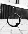
 “holes in one” — tnun “holes in one” — tnun
"This is a prime example of image-as-object, with the added bonus of evoking a ship without actually being a ship. I can't resist."
 “Reborn” — violinist123 “Reborn” — violinist123
"I know this is some sort of backyard macro, but at the same time I have no idea what it is. The inverted processing has made this utterly mysterious. Visually beautiful as well."
"Makes me a little curious...like a mystery."
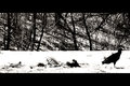 “Depart” — glad2badad “Depart” — glad2badad
"a great example of an image that tells a story. The role of the bird is demonstrated visually, plus a suggestion of some sort of progression... or cycle. I also love the high contrast processing."
"Strong message (neat story, beautiful mood). One of the better compositions in the challenge."
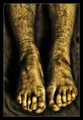 “Set Me Free” — ace flyman “Set Me Free” — ace flyman
"There’s something about this image that keeps me coming back. I’m honestly not sure whether that’s a function of the skill with which the image was made, so to speak, or whether it’s more along the lines of car-wreck-peeping. I mean, these are troubled feet, there’s no question about that. But they are, nonetheless, compelling feet. There’s something about the mangled nails and the way the big toes are bent under that just almost makes me gasp with sympathy.
The title’s a whole other level. Who’s speaking? Does the owner of these feet wish to be liberated from them? Do the feet want a better life? The pose is suggestive enough of crucifixion, sans spike, to raise that issue.
The processing is positively acidic, emphasizing every blemish. It calls to mind Yeats’ “every tatter in its mortal dress”, which, for me at least, brought the whole “Sailing to Byzantium” poem into play right alongside the image, the more so since the title more or less presages Yeats’ theme of what he’d choose to be if freed by death…"
“Deceit” — Insomniac
"I find it refreshing to come across an image in this challenge that clearly conveys an emotion as opposed to a sentiment.
The symbolism of the inverted bouquet obscuring the face goes beyond mere conveyance. The sensuality of the nude torso, in effect, is the only "face" left to consider. Here, a fantastic x-rayesque chiaroscuro reminiscent of photograms á la Nagy-Moholy and Man Ray caresses the forms to the point of revealing the woman's ribs and spine. The resulting lucidity is profoundly compelling and, to my senses, nothing short of magical."
"It's clearly a striking and compelling image."
 “Feed Me” — pixelpig “Feed Me” — pixelpig
"A delicious effervescence, well stopped, toned and composed, and a sober, factual image at that."
"the composition is lovely"
"...it said in a deep rumbly tummy voice... I can hear the metallic {{{ting}}} as it hits the plate."
 “Hinomaru” — Yo_Spiff “Hinomaru” — Yo_Spiff
"I'd expect the image lead to the title (and back to itself), as is usually the case. Here, the title minimizes the window so considerably, that it effectively caps the sheer number of flights the image would confound us with sans that delineation. I rated this shot fairly high because of this critical dynamic and also because I could relate the visual depth and dimensionality to this sense of it..."
"I think it's beautiful, I like the composition..."
"I like the colour scheme, and the simple design. I like the "long" approach."
"It is really quite a lovely composition. I keep coming back to look at it, and even though my eyes go out of it, I keep going back to it."
"To me, the title was critical in accessing the image at all. Hinomaru, sun disc, deity, flag, the ultimate traditional symbol for tradition. It associates long-standing controversy via bloodlines to nationalism and oppression."
"I dig the reverb. I see this printed very large in a very big white cavernous room. I enjoy it in an abstract expressionist sort of way. It has power."
 “Summer” — rinac “Summer” — rinac
"...once I start to *trust* the image, I start seeing stories in it."
*************
Congratulations to all!
(Posted on behalf of Ursula, ZeusZen, Posthumous, RKT, and Bear_Music) |
|
|
|
|
07/10/2013 03:41:03 PM · #3 |
Originally posted by Louis:
We are happy to announce the results of the juried edition of Fine Arts II. On behalf of the other judges,  Bear_Music, Bear_Music,  Ursula, LevT, Melethia, Ursula, LevT, Melethia,  DrAchoo, posthumous, DrAchoo, posthumous,  bspurgeon, and paulbtlw, I would like to thank all members for their participation in this challenge, and for your support of this process. Thanks also to bspurgeon, and paulbtlw, I would like to thank all members for their participation in this challenge, and for your support of this process. Thanks also to  Langdon for his participation in making this event possible. Thanks especially to Don ( posthumous) for his work compiling the quotes from the jury's actual deliberations on our winners and honourable mentions. In addition to our comments of advocacy for our choices, this year we've decided to include some of the comments that went the other way for some of us, to give you some insight into how our deliberations played out. Enjoy. Langdon for his participation in making this event possible. Thanks especially to Don ( posthumous) for his work compiling the quotes from the jury's actual deliberations on our winners and honourable mentions. In addition to our comments of advocacy for our choices, this year we've decided to include some of the comments that went the other way for some of us, to give you some insight into how our deliberations played out. Enjoy.
Here are your winners, preceded by Don's quick notes:
A very tired dead man has finally finished compiling comments for the Jury's results. The comments you see were edited and stitched together for your reading pleasure.
All picks were completed before the challenge was over, in complete anonymity.
**************************
Awards:
1st Place
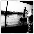
MEKONG
Voyeuristic. I'm there. In the boat looking over his shoulder. Gritty, suggesting an aspect of life along the river. The cig is a lucky catch, that made me laugh for some reason. Another image that I would love to see as a series, same with Tsunami.
There so much immediacy in this photograph that I can't help but love it. I'm thrilled that every rule is broken here. So much that is supposed to be a "no-no" in composition works so well for this photograph that it seems to be an embodiment of its own style. The cut upper right corner, the bisected person in the foreground, the powerlines, the messiness, the noise, the intense contrast and black clipping, all work to present a photo that feels like a travelogue, a piece of journalism, and art, all in one. I adore this photo. ... Its "mistakes" are beautiful.
This has an immediate voyeuristic interest... as in, "what's going on here?" into lives that seem more interesting than my bourgeois life. But the more I look at it, the more it confounds me. How can those two men be in those two positions? This disorientation adds weight to the already metaphorically weighted notion of high water. Which man is on top?
It was (is) one of my overall favorites irrespective of the challenge theme. But in my mind it is not quite "fine art" as far as the genre goes. My internal definition implies a more deliberate way of constructing an image rather than catching something beautiful on a spur of a moment (even if it is serendipitous, at least I want a feel of deliberacy).
I loved this one, although I didn't like the border. It's a fine example of a snapshot that makes art. But it didn't quite fit my interpretation of "make a contribution to CONTEMPORARY ..." It looks and feels dated to me.
I really like this picture, I have no problem supporting it but it didn't match my expectations for the challenge. I think I know why. When I was growing up we had, in my house, a set of books called World War II in pictures - one book for every year of the war. Many of the pictures had this sort of first person perspective and very similar tones and contrast characteristics. I think because of my exposure to that material, this screamed photojournalism to me - not that this should exclude it from 'Fine Art', it's just that's not what I had in mind.
I’m in the camp where this is an excellent image, but an excellent photojournalism image, not Fine Art. Personally I love good use of image grain, and this one has it, but I think it belongs in LIFE rather than the Guggenheim.
But, in THIS context, "Photojournalism" is being used as a shorthand for "an image shot in a photojournalistic style". We could say, for instance, that Cartier-Bresson's work is "photojournalistic" if we wanted to. Anything that's truly candid, actually, is more or less photojournalistic. And I don't think we should be disqualifying images from consideration based on what we *think* they were intended for.
I disagree that "Mekong" is photojournalism. The composition is completely off-balance and neither character can be properly "observed" in the voyeuristic fashion. This shot is 2 seconds *after* the photojournalistic shot, as they get back to their lives. This is not a photo I would see in a newspaper or news magazine or even National Geographic.
It's the emotional aspect that makes it good in my eyes
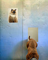
2nd Place
 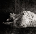
THREE BREATHS
This is just breathtaking, pardon the pun. A sheer beauty. Perhaps not much in terms of deeper meaning or a story, but I can live with that in fine art.
A quiet piece/peace. There's something soothing about the way a cat curls into itself to sleep. But just when you get comfortable with it, there's the added disconnect of an apparent half-real, half paper-mache'd cat. In other words, I'm no longer thinking it is a reflection. Can't quite figure it.
Truly stunning. It stopped my inner monologue and kept me. The lack of face, textures of a barn, and grungy feel, make me wonder if this cat is feral. OK, he is nice and fat, and that ruined that line of thought briefly, but then I figured he must be a glorious hunter and survivor. An aside, the tones are splendid.
So visually pleasing it's ridiculous. The cat, consuming itself in its own sleep, is in turn consumed by the block of texture and darkness around it. As the cat gets bi- or tri-sected by the lines that literally cut the imagery in pieces, you notice other things -- the fur reaching for the upper left third of the frame, and the way its perch disappears in the larger elements of darkness around it, making it seem to float. I don't know if it means anything, but it certainly feels good to look at.
This was the easiest and quickest choice for me. I can only guess as to why. It is just visually staggering... a disorienting combination of layers, of real and unreal, of live and dead.
Normally i'd respect such a shot but not like it too much; but with this one I found it truly compelling. I still find myself going to look at it now. I'm bothered that I can't nail down the 'why' - it was a truly instinctual pick.
Has great immediacy, feels like a creation from someone who has their own measure - it doesn't seem to try; that's at the heart of its effectiveness.
3rd Place
FEAR OF LETTING GO
I like the allegorical aspect of these images, I like that they are in color and that they are sharp :-) I am not bothered at all by what some are calling the "HDR look" of "Letting Go"; by my standards it's actually pretty subdued. I'd like to see one of these images get an award from us.
There's a great deal of thought going into the creation of "Letting Go", and while some of us may not find it to be their cup of tea, it's distinctly a *realized* artistic effort.
An interesting concept, love the absurdist humor.
Quirky, odd, warm, humorous, and odd. Did I mention odd? I like the repeating motif (always wanted to use that word!) of the flowers, the variety of textures, the two halves of the bodies which would connect to make a single whole. The processing is contemporary and light, matching the mood of the image itself.
The story told through circular imagery and composition is fascinating.
I liked this because a) it was in color and b) it was in focus and still it compelled. I can take many things away, some accidental, some on purpose.
I don't know what it all means. The tulips in odd places, the mysterious posy-bearing vistitor, the escaping doppelganger -- what is it?
This is a lot of fun, it has some play with interior and exterior space, and a sense of humor about itself.
In some ways this came across as trying a bit too hard but the more I looked the more I liked and the nested metaphor of construction began to sit well with me. I like its effort, I like the repeating flower and the comic/tragic intonations.
It is clearly set up, constructed, non-organic, non-emergent, over-thought. But... for me, it is crafted; it IS the choices the photographer has made, each part reflects intent and this in many ways is a purely created piece. No serendipity, no camping out waiting for the right moment, no "I'll process it this or that way to see if I can give it an arty look". This image has been conceived and then executed - for me the flat light and tones serve it well, offering up a 2D feel - an intentional reduction to a 'picture', minimising the depth we sometimes strive to capture to bring photos to life. Here, the scene is framed as a picture, just as pictures might be framed. So I love the intent, I love how this is the product of a brain, I love that creative process.
Honorable Mentions, in alphabetical order:
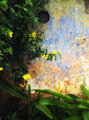
APRIL IN SERENDIB
A low-key, understated masterpiece. It truly resonates with me in its purity and grace. I love the almost-horizon that eases its way subliminally into the image from the left, even as the branches reach to the left to embrace it. I am reminded of the two princes of Serendib, "who in their travels always were discovering, by chance or by sagacity, things they did not seek."
I simply love minimalistic art, and it is very well done ... love the minimalism, the composition and tones, just a very zen photo.
This is beautiful.
Simple, beautiful and pure. Perhaps too much of each to be truly effective...? It has no disruptive power but it is immaculately constructed and presented.
AS I LAY ME DOWN TO SLEEP
also interesting, well done technically. Somehow I did not feel “descending into sleep” here, despite the intentions, I actually feel tension on girl’s face as she dips underwater. I think she is scared, and I am scared for her, too (agree ... feels spooky)
It is certainly more than a little gimmicky but I was sold on two things - the confidence in the high key, especially how it robs the face of detail and the propagation of the wave - there are echos of religious iconicity here. I think the image plays on a number of social norms and cliches of children as 'angels' etc. Thinking about it now (I hadn't before) part of me wonders whether the deathly pose and the wave is also a nod to Japanese tragedy - whether that's a good thing or not is another matter entirely.
CELEBRITY
Because Lensbaby is a very contemporary invention, and this is the best of the Lensbaby shots in my view. Also because it shows a contemporary concept rather well, the proliferation/commonness of celebrities in this day and age.
Gorgeous shot. I love the light and the effect. I am biased against shots that depend on a single effect, but a really good one can take it over the top for me.
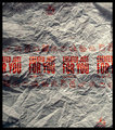
CREATION
Conceptual art. It only works with the title. This wrinkled paper becomes the big bang, the burgeoning chaos of cosmos.
I do enjoy the utterly ironic message of consumerist waste posing as “creation” rather than “destruction”. That seems very Fine Art to me.
I have greater appreciation for this, thanks to the comments already given. It's well-constructed, and its message is subtle but clear. It seems more graphic than artistic to me, but no matter.
Technically it is very good; all the (limited) choices are bang on. There's a good history of having our modern commercialist world offered back to us and getting us to reflect. There is irony in the title, there is irony in the don't litter icons and there is something delicious in the prominence of the words 'For You' and how the modern world is largely defined by individualistic motivations. I don't think this is an image that is easily dismissed. I think its creator knew exactly what they were doing.
I am not a McDonalds fan. Nothing like going to Europe and its millennia-old cities only to have a damn golden arch on every freakin' corner. Blah! But what I DO like about that photograph is the irony (or disconnect, perhaps) of the "Created Just for You!" in endless repetition.
HIDDEN EVIL
Intriguing and beautiful to look at.
I appreciate it more after reading comments from others, but I still don’t quite like it. It smells of Rousseau-like primitivism, and I don’t like Rousseau :).
I like Rousseau. Brilliant connection! This strikes me as Rousseau underwater. (Jacques Rousseau?)
I am apt to enjoy the moral contemplation that is directed by the title, but I felt the image was very compelling and one you could keep staring at wondering if you could make out what was in the hole. A piece that caused introspection in me, and I like that. ... It continues to grow on me. First, the de facto medium for Fine Art seems to be B&W, so if an image can use color to an actual benefit, I think it’s a point in their corner. In other words, it strikes me as harder to come up with a good color Fine Art shot. Second, the image naturally resonates with my view of the world. Evil in the Garden of Paradise. Evil lurking within our outwardly pretty masks. And even though we know it is there, it does remain hidden. What is it? What lurks within? Often we are the last to become aware of what our own flaws are.
I found it strangely compelling, and there was a certain tension between the title and the bright color.
HOMMAGE A JACK OX
Another pretty and spare photo, and somewhat enigmatic.
Gorgeous and fascinating. A sort of cubism. I looked up Jack Ox and couldn't find the connection. I like that. :)
the overall effect is compelling; projected I'm guessing, but it does work.
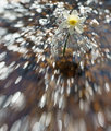
K-2
Leaves me breathless, I love the sparkling clarity of it.
...because of the water and the colour. Because high energy sports are so contemporary, because it is so obviously digital, because it is way oversharpened and yet somehow that works in this image, because of the energy.
There's a certain flow that works, and the sharpness and strong colour work well.
A cool photographic effect.
Great colours ... I do like the attempt to reduce to the energy of the rushing water and the sport so captured.
LONDON EYE
A powerful image.
Wins best title award. There's the eye, of course, but also the recognizable bus and metro sign. An oddity in real life, just a man going about his daily business (one assumes). I can't quantify why this works - just that it does. There's something to be said about capturing the everyday.
I initially liked it because you just wondered "what's going on?" I like the background except for the specular highlights of the lady(?) behind. But the back left looks wonderfully dreamy. Perhaps this man is missing an eye from an accident with a dart as a child.
This image is also kind of dark and twisted for me. I think the subject has been perfectly caught, and splendidly isolated. One really does wonder what's going on here, but at the end of the day, I'm certain it's nothing more than the captured private moment of a man in public, whose expression has rendered this a piece of art and a pun on the famous London landmark. Very clever, and very wonderfully done.
Wow, a great capture.
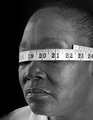
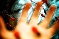
MEASUREMENT OF A WOMAN
The hardest one to judge, I think. Full of messages, seems to be informed by an emancipatist paradigm. It is well constructed - perhaps overly so... pin-sharp, close in, nowhere to hide for the viewer. You will look, you will see in a way the subject cannot when subject to such 'measurement'. I pick up echos of quantum mechanics in the image too - the whole observation/measurement futility thing (I do know I've extrapolated here). And then look at the numbers on the tape as it intersects the eyes 18-21, the cusp of adulthood, I don't think that's accidental. I think this is well made and more thoughtful than I had thought when I dismissed it from my own list.
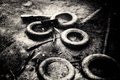
THE NEGATION
I liked the image a lot ... on a pure sensual level.
A great stew of depth and texture, light and dark. Just a darn nice photograph.
The texture conjured up impressions of human ash drifting down over Auschwitz (that was Schindler’s List wasn’t it?). I’m quite sure this was not the artist’s intent, but lucky for her, the image gets to ride on those powerfully emotional coattails. Desolation and despair.
I was drawn to its abstractness and mystery. I almost immediately unravelled the mystery (abandoned tires in a river or pond), and then it lost its appeal, and became a kind of urban chronicle of some kind and so lost its appeal. I still like it for its presentation, and I'm happy to see it mentioned.
I love this. Delicious to look at. Like chocolate donuts. mmmmm
I like the underwater feel of this (I suspect it is). Murky, mysterious and a little dark.
POACHED EGG
I like the allegorical aspect of these images, I like that they are in color and that they are sharp :-)
It's funky, plays with words/ideas, but also has clothing/pose that is very contemporary.
I didn't like at first, but the more I looked at it, the better I liked it.
We are talking about making a contribution to contemporary art. Droopy jeans are very contemporary, I kinda like that. Smoothened skin is another thing that is very much abused these days, but I think it works here. The picture makes me smile, and I like it,
As much as I don't like the presentation of the male, the Egg image has grown on me. Consider the Millennial Generation (the generation following Generation X). The young 20 something, hiding behind social media, perilously holding the nest egg of his 50 something parents. It identifies the differences between generations...vanity, interpersonal relationships and skills, work ethic, and financial values. I appreciate the image for what it's given me.
It is nice to have a Generation X'er who can explain Millennial Generation issues to us aging Baby Boomers :). You came up with an interesting narrative for this image. My only problem with it is that with enough imagination one can always concoct a plausible story using a small set of "symbolic" elements. And probably more than one. For example, for a deeply religious person this poached egg may symbolize a young life lost through an illicit abortion, so now the young father-not-to-be is beginning to realize how stupid and irresponsible he was, but of course now it's too late, the house that could have been full of life, is empty. Or say for a convinced vegan, this is a story about a person who realizes how terribly wrong it is to eat animals (birds, eggs), feels deep remorse, and identifies himself with the birds by wearing a bird mask... or even "deeper", as the whole mankind screwing up life on Earth (Easter egg) ... and so on, and so forth :)
for me the important thing is that this image did lead to an interpersonal dialogue (if not for me). I think that if an image is engaging enough that we take the time to construct meaning from what we see then the image becomes art, it catalyses intrapersonal dialogue and thus articulates with our shared culture. Through its resonance with our own imagination it becomes relevant. Of course there is a risk that this all becomes self-fulfilling but an image needs to have a hook to keep you long enough to be bothered. For some people this image did just that.
Any picture that makes people come up with stories is worth coming back to.
SCAREDY CAT
I very much like it.
A fun image
Fun but silly, well composed but tricksy, engaging but deceitful
I like this quite a bit. Maybe it's too derivative of Wegman, but he really does pull off the Wegman. Maybe it is Wegman.
Amusing and well constructed (to a point), the crudeness of the facade and the prominent colour noise is conspicuous. I kind of like how it has been embraced and not hidden with processing trickery but nonetheless, I'm a sucker for polished work and this lacks a little for a constructed piece. I do like the overall image though.
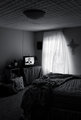
STATE OF THE UNION
I think it's on point, so to speak. It communicates to me at several levels. I'm a sucker for Bleak, and this image has it.
This one really has stuck with me. There's a timeless yet very timely quality to it, a reality. A sense of being let down. There was a time when the bed would be crisply made, the curtain open to let the light in, but the optimism is no longer there.
I love the story/mood; because it has a timeless quality to it, and yet, is completely dated, and contemporary, and so empty/full looking.
This grabbed me because I feel like truly represents the US at the moment. Disconnected on many levels. We no longer admire and look up to our presidents, not just Obama, but Obama has lost his grasp on social America. I voted for him, and I'm disappointed.
I passed over this one quickly, but I'm more inclined to find merit in it on further viewing. I don't know the motive for this image, but it communicates conservative alienation, bilateral isolation, or liberal disappointment to me (or all three), reinforced by the wind-blown room, the unmade bed, the crucifix, the general disarray. This could be a powerful image despite its technical inefficiencies.
This one I rather like, but I seem to find it more ambiguous than other people (that's what I like about it).
I see the commentary, you Americans have reinforced it for me. It flips in my head from 'constructed' to 'emergent' and back again - there is merit in either motive/origin but with each cycle of flipping the image loses power for me. It well made though - exposure and tones are expertly judged and the message that was constructed or emerged has, from the writings of others here, been well communicated.
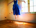
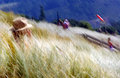
THROUGH YONDER WINDOW
I found that over the top colors worked in this image. It was surprising for me because I usually dislike over-the-top colors, and I like being surprised :). A cheerful image on one hand, and a nod to Dali-esque surrealism, on the other. An interesting combination that compelled me to choose it.
I hadn't considered this, but after being with it for a bit, I appreciate it more and more. It does feel light and airy to me, suffused with a kind of apprehensive joyfulness (I take her to be middle-aged and not in the prime for dancing), and I appreciate that message. The let-go flowers are more burdensome for me, and I feel this would have been much more without them. Overall though, I like it, and I'm glad it was presented, because I wouldn't have included it on my own.
A great thumbnail but the full image disappoints a little. I commend its colours, light, subject and composition but perhaps not the sum of those parts.. It is really, really pretty though - I've spent quite a while looking at it now and it is a grower. I like the effort and the vision.
TRANSPORTARE
I very much like it.
to borrow from the title, this transports me. I enjoy finding myself taken into the flow of a photograph - this does that. There's the triumvirate of two-wheeled cycles dominated by the woman on the pink bike (pink!), and the ominous presence of the four-wheeled beasts to the side (though only two wheels show clearly, perhaps a nod to their lineage.) And it just has a wonderful flow to it.
a good sense of mood/atmosphere. It's a quiet piece.
Pretty, pretty, pretty! In a good way too, gorgeous colours, great light; I do think it sits in the "I'll take a few shots from here and see what I can eke out in the edit" camp, but there is skill and intent n that process. I am confident that at the moment the photographer pressed the shutter they had a very good idea as to how the final image would look.
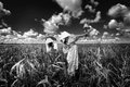
TSUNAMI
Of course I am influenced by the turn of events, but it just gut-wrenching.
It impacts me greatly, presentation is metaphorical and understated. The only problem is the title, but I refuse to judge the photo by the title.
I certainly understand the issues brought up in regards to the manipulative title, and I felt the same way, but for me the image stands on its own without the title, I think given the turn of events, I would’ve thought of the tsunami regardless of the title. I think the processing is very appropriate, and the photographic way of expression the helplessness of a person against flow of nature is great. I don’t care how it is done, reflection in a car or whatever, I am simply looking at the result.
This caught my eye at first because my last FS had the tsunami in mind. I've never personally lived through a tragedy of this sort, thus the importance of this image for me. It brought empathy to the forefront. As I delved in to the image more faces of despair appeared, another tug at the heart for the human condition. I don't know where the distortion is coming from, but it clearly represents water, a simple choice for the photographer; however, it is extremely effective. The choice of tone works very well. A timely piece.
If I had a class and shouted "you have 5 minutes to do a tsunami tribute... GO!!!" and a kid ran back to me with this photo, I'd be blown away.
Well executed and compelling in its own right but as a contemporary piece it resonates so strongly. I challenged myself to consider whether it was cynically constructed but I could not find that in it; instead the distortion/reflection is itself reflective of the essence of the wave and the tragedy so caused.
I absolutely hear (and share) others concerns about its manipulative nature. We don't know the personal context of the photographer and all could be personal or all could be cynically constructed. Does the image work as a contemporary contribution? Yes it does. I actually think the manipulation can work for it too; we all had our perception of that event mediated via TV and newspapers; advertising space was still sold, tragedy became primetime - it's the world we live in. We could say media is manipulation. I think Tsunami image is reflective, I think it is manipulative. |
|
|
|
|
07/10/2013 09:48:49 PM · #4 |
I'll jump in to these waters and say, in my opinion, these "Fine Art" challenges are just another FS in disguise. You cannot honestly look at most of the regular challenge entries and say many of them are not worthy of the name "art".
Is this fine art challenge just a way to feel haughty-taughty about your photography? I think so.
But if it makes you feel better to label the entries in THIS specific challenge as "fine art", as opposed to all the other art we do the rest of the time, by all means, have at it.
/end rant.
-m |
|
|
|
07/10/2013 10:01:47 PM · #5 |
even in the so called fine art challenge
i will not change the way,when and where i will
put sufficient pressure on the shutter button
to hear that most satisfying CLICKke |
|
|
|
07/10/2013 10:32:16 PM · #6 |
| It's really more about the voter, than it is about the shooter, IMO. Hopefully the voters who incline towards sharp, bright, saturated, smooth, comfortable images will step back and say, hey, THIS one's operating from a different paradigm, and change the gears in the voting machine :-) |
|
|
|
07/10/2013 11:05:46 PM · #7 |
Originally posted by mefnj:
I'll jump in to these waters and say, in my opinion, these "Fine Art" challenges are just another FS in disguise. You cannot honestly look at most of the regular challenge entries and say many of them are not worthy of the name "art".
Is this fine art challenge just a way to feel haughty-taughty about your photography? I think so.
But if it makes you feel better to label the entries in THIS specific challenge as "fine art", as opposed to all the other art we do the rest of the time, by all means, have at it.
/end rant.
-m |
what rock have you been under? plenty of people are here to create technically excellent photos, not art. how dare you call their photos art, or hold them to artistic standards? are you saying voters should always apply that standard as well? you are intolerant of other viewpoints.
having one art challenge allows for a hundred non-art challenges.
you're the one who's haughty taughty, whatever that means. |
|
|
|
07/10/2013 11:10:14 PM · #8 |
Originally posted by Bear_Music:
It's really more about the voter, than it is about the shooter, IMO. Hopefully the voters who incline towards sharp, bright, saturated, smooth, comfortable images will step back and say, hey, THIS one's operating from a different paradigm, and change the gears in the voting machine :-) |
And along those lines, it encourages the shooter to do likewise and not get punished. There's far more leeway (perceived or otherwise, doesn't much matter) for getting a good vote from an image which in many other challenges might be considered edgy or alternative or contrarian. It's the fact that the voter leeway gives the shooter greater freedom that these are good exercises in pushing our own zone of comfort. |
|
|
|
07/10/2013 11:50:14 PM · #9 |
| Fine art is any art you do not understand. When someone asks you what you think you reply, "It's fine!" :) |
|
|
|
07/11/2013 01:15:54 AM · #10 |
|
|
|
07/11/2013 03:12:40 AM · #11 |
Originally posted by DrAchoo:
Fine art is any art you do not understand. When someone asks you what you think you reply, "It's fine!" :) |
LOL!
Must we have this discussion every single time ad nauseum!!

Message edited by author 2013-07-11 03:35:42.
|
|
|
|
07/11/2013 03:15:01 AM · #12 |
Originally posted by tnun:
I want haughty taughty. |
Me too!
Let's just have some fun, and forget the technicals, which is sooo boring anyway!
;----------)
 |
|
|
|
07/11/2013 10:49:42 AM · #13 |
Originally posted by Neat:
Originally posted by tnun:
I want haughty taughty. |
Me too!
Let's just have some fun, and forget the technicals, which is sooo boring anyway!
;----------)
|
blame Cory ... he started it!!!
;-)
-m |
|
|
|
07/11/2013 11:01:55 AM · #14 |
I might not get time for this now :-(
We could just entitle this challenge "No brains, shoot from your guts"
|
|
|
|
07/11/2013 11:20:42 AM · #15 |
Originally posted by mefnj:
. . . a way to feel haughty-taughty . . . |
I've always said "hoity-toity" but I quite like "haughty-taughty" :)
Going out today to look for the winning Happiness shot - will keep my eyes open for people (or things?) with their noses in the air. Or maybe I'll just put mine there some and see what I get :)
|
|
|
|
07/11/2013 11:48:51 AM · #16 |
Originally posted by posthumous:
Originally posted by mefnj:
I'll jump in to these waters and say, in my opinion, these "Fine Art" challenges are just another FS in disguise. You cannot honestly look at most of the regular challenge entries and say many of them are not worthy of the name "art".
Is this fine art challenge just a way to feel haughty-taughty about your photography? I think so.
But if it makes you feel better to label the entries in THIS specific challenge as "fine art", as opposed to all the other art we do the rest of the time, by all means, have at it.
/end rant.
-m |
what rock have you been under? plenty of people are here to create technically excellent photos, not art. how dare you call their photos art, or hold them to artistic standards? are you saying voters should always apply that standard as well? you are intolerant of other viewpoints.
having one art challenge allows for a hundred non-art challenges.
you're the one who's haughty taughty, whatever that means. |
And the crack in the Plexiglass that holds this dimension from leaking into the next gets crow-barred open further.
In one dimension is the technically proficient passport photo stock photography camp
In the other is the meaningful use of a camera as weapon of art destruction.
at times the dimensions collide, I could name the photographers but won't. No one is saying don't mix the two.
But for everyone's sake, be open to the latter to the detriment of the former. |
|
|
|
07/11/2013 11:57:51 AM · #17 |
Originally posted by nam:
Originally posted by mefnj:
. . . a way to feel haughty-taughty . . . |
I've always said "hoity-toity" but I quite like "haughty-taughty" :)
|
I already got hoity toity, now I want this new thing. |
|
|
|
07/11/2013 12:28:14 PM · #18 |
| hoity-toity is overpriced, i'm downgrading to porta potty. |
|
|
|
07/11/2013 12:29:43 PM · #19 |
The ‘Vulgar’ Photographer — Trespasser on the Sacred Ground of Fine Art?
This piece is intended to add dimension to the discussion. I certainly am not trying to provoke, or argue with, anyone.
I do view photographers like Ansel Adams as an artist. Though, I won't be entering this challenge. (Back to the gallery!) |
|
|
|
07/11/2013 12:37:40 PM · #20 |
Originally posted by mefnj:
blame Cory ... he started it!!!
;-)
-m |
ROFL - You'll want to save this for re-use I suspect. ;) |
|
|
|
07/11/2013 01:09:05 PM · #21 |
Originally posted by skewsme:
hoity-toity is overpriced, i'm downgrading to porta potty. |
|
|
|
|
07/11/2013 01:21:26 PM · #22 |
Originally posted by skewsme:
hoity-toity is overpriced, i'm downgrading to porta potty. |
why can't I add you to my favorite photographers twice? |
|
|
|
07/11/2013 03:14:14 PM · #23 |
Originally posted by FourPointX:
Originally posted by skewsme:
hoity-toity is overpriced, i'm downgrading to porta potty. |
why can't I add you to my favorite photographers twice? |
That would be like devaluing the currency. It's a colossal no-no... |
|

|
|
Current Server Time: 04/24/2026 06:09:50 PM  |
Home -
Challenges -
Community -
League -
Photos -
Cameras -
Lenses -
Learn -
Help -
Terms of Use -
Privacy -
Top ^
DPChallenge, and website content and design, Copyright © 2001-2026 Challenging Technologies, LLC.
All digital photo copyrights belong to the photographers and may not be used without permission.
Current Server Time: 04/24/2026 06:09:50 PM EDT.
|


