| Image |
Comment |
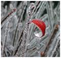
| 12/09/2002 08:54:33 PM |
Hanging On by welcherComment: nice exposure, good lighting and color. good shape for this photo. |
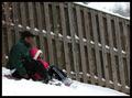
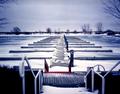
| 12/09/2002 08:46:17 PM |
First Snowby BAMartinComment: it looks like the camera is tilted because fence posts and slats are usually veritcle to the ground and these are tilted. even if these are not verticle, tilting the camera to make them verticle in the picture would have made the slope lood steeper and i think would have improved the picture. other than that it is a great composition with good color. |
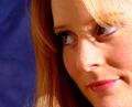
| 12/09/2002 08:40:50 PM |
Portrait of a Beautyby byetkoComment: nice background to compliment the facial tones. good lighting. would like to see a little more of her chin, might be cropped a little too much but overall a very nice picture. |
| 12/09/2002 08:38:45 PM |
|
 Photographer found comment helpful. Photographer found comment helpful. |
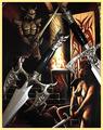
| 12/09/2002 08:37:19 PM |
Vaelen Confronts Darknessby HBunchComment: nice composition with the swords from the picture on top of the picture. it looks like they are part of the picture, nice job. |
| Photographer found comment helpful. |
| 12/09/2002 08:27:12 PM |
Leading the Choirby crabappl3Comment: excellent photo. you captured the moment. good lighting and composition with the attentive girl in the background. good clarity and color. |
| Photographer found comment helpful. |
| 12/09/2002 08:24:00 PM |
Birds Eye Viewby spidermanComment: looks like it might have been blown up a little too much with grain showing across most of the photo. |
| 12/09/2002 08:17:14 PM |
Yuleby KimblyComment: i like the composition, and the detail and texture of the skin. i like the lighting, both the left lighting and the Christmas lightse. very original. i would give more rating points if the overall tone was not as green. |
| 12/09/2002 08:12:19 PM |
Marina in Decemberby MorganComment: very nice composition. i like the near and distant forms in the photograph. the near forms would look better in focus. the red in the center bottom is a great focal point that leads the eye out to the distance. |
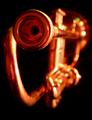
| 12/09/2002 07:51:30 PM |
Blow Itby KonadorComment: good background and point of focus. i like the different colored highlights on the bell part of the horn. |
Home -
Challenges -
Community -
League -
Photos -
Cameras -
Lenses -
Learn -
Help -
Terms of Use -
Privacy -
Top ^
DPChallenge, and website content and design, Copyright © 2001-2025 Challenging Technologies, LLC.
All digital photo copyrights belong to the photographers and may not be used without permission.
Current Server Time: 08/18/2025 08:50:33 AM EDT.