| Image |
Comment |
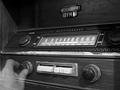
| 08/05/2002 11:54:00 AM |
Vintage FMby mcmurmaComment: Woooo - spooky, sneaky and scarily good. The perfect subject and an almost off-hand use of a clever effect. Im wondering if this might even be one of the rare photographs that would have benefited from sepia tone. Regardless - excellent concept, execution and technicals. No faults at all. Well done! |
 Photographer found comment helpful. Photographer found comment helpful. |
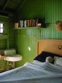
| 08/08/2002 06:42:00 AM |
And This Too My Eyes Have Seenby sheyingshi88Comment: This was a surprisingly difficult one to shoot I bet. Getting those reflections in the windows without catching yourself in there too has meant you had to stand slightly off to one side - and that means the tops of the window frames are quite square with the top of the picture frame. There's no real solution to this I dont think except perhaps getting down on the ground and shooting up at the windows. I doubt that would have made such a nice picture, though. I love the colours and the concept of the reflections. Very good work. |
| 08/08/2002 07:26:00 AM |
|
| Photographer found comment helpful. |
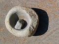
| 08/07/2002 04:46:00 AM |
Stone Age Cuisinartby myqylComment: Good subject and background. Not sure about the *strong* shadows, though. They become more of a focus of attention than the mortar and pestle. Nicely captures the grain of the stone. |
| Photographer found comment helpful. |
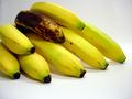
| 08/06/2002 08:59:00 AM |
El plátano en el bolsillo del diabloby karen_vComment: Interesting approach to the challenge - I like your idea. Your framing seems off to me, though. There is a lot of empty space at the bottom and in the top right but the bananas on the left are partially cropped. The focus of this picture is the old banana but that doesnt sit at a natural position to within the frame. I think you should have had the bunch of bananas fill the frame with the old one at the 1/3, 1/3 point. Your arrangement of the bananas is good but you've pushed the colour up too far for my taste. On my screen they look un-naturally yellow. |
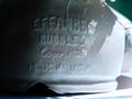
| 08/05/2002 11:45:00 AM |
Antique Kitchen Toolby KimblyComment: Wow what a wonderfully pin sharp image. Your lighting is good - not too even since that would have made everything look flat - just right for the highlights. I think my only comment is that it would have been nice to see a little more of this gadget so that we can see how it works. :) |
| 08/07/2002 05:17:00 AM |
getting oldby melloComment: Lovely picture. Fantastic lighting and framing. Really like it. |
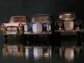
| 08/07/2002 04:40:00 AM |
Dinky Carsby JeanComment: Coo - classic toys! Nice idea to take them on the glass/mirror. They're slightly unevenly spaced, though and Im not sure there's enough light overall. Good atmospheric shot. |
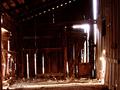
| 08/05/2002 12:32:00 PM |
untitledby aelithComment: Nice idea and a good setting but that blown-out light through the cracks is too much. Perhaps a low intensity fill-in flash inside this building would have brought out more interior detail as well as dropping the exposure reading on the camera - removing the over exposed lights. |
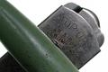
| 08/05/2002 11:43:00 AM |
Cracked Bubblesby WillaComment: At first I thought this was slightly out of focus - it's something about the lettering - but then I realised that the crack is in perfect focus. This contradiction somehow attracts me. That and the colours - the teracotta and the green are very attractive together and perhaps could have been brought out a touch more with your graphics package. Otherwise it's a lovely photo - the light is a little ove strong on the right and a little over dark on the left but that's just nit picking. Lovely atmosphere. Well done. |
Home -
Challenges -
Community -
League -
Photos -
Cameras -
Lenses -
Learn -
Help -
Terms of Use -
Privacy -
Top ^
DPChallenge, and website content and design, Copyright © 2001-2025 Challenging Technologies, LLC.
All digital photo copyrights belong to the photographers and may not be used without permission.
Current Server Time: 08/27/2025 06:37:19 PM EDT.