| Author | Thread |
|
|
08/12/2002 12:55:00 AM |
|
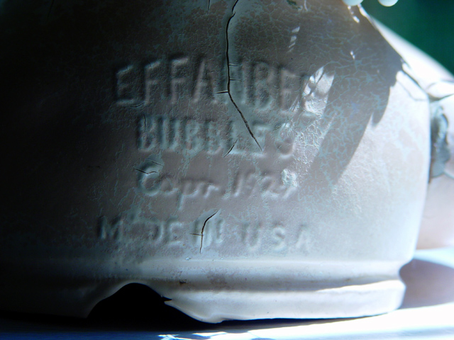
Well, in response to 'nightfall's' comment, I'm sorry my photo confused you. No, it was not shot through a mirror. The crack is in the back of the doll. For those who were not sure, I am fairly confident that this photo is in perfect focus. What you are looking at is the back of an old composition material constructed doll. The doll's name ("Bubbles") is obvious as is the date, etc. I thought this was explained in my description, but anyway, thanks for looking and commenting! I got a lot of comments about the "too dark on the left" and "too light on the right" thing, and now that it has been kindly pointed out to me, I am still not sure I agree with it, because I was attempting to use the light to emphasize the age of the subject and also to make the letters stand out. Apparently I screwed up on the light, but I did my best. It was fun to get both good and bad comments. |
|
Comments Made During the Challenge  |
|
|
08/11/2002 02:21:00 PM |
|
this shot has me confused. is the crack in the container itself? it almost looks like you shot the bubbels in a mirror which had a big scratch on it or something. well anyways, I like the lighting gradient. |
|
|
|
08/11/2002 07:06:00 AM |
|
yes. it's from 1924... it looks like a nice picture but is kind of boring too. |
|
|
|
08/10/2002 05:37:00 PM |
very interesting. I first rated this a 6 in my first run through. Now, as I take a closer look - there is much more technique here. I like the lighting/direction. I like the exposure - different, but good. This is a well executed photo - with thought and effort put into it. Great work 8
Ruthann |
|
|
|
08/09/2002 06:01:00 PM |
|
I don't think I get this. What is it? Also way too dark at left. |
|
|
|
08/07/2002 05:33:00 PM |
|
Neat patterns and shadows. |
|
|
|
08/07/2002 01:32:00 PM |
|
The subject is very well selected. DOF may be a little shallow for it, however, as the soft edge on the pottery to the right makes the photo look washed out to a higher degree than it really is. |
|
|
|
08/07/2002 06:59:00 AM |
|
this is a good subject for this challenge... the lighting seems a little strange... going from extreme dark to extreme light may not be the best choice... I wonder how this image would look with the light a little more even on the subject? - jmsetzler |
|
|
|
08/06/2002 05:10:00 PM |
|
Intertesting lighting effect but maybe too dark on an unknown subject. |
|
|
|
08/06/2002 03:48:00 AM |
|
I can not ecactly understand what this is. The text is blurred too much. I'd focus on the text more and prefer to look obliquer. The top is wonderful, the low is terrible. Good work, anyway. |
|
|
|
08/05/2002 06:53:00 PM |
Something old. Use your photographic technique to emphasize the age of your subject.
Composition - quite good
Technical Aspects - good. perhaps a little more even lighting
Meets Challenge - yes
Visual Impact / Originality - good
|
|
|
|
08/05/2002 03:38:00 PM |
it certainly looks old, but then i get no clear idea of what "it" is. showing more of the object, perhaps in relation to its usage, would have made it easier for thick-skulled reviewers like myself to figure it out. the lighting is dramatic and i like that, but you have lost some detail to highlights on the right, and shadows on the left. the green triangle upper right is a puzzle as well. ~mcmurma
Aesthetics...4
Meets Challenge...4
Overall...4 |
|
|
|
08/05/2002 12:49:00 PM |
|
The right side is a little washed out,and needs a little more contrast--otherwise nice pix. |
|
|
|
08/05/2002 11:43:00 AM |
|
At first I thought this was slightly out of focus - it's something about the lettering - but then I realised that the crack is in perfect focus. This contradiction somehow attracts me. That and the colours - the teracotta and the green are very attractive together and perhaps could have been brought out a touch more with your graphics package. Otherwise it's a lovely photo - the light is a little ove strong on the right and a little over dark on the left but that's just nit picking. Lovely atmosphere. Well done. |
|
|
|
08/05/2002 12:57:00 AM |
|
Your item definitely shows its age, but the framing makes it difficult to tell what it is. Also, a little sharpening of the picture would have brought out all the aging indicators (cracks, bubbling paint, etc.) Controlled lighting would also have helped this picture. |
|
Home -
Challenges -
Community -
League -
Photos -
Cameras -
Lenses -
Learn -
Help -
Terms of Use -
Privacy -
Top ^
DPChallenge, and website content and design, Copyright © 2001-2026 Challenging Technologies, LLC.
All digital photo copyrights belong to the photographers and may not be used without permission.
Current Server Time: 06/27/2026 02:21:36 PM EDT.