| Image |
Comment |
| 06/13/2005 02:25:35 PM |
Commitmentby LadeeMComment: * Greetings from the Critique Club *
First of all, let me say I remember this image from the Decisions Challenge (fondly). I think you really used B/W to your advantage and the softness and clarity of the image are great. I think you could crop out a little more of the upper left and/or process it a little more (reduce backlighting, play with contrast, etc.) - there seems to be a bit of glare on the fabric there.
The composition is good, but I think could be improved even more by perhaps expanding the crop to the bottom & right. Don't get me wrong - it's a nice rock & should be shown off. I just think that you might accent it more by slightly increasing the size of your crop in that direction.
Very nice shot.
Just my 2 cents...
Jimmy
|
 Photographer found comment helpful. Photographer found comment helpful. |
| 06/13/2005 01:21:37 PM |
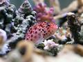
Hawkfishby SailingduckComment: My least favorite of the four your posted for comment. HOWEVER, you've got great composition and colors here. The lighting is a little strong (creating somewhat of a glare on the lighter objects) and the focus is a little off overall. BUT, I must say that I really like this shot too. There is a small patch in the upper left-hand portion of the coral that looks very focused - is this from the focal point of the camera (distance happened to be just right) or is it something from post-processing? It is a little distracting, as I wish the fish & more of the scene were that clear.
Just my 2 cents... Great job! |
| Photographer found comment helpful. |
| 06/13/2005 01:17:39 PM |
trio of pinkby SailingduckComment: Another GREAT shot! I would like it to be a little closer, but the colors and processing are wonderful. I think that purple petals can withstand more processing than most others (IMHO), and you've done a great job here. The dead buds in the upper portion are only slightly distracting.
Fantastic job! (This is starting to sound redundant!) |
| Photographer found comment helpful. |
| 06/13/2005 01:16:06 PM |
fantailby SailingduckComment: Wow - I can see (since this is just the 2nd image I've looked at from my "offer to comment" thread, that you are definitely good...
This is another great shot! The only thing I see is that bright white spot at the base of the bird's left wing. You might be able to tone that glare down a bit. Otherwise, I think the clarity, composition, and sky colors are wonderful.
VERY nice job. |
| Photographer found comment helpful. |
| 06/13/2005 01:14:16 PM |
Butterflyby SailingduckComment: Spectacular macro! I really love the blurred background as well - it works here. The colors and clarity are amazing. VERY nice job. The lighting and composition are great - and it doesn't look overprocessed.
Really - I mean REALLY - nice job! |
| Photographer found comment helpful. |
| 06/13/2005 01:11:17 PM |
undecidedby charliebakerComment: * Greetings from the Critique Club *
Man, I've gotten some tough ones to comment on lately - and this one is right up there with the best of them!
First of all, I think that this artistically met the challenge quite well. I wondered if someone would submit something like this. You must admit, that this is an extremely difficult image to comment on...
I do like it - in the context of the challenge. I guess I can't say too much more about the composition, crop, color, clarity, or lighting. I think they all speak for themselves in this shot.
Nice job. :-)
Just my 2 cents...
Jimmy
|
| Photographer found comment helpful. |
| 06/13/2005 12:41:37 PM |
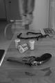
ROPE!by lwphotographyComment: * Greetings from the Critique Club *
First of all, let me say that I remember this image from the challenge very well. You met the challenge with your choice of concept and composition perfectly. Disturbing as suicide may be to some, it is a fact of life and as photographers (the eyes of reality) we shouldn't stray away from illustrating a reality others might find unappealing.
I think your use of B/W in this particular instance was an excellent choice. There's something about the decision itself that IS black and white. The composition I think is also very good. I like the various implements lined up on the counter.
The thing that bothers me most about the photo is the OOF on the rope (chosen method) and the model & chair. I think that some blur would be great on the corpse and chair to imply movement, but I think it's a little too much here (IMHO). I know it took me a moment to even see the feet and chair because of the focus on those objects. Again, I think that some blur is good for this shot, but not quite so much.
I have to say too, that the overturned chair is a really nice touch - it really adds to the reality of this scene. You obviously took a great deal of time setting up for this shot - and it shows - and I think it payed off.
The lighting is also very good here, and the detail on the gun is exquisite. I would like to have seen some of the same attention to clarity on the rest of the "available options".
Overall, I think this was a very good entry & is a strong piece of art on its own. There's a lot of merit here... Very nice job!
Just my 2 cents...
Jimmy
|
| Photographer found comment helpful. |
| 06/13/2005 12:29:15 PM |
Dilemma by banmornComment: * Greeetings from the Critique Club *
WOW... I have to try to comment on this one, huh? Yikes!
First of all, spectacular job! This was one of my favorites from the challenge (in fact I gave it a 10). I can't believe you actually shot this through the storefront glass and didn't have any glare/noise. The colors are outstanding. The composition and angle of the shot are perfect. There are a couple of ties (orange in middle left and purple in upper right) that are slightly out of focus, but that's only noticeable at extreme close-up.
You managed to really wow me with the color & lighting - especially now that I know you shot it through the glass. I don't know how you managed to keep that interference at a minimum, but you definitely know your way around PP or you got really lucky! LOL
What else can I say... Outstanding job & congratulations!
Just my 2 cents...
Jimmy
|
| Photographer found comment helpful. |
| 06/13/2005 12:24:02 PM |
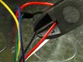
Hope it's the red oneby bulletheadComment: * Greetings from the Critique Club *
I remember this shot from the challenge well. By far the best wire-cutting shot. You kept it simple, clean and colorful. Very nice composition. I like the lines a lot too - they lead the eye right into the decision portrayed in this picture.
It met the challenge perfectly and is a very nice shot on its own. The background is a little noisy & distracting, but only slightly so. The detail you managed to eke out on the wirecutters is great. Lighting is also very good - very little glare (with the exception of the background, and I'm not sure how you could cut down on that noise unless you did it selectively). And by sticking with very basic colors in the wires, you really accented the overall feel with the color.
Very nice job. Sorry I don't have more critical suggestions to make, but I think you nailed this one right on!
Just my 2 cents... :-)
Jimmy
|
| Photographer found comment helpful. |
| 06/13/2005 11:55:00 AM |
Of Shoesby SimonkasprzakComment: * Greetings from the Critique Club *
You really did capture an intangible decision exquisitely. The pose of the feet are perfect to create the scenario of indecision. The composition is terrific - I like the way the shot is cropped. The lighting, however, is a little harsh (too bright). I think you could reduce some of the backlighting and play with the contrast a little more to really bring out more detail and a warmer glow to the overall scene.
I also think you could get a little more pizzazz out of the colors represented by adjusting the saturation. If you're going for a muted color shot, then I still think this is true. The colors are a bit washed out by the lighting, so the combination of working on the lighting & the colors (IMHO) could make the shot even more powerful.
You really did a beautiful job with this setup. Again, you created an immediate sense of what was going on in the scene. That alone is something to be very proud of. It's not easy to evoke emotions from your viewer so quickly. Great job!
Just my 2 cents...
Jimmy
|
| Photographer found comment helpful. |
Home -
Challenges -
Community -
League -
Photos -
Cameras -
Lenses -
Learn -
Help -
Terms of Use -
Privacy -
Top ^
DPChallenge, and website content and design, Copyright © 2001-2026 Challenging Technologies, LLC.
All digital photo copyrights belong to the photographers and may not be used without permission.
Current Server Time: 07/18/2026 11:24:56 PM EDT.