| Author | Thread |
Comments Made During the Challenge  |
|
|
08/23/2002 01:17:00 PM |
|
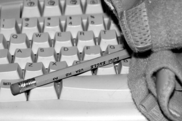
b&w works well here, so does DOF, but i am totally missing what the thing on the right is and how it fits into the photo. a piece of clothing? sorry, must be having one of my blond days. -- gr8photos (4) |
|
|
|
08/22/2002 09:12:00 AM |
Composition: Subject Placement, Cropping, Background4,
Technical: Focus, Exposure, Lighting, Processing5,
Challenge: Does your entry meet it?10,
Appeal: Is it Interesting, Motivating, Etc.? 4,
Total Averaged Rating6. Autool
|
|
|
|
08/21/2002 07:46:00 PM |
From my perspective:
Meets challenge:Yes
Technical:a little blurry
Appeal/Artistic:Doesn't appeal to me really
Composition:I think this would look better without the rags. I just don't understand why they are included here...Of course it may just be over my head.
Originality:ok
Comments:Good luck in the challenge.
|
|
|
|
08/21/2002 11:15:00 AM |
|
I believe that the lighting is slightly harsh on this photo... maybe the camera flash? I also believe, in this case, that more depth of field would be an improvement :) I'm asking myself why you chose black and white also.... I believe that a color image in this case would make the pencil stand out more since it would contrast better against the keyboard in color :) - jmsetzler |
|
|
|
08/21/2002 11:02:00 AM |
|
Great contrast of the pencil and the keyboard. I wasn't sure what the object to the right was, but my mom and I agreed that it was the wrist thing used when people get carpal tunnel. Then it all makes sense. Your lighting is good and the angle is good. at the bottom, it looks parallel to the bottom of the photo, but at the top, it looks like it's tilted a bit to the left. Most likely nothing can be done about that at this angle, but I wouldn't change the angle. I like it how it is. Good photo and good luck in the challenge. |
|
|
|
08/20/2002 04:42:00 PM |
|
I won't let those things go near my keyboard, they leave erasings between the keys. |
|
|
|
08/20/2002 03:28:00 PM |
|
I like the use of BW here, and the deapth of field works for me too... However, whatever that is on the right hand side of the shot, it killed the shot for me...I think this would have been a VERY strong shot without the whatever it is... But it dominates my attention everytime I revisit this shot... I'd love to see a reshoot without it :) |
|
|
|
08/20/2002 10:44:00 AM |
Focus a little fuzzy but like the patterns.
Kavey |
|
|
|
08/20/2002 07:42:00 AM |
|
A nicely taken shot but Im not clear what that towel thing is. Good light and focus. |
|
|
|
08/19/2002 11:14:00 PM |
|
This is a bit too grey-on-grey for my taste-- shouldn't the keys be white? And I'm not quite sure what that item there is on the right-- a cloth of some sorts? --4-- sohr |
|
|
|
08/19/2002 09:05:00 PM |
|
not sure what it is on the right, or what relationship it has with the rest. Keyboard could do with some cleaning ? |
|
|
|
08/19/2002 08:04:00 PM |
|
I'm a little confused by whatever that is on the right of the picture and what it has to do with the subject matter. |
|
|
|
08/19/2002 01:56:00 PM |
|
I understandthe juxtaposition of the keyboard and the pencil but don't understand the towel, if that's what is is. I cannot find this image particularly original as I have seen lots of keyboard images by now. Nice job on the duotoning. 5 Journey |
|
|
|
08/19/2002 12:38:00 PM |
|
whats all that junk on the right? Couldn't you make the pencil label right side up? |
|
|
|
08/19/2002 12:01:00 PM |
|
I guess the right side can be cropped a little- to me it appears too overpowering.6 |
|
|
|
08/19/2002 10:06:00 AM |
I'm lost as to the meaning behind or use of the cloth/towel/ what is it?
good use of light. |
|
|
|
08/19/2002 09:51:00 AM |
|
I like the idea and the photo. |
|
|
|
08/19/2002 02:43:00 AM |
|
What is that supposed to be, to the right? |
|
|
|
08/19/2002 12:49:00 AM |
|
I don't know what it is, but the thing on the right is really distracting. |
|
Home -
Challenges -
Community -
League -
Photos -
Cameras -
Lenses -
Learn -
Help -
Terms of Use -
Privacy -
Top ^
DPChallenge, and website content and design, Copyright © 2001-2026 Challenging Technologies, LLC.
All digital photo copyrights belong to the photographers and may not be used without permission.
Current Server Time: 06/28/2026 05:25:19 AM EDT.