| Author | Thread |
Comments Made During the Challenge  |
|
|
08/25/2002 11:25:00 PM |
|
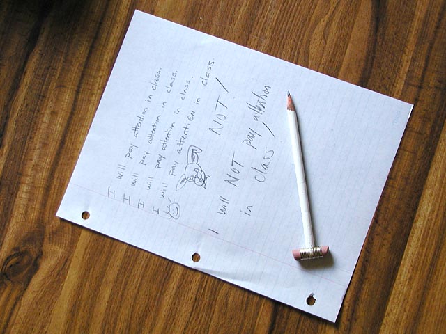
I'll start out first by saying I LOVE that wood grain. very pretty. the idea behind this photo is funny. (for everyone that doesn't have a kid on ridilin, that is). I also like the use of a different looking pencil. cute bunny. lighting and frame placement is great, as is the angle. there is a dark spot in the upper left that is a bit odd, but I was thinking it may be in the wood, however, if it's not, I'd like to see it without the dark spot. good luck in the challenge. |
|
|
|
08/25/2002 10:41:00 PM |
|
This is a clear photo with good color. However, I am sensitive to the subject matter of this photo (particularly the title). Maybe it's because I am a teacher and I have seen children struggle with attention disorders. I hope it was not a joke. I have voted on it with the assumption that it was serious. |
|
|
|
08/22/2002 10:38:00 PM |
|
normally i don't like a wood grain background, but i think it works well here simply because it could be a desk or table top in a classroom. love the pencil. karmat |
|
|
|
08/22/2002 04:31:00 PM |
|
good entry for childhood challenge! |
|
|
|
08/22/2002 11:46:00 AM |
|
would go more closeup on the paper, even cur off the edges to be able to see what's on it |
|
|
|
08/22/2002 09:09:00 AM |
Composition: Subject Placement, Cropping, Background4,
Technical: Focus, Exposure, Lighting, Processing5,
Challenge: Does your entry meet it?10,
Appeal: Is it Interesting, Motivating, Etc.? 2,
Total Averaged Rating5. Autool
|
|
|
|
08/21/2002 12:33:00 PM |
cute, and i like the dual eraser thing and the wood-grain on the table, but overall the image does little to "grab" me. sorry. ~mcmurma
Aesthetics....3
Meets Challenge...5
Overall....4 |
|
|
|
08/20/2002 03:23:00 PM |
I like the idea behind this very much. (Being honest - not to offend) I think this could've been done a little more effectiveley (also just for the record, and not sure if it was intentional, but it's Ritalin) Being someone with ADD, I can respect the intent and can imagine something more for this - the shot is too set up...or organized, yes that's the word...the word people with ADD do NOT know. I think I would have added some more misc things in disarray - things that didn't have anything to do with anything...or some tears in the paper...or put the pencil through one of the paper holes. As for the photo, I would crop it more, I don't think that so much of the desk space is necessary. I may have also come at it from a different angle, a little lower perhaps. Sorry to go on and on, just that this one hits home, so a creative idea. I was just thinking...for someone with ADD, they see the wold go faster than most, would be cool if there was a slight blur in the image...but you know it would not go over well here lol. One more quick thing, the lighting does not do much for this - it's not setting a mood - but not sure what to suggest.....but I just had another idea - peal some of the pencil, as if done with a finger nail...yes that would enhance the idea of needing ritalin - that would put more emphasis on the pencil and not relying so much on the what is on the paper.
Alright, sorry to go on and on. If you give this another shot, I'd be interested in seeing it. Still great effort.
Ruthann |
|
|
|
08/20/2002 02:52:00 PM |
|
Cute! It's "Ritalin" by the way. See, you *should* pay attention in class. ;-) Please know that I'm teasing...lol |
|
|
|
08/20/2002 01:04:00 PM |
|
Too common a misconception. Need to be stimulated, interested, and challenged. But then, that would make too long a tiitle, huh? |
|
|
|
08/20/2002 11:54:00 AM |
|
The pencil's presence in this picture is questionable at the moment. I like the two erasers, but I'm rating on the use/necessesity of the pencil to make the point in the picture. Also, the upper corner seems underexposed/dark. Good idea overall, though. |
|
|
|
08/20/2002 06:45:00 AM |
I personally am not overly keen on photos where the interest is mostly in the text written or printed on the paper/ sign/ wall.
I like the customised pencil - it reminds me of the kind of things we did as kids to pencils and stuff at school. I find the veneer background a little heavy.
The focus and lighting seem good.
Kavey |
|
|
|
08/20/2002 12:11:00 AM |
|
You misspelled Rital--- what was I saying? Anyway, good idea, buy I would have liked to see the two broken pieces not so arranged. |
|
|
|
08/19/2002 05:29:00 PM |
|
crop this closer to eliminate the table some more, and the writing and illustration will pop out too. |
|
|
|
08/19/2002 12:47:00 AM |
|
Home -
Challenges -
Community -
League -
Photos -
Cameras -
Lenses -
Learn -
Help -
Terms of Use -
Privacy -
Top ^
DPChallenge, and website content and design, Copyright © 2001-2026 Challenging Technologies, LLC.
All digital photo copyrights belong to the photographers and may not be used without permission.
Current Server Time: 06/28/2026 09:58:35 AM EDT.