| Image |
Comment |
| 07/11/2005 03:26:19 PM |
WEB.jpgby BrookiedComment: It looks like very small beads have been strung to form the web. I believe the colour has provided just enough contrast to enhance the detail. |
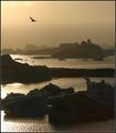
| 07/11/2005 11:51:44 AM |
Twilight's Last Gleamingby NeilComment: Good depth produced through the use of a foreground object (dock) as well as the leading line of the river and the clouds. For more interest though I feel the need for some lights in the houses on the far shore. |
 Photographer found comment helpful. Photographer found comment helpful. |
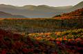
| 07/11/2005 11:47:41 AM |
Autumn Tapestryby NeilComment: What strikes me with this image is the painterly feel and the gentle flow from foreground to background produced by the transitions from shadow to light and back again. |
| Photographer found comment helpful. |
| 07/09/2005 03:31:02 PM |
Darknessby arsenalComment: Nice and moody though I think a little more light to give the subject more definition is needed. (not too much though, don't want to spoil the mood) |
| Photographer found comment helpful. |
| 07/09/2005 02:31:27 PM |
Run!.jpgby pidgeComment: Definitely a good start though I feel that the focus area is too small, too much of the person is involved in the blur effect. |
| Photographer found comment helpful. |
| 07/08/2005 01:36:17 PM |
JZ5G3581.jpgby bruskiComment: Love the negative space. Was this done on purpose or was it a happy accident? |
| Photographer found comment helpful. |
| 07/08/2005 12:02:03 PM |
power linesby focus57Comment: ***** Critique Club *****
First Impression: Good choice of subject for the topic.
Composition: The power lines lead the eye through the image giving it depth. The lines separating the fields also draw the eye through in a nice curving fluid motion.
Exposure: Depending on the mood you are trying to portray one might say that this image is slightly under exposed. The detail in the middle of the picture is almost lost in shadow. If more detail were visible in the fields the lines separating the fields would be stronger.
Impact: Some impact is generated with the height of the tower in the foreground. I believe more impact could be achieved if more detail were visible through the middle of the image.
Good eye and keep shooting.
Colette |
| Photographer found comment helpful. |
| 07/08/2005 10:04:52 AM |
|
| Photographer found comment helpful. |
| 07/06/2005 01:20:11 PM |
over the lagoonby arngrimurComment: Great mood created by the lighting in this shot. Also, the diffents shades of colour on the rocks in the background is amazing.
One thing though, I feel that this image could have more impact if the orientation were landscape, rather than portrait. This would draw more attention to the different shades of colour on the rocks and eliminate some of the negative space in the sky. |
| Photographer found comment helpful. |
| 07/05/2005 04:53:44 PM |
At the Deliby rblantonComment: The colours are amazing. (Interesting body paint) The image has a painterly feel. |
| Photographer found comment helpful. |
Home -
Challenges -
Community -
League -
Photos -
Cameras -
Lenses -
Learn -
Help -
Terms of Use -
Privacy -
Top ^
DPChallenge, and website content and design, Copyright © 2001-2025 Challenging Technologies, LLC.
All digital photo copyrights belong to the photographers and may not be used without permission.
Current Server Time: 08/12/2025 12:22:35 PM EDT.