| Author | Thread |
|
|
07/09/2005 05:07:16 PM |
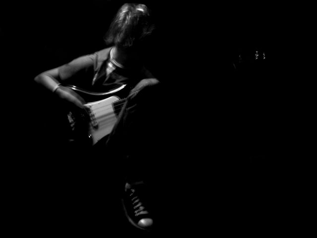
I like what your trying to do here. Though if you will let me, (and since I'm going to type this all out and then hit submit, you have no chance to tell me I can't) lol, I have some suggestions. I think you need to get rid of the blur. I know that the blur might have been your favorit part, and if you want it there it needs to be better done. if you want the blur you need to make it even, you can do this one of two ways, 1. have your subject sit still and move the camera or 2. have the subject sit still and use photoshop tools to add blur.
I like what you are trying to say with this shot though, and mabey, if you added just a tad more light in certin places it would work. I would use a pin a light and long exposures while moving the pin light to do that but that may be the hard way to go about doing that.
I know this has been kinda scattered, sorry about that, but I hope it was enough to help. |
|
 Photographer found comment helpful. Photographer found comment helpful. |
|
|
07/09/2005 04:18:14 PM |
|
would have been real solid minus the blur. |
|
| Photographer found comment helpful. |
|
|
07/09/2005 04:08:41 PM |
Nice solid black background. Good use of the rule of thirds and framing is fine. In general, the exposure looks OK. Black and white is a good choice.
The weakness of this image is not so much in technical quality as it is in composition and content. Your image will fail to make a connection with most viewers. The reason is that it lacks a clear and visible meaning. Every photograph must make a connection to the viewer.
There is nothing wrong with the viewer having to figure out what an image means. The greatest photographs ever taken make people think. But it is the duty of the photographer to provide enough reasons for them to care. Yours does not.
From the image title you hint the main subject may be in a melancholy mood. But by looking at the picture the guitarist could just be having a good time jamming as far as we can tell. If you included their face it would go a long way toward the viewer understanding what this image is supposed to mean. An anguished face would make a strong viewer connection.
The distant objects in the background are indiscernable. As such of most viewers will find them to be major distractions and only contribute to their confusion as to what this image is supposed to be about.
Practically every darkened image of a musician strumming a guitar is blurry. The first 100 or so times you see blurry muscians work, but after that if comes across as an old, overused technique unless captured in a new or unique way. If you are going to show motion blur then design or capture it in a dramatic way to show a clear and purposeful meaning to the motion. Otherwise, the viewer just assumes the photographer doesn't know how to take a clear picture.
In terms of photography it is not a bad picture technically, but it is a confusing one and that hurts. |
|
| Photographer found comment helpful. |
|
|
07/09/2005 03:38:18 PM |
|
I agree with the previous comment about the lighting, that it needs just a touch more for maximum impact. Also, the image is a little bit flat. There is the very good black area, but there seems to be too much grey and not enough white. I took the image into photoshop and raised Brightness/Contrast both by 15, 20, and 30. Play around with that and see what you think of the difference (it need not necesarilly be in photoshop). I really liked it at about 20, it gave the image alot more pop. You could also get the same effect by playing with the levels. |
|
| Photographer found comment helpful. |
|
|
07/09/2005 03:37:46 PM |
it's a nice concept. I like the idea but the blur takes away from it a bit, IMHO.
Good stuff tho.
Is the blur intentional? |
|
| Photographer found comment helpful. |
|
|
07/09/2005 03:36:16 PM |
|
I agree that possiblt a little more light may be needed along with possily less softness to the image. I think if you lighten it up a bit people will be able to see more clearly that the light spots on the right are the guitar and not just some distracting spots. |
|
| Photographer found comment helpful. |
|
|
07/09/2005 03:31:02 PM |
|
Nice and moody though I think a little more light to give the subject more definition is needed. (not too much though, don't want to spoil the mood) |
|
| Photographer found comment helpful. |
Home -
Challenges -
Community -
League -
Photos -
Cameras -
Lenses -
Learn -
Help -
Terms of Use -
Privacy -
Top ^
DPChallenge, and website content and design, Copyright © 2001-2026 Challenging Technologies, LLC.
All digital photo copyrights belong to the photographers and may not be used without permission.
Current Server Time: 06/21/2026 06:59:41 AM EDT.