| Image |
Comment |
| 12/11/2002 09:10:49 AM |
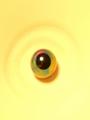
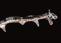
one yellow eyeby BadPiggComment: The circular markings / highlights on the paper are a good continuation of the circles of the central object, but it really needs a bit more contrast to make them stand out. A squarer crop might also help here. |
 Photographer found comment helpful. Photographer found comment helpful. |
| 12/11/2002 09:06:23 AM |
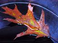
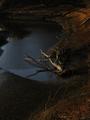
wet leafby shutterflyComment: The colours in this shot are great, giving a good contrast between the leaf and the background. The diagonal of the leaf is also good for leading the eye into the shot, but the waterline along the top of the frame is a bit distracting. A slightly deeper DoF would get all of the leaf in focus, including the nearside, which I think would help this image. |
| Photographer found comment helpful. |
| 12/11/2002 08:52:37 AM |
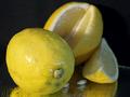
Lemon DROPSby justineComment: The composition of this photo is good, but the lighting doesn't help highlight the water droplets on the lemon skins, and the crop & angle means that a potentially interesting reflection off the surfacetop has been lost. I'd also suggest using a second light from the righthand side, to help bring some warmth to the colours. |
| Photographer found comment helpful. |
| 12/11/2002 08:41:31 AM |
Maybe I Can Sneak Into DPC2by GeneralEComment: A fun portrait and good use of magic-hour lighting. The only thing detracting from this image is the background, but since the subject fills most of the frame, it isn't too much of an issue. |
| Photographer found comment helpful. |
| 12/11/2002 07:50:35 AM |
Christmas Time Is Hereby jenaromComment: The softness of the ball, combined with the mix of focus on the middle branch, makes my eyes water trying to focus properly - there doesn't appear to be a clear focal point to the image either. However, the colours and background contrast really make the ball jump out. |
| Photographer found comment helpful. |
| 12/11/2002 07:48:14 AM |
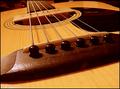
Melancholy Melodyby nards656Comment: Firstly, the colours feel very orange/red, which may have been due to your lighting or the WB of the camera. Secondly, there doesn't seem to be a focal point - this would have been a good opportunity to use a shallower DoF to highlight one part of the guitar. Also, if the shot was rotated anti-clockwise (or counter-clockwise if you're american), the strings could have led the eye from the top left corner down into the image.
That all said, I do like this shot :o) |
| Photographer found comment helpful. |
| 12/11/2002 07:37:06 AM |
Neon Twigby kandyjComment: An interesting shot, but unfortunately the highlights seem blown-out, which makes it very hard to work out that there's a twig inside the ice. Perhaps a softer light would have helped here. |
| Photographer found comment helpful. |
| 12/11/2002 07:21:53 AM |
light's ebbby aelithComment: This is definitely an image that needs the greyscale below it :o) The blues and oranges work well together, and the mix of ripples and reflections helps add interest to the image. However, I personally would have cropped off the lower quarter (maybe lower third), since I feel that that area doesn't add anything. |
| Photographer found comment helpful. |
| 12/11/2002 07:18:07 AM |
Merry Kissmas!by karmatComment: Interesting idea, and good use of negative space. The white background, presumably brightened using levels, unfortunately makes the label merge into it (intentional?), making the label seem separate from the main subject, which in my opinion detracts from the overall image. |
| Photographer found comment helpful. |
| 11/11/2002 05:45:00 AM |
|
| Photographer found comment helpful. |
Home -
Challenges -
Community -
League -
Photos -
Cameras -
Lenses -
Learn -
Prints! -
Help -
Terms of Use -
Privacy -
Top ^
DPChallenge, and website content and design, Copyright © 2001-2024 Challenging Technologies, LLC.
All digital photo copyrights belong to the photographers and may not be used without permission.
Current Server Time: 04/26/2024 08:54:11 PM EDT.