|
|
| Image |
Comment |
| 01/25/2003 03:39:43 PM | Rugby: Ballet for Blokes.by catpixelComment: Critique Club Comment :o)
Composition:
The positioning of the players within the frame is great, and it definitely capures the moment well. The framing and wide aspect crop helps a lot, as it draws the viewers' attention to the players. Unfortunately you'd can't see the ball in this shot, so it makes it slightly trickier to work out what's going on at first glance - viewers will probably either be drawn in by this mystery, or pass over it.
Background:
With this sort of action shot, it's always difficult to control what exactly ends up in the shot when you take it. The background is probably a bit too busy, since it distracts from the players - perhaps a different position or angle would have helped, but since you're in a busy Central Park, its hard to say :o)
Camera Work:
I'd guess that this shot was was taken using full zoom, and probably digital zoom too - I personally never use digital zoom, since it lowers the quality of the shot and gives you less control than just cropping it afterwards. The focus on the players is good, but perhaps a shallower DoF would have helped blur the background a bit, making the players stand out more.
Post Processing:
Since you've not provided any post processing details, I've no real idea if you've done much to this shot. One important thing to mention is that this shot is only 86Kb, out of a maximum 150Kb, therefore you may have lost quite a bit of detail by compressing the image down to that size - I always recommend that you try to get as close to the 150Kb line as possible, so that as little detail as possible is lost.
One suggestion I have for this shot would be to play about with the saturation & colour balances, since this shot could probably do with being a bit more green and a little less blue, which would make it seem a little warmer and improve the contrasts a bit (even if it wasnt a warm day ;o).
My Opinion:
I'm a Brit myself, so I know what Rugby is :o) Out of curiousity, do you know if they were playing Rugby League or Rugby Union? Anyway, this is a good action shot, well composed, and as such I quite like it. However, it's definitely borderline as to whether it meets the "humor" challenge, and is only really saved by the title. Overall I'd rate it as an above average shot, but its not right for the challenge.
If you have any questions about this critique, please feel free to PM me about it. |  Photographer found comment helpful. Photographer found comment helpful. |
| 01/14/2003 07:47:12 PM | Rain Drops Keep Falling on My...by rj324Comment: Critique Club Comment :o)
Composition:
The most obvious thing about this shot, on first glance, is that there is no main focal point, and since there is nothing in the near background to reflect in the raindrops, this image becomes more of an abstract. Since you'd have had little control over where the raindrops actually were on the glass, I'd have tried to get a shot where a group of droplets lead the eye across the frame.
Background:
The background on this shot is an usual light greeny-turquoise. Considering that you're trying to sell the 'raindrops' aspect of this image, perhaps a more "stormy" colour would have helped here, such as a darker blue.
Camera Work:
The most obvious "fault" about this shot is the focus, since the corners (especially the lower left) are out of focus. This is probably due to your choice of F stop, since F2.2 leads to a very shallow DoF. Also, since you state that this was a car window, the probably angled or curved glass would exaggerate this. While shallow DoF is good in many instances, as it can draw the eye into one area of the image, the lack of a focal point to this shot means that it just feels confused. There's also a dark patch in the very bottom left corner that could easily have been cropped out.
Post-processing:
Since you've not provided any details, I can only guess as to the post processing you've done, if any. One important thing to mention is that this shot is only 48Kb, out of a maximum 150Kb, therefore you may have lost quite a bit of detail by compressing the image down to that size - I always recommend that you try to get as close to the 150Kb line as possible, so that as little detail as possible is lost.
My Opinion:
The idea behind the shot was reasonable, but the odd focus and lack of any real focal point really drags this shot down, which I think is reflected in the final score. Since all photos in this particular challenge had to use the title to sell the shot, I can't complain about that. This shot just about meets the challenge, but it lacks any interest.
If you have any questions about this critique, please feel free to contact me via the PM system. | | Photographer found comment helpful. |
| 01/14/2003 06:20:27 PM | Brahm's Lullabyby karmatComment: Critique Club Comment :o)
Composition:
Photographing a child is obviously quite tricky, since there is little that you can do to get them exactly how you want - catching them while they're asleep is probably as good a time as any ;o) It's a pity that your crop wasn't a touch taller, since you've missed off the end of the child's left hand. In addition, a slight change of camera position, more up and to the right, could have positioned that left hand more on the same vertical line as the child's eyes, plus the line of the arm would have lead the viewer's eye across the shot nicely. As its currently positioned, it doesn't do this as well as it could. I'd also suggest that you try flipping the shot left<->right, as ths can sometimes help lead the eye from the topleft corner (the natural start point) into the image.
Background:
The solid black background means that the child is the only point of interest in the shot, and provides a reasonable contrast. However, the lack of texture to the surface makes it hard to work out where exactly the child is asleep - on a bed? the sofa? the floor? or whereever, so there is a slight lack of context there.
Camera Work:
The focus is a touch soft, but that can be expected from such a long exposure, especially with an "unwilling" model :o) Perhaps increasing the lighting (or using a lighter background) would help reduce the shutter time, and thus retain the details of the shot a bit more.
Post Processing:
I'd be curious to see what this photo looked like in colour, since you've obviously made the choice of going for b&w here. The lack of colour means that the eye is drawn to the lighter areas of the photo first, which in this case is the clothing, and the dark background merges into the child's hair a bit, which is unfortunate. That said, the fleshtones are good, and the slight lack of focus works for you, since portraits tend not to be in super-crisp detail :o)
Your choice of a slight black border doesn't assist this photo greatly, since it only affects the lefthand side of the shot - perhaps a single pixel border of white in between the main body and the black border would work, but I'll leave that to you to play around with.
One quick note on your crop - you've not used the maximum 640 pixels on either of your dimensions, so your photo could have been a little bit larger, thus could have shown a bit more detail, or a bit more of the child.
My Opinion:
Its a photo of a child, something I'm not overly keen on in general on DPC, since many parents consider a snapshot of their child doing anything "cute" would make the shot a surefire winner (in their mind). However, in this case, you've created an appealing photo without falling into this trap, and I'd rate this as definitely an above average shot. As for meeting the challenge, in this challenge using the title to sell a photo was pretty much mandatory, and your choice works well.
If you have any questions about any of this critique, please feel free to contact me via the DPC Fanatics chatroom or via the PM system. | | Photographer found comment helpful. |
| 01/09/2003 05:55:49 AM | Stayed Homeby mcraelComment: Critique Club Comment :o)
Composition:
The vehicle fills the frame, which means there's no ambiguity as to what the subject is! I have two suggestions though - rotating the image a degree or two clockwise would help balance out the angles, as it feels slightly slumped to the lefthand side currently (if the vehicle really does slump like that, it may have been best to use a different camera position to help emphasise it). My other suggestion would have been to flip the image left<->right, so that the lines of the side of the vehicle lead the eye from the top-left corner down to its front. However, doing so would mean that the licence plate would be backwards, so perhaps you'd have to take this shot from the other side of it.
Background:
Since the vehicle dominates the frame, there is very little background to this shot, but what little there is helps provide context to the image (ie everything's snow-covered), yet it doesn't distract from the subject itself, which is ideal.... but perhaps cropping the righthand side a little would help make a cleaner edge there.
Camera Work:
I've already mentioned two possible other positions from which you could have shot this, but perhaps a higher angle shot, looking down on the vehicle a bit more would have helped, since that would show more of the snow on the roof etc. Other than that, the focus on this shot is excellent, and the DoF is very deep, so that the entire vehicle (and most of the background) is very clear.
Post-Processing:
Since you've provided no details, I can only guess at your post-processing, which I'd guess included focus sharpening. My one suggestion would be to play with the levels, and try to create brighter, less muted colours (which appeal more to the "normal" dpc voter). The alternative would be to really desaturate the shot, and wash the colours out more, so that it'd emphasise the cold & abandonment.
My Opinion:
This shot definitely meets the challenge, but I feel it lacks anything that really holds my interest, making it an "average" photo. But that's just me :o)
If you have any questions about this critique, please feel free to PM me about it. | | Photographer found comment helpful. |
| 12/11/2002 03:13:49 PM | Last Year's Resolutionby myqylComment: Good use of b&w and the RoT here, and the dust on the seat really adds to the sense of disuse. However, the shot feels slightly tilted, and may benefit from being rotated clockwise by a few degrees. | | Photographer found comment helpful. |
| 12/11/2002 03:12:15 PM | Enduranceby KarenBComment: Nice composition, and the sun shining through the leaves really helps add detail to them. However, since the DoF means that there is no other focal point, maybe a tighter crop would help. | | Photographer found comment helpful. |
| 12/11/2002 03:10:40 PM | Minor Sunrise in a Major Keyby inspzilComment: Very nice colours in this shot, which contrast well against the dark silhouettes of the trees. However, there appears to be a redish glow to the bottom edge of the photo, perhaps residual from a lens flare, which could be removed by recropping. | | Photographer found comment helpful. |
| 12/11/2002 03:02:05 PM | Face-to-Face In the Snowby magnetic9999Comment: Great head-on shot, and the DoF on it is good. However, it feels like the shot has been over-sharpened, and that some of the detail has been lost because of it. | | Photographer found comment helpful. |
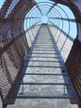
| 12/11/2002 02:45:15 PM | Stairway to Heavenby goodtempoComment: At first glance, this appeared to be an oddly slatted walkway, but then I worked out that it was a vertical shot :o) The perspective on this shot is simply superb. I'd be curious to see what this shot looks like either as a b&w, or more saturated. | | Photographer found comment helpful. |
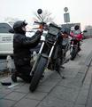
| 12/11/2002 02:42:16 PM | Roadside Repairs (Portrait of a friend)by AzrifelComment: I feel that this shot needs to be rotated clockwise by a few degrees, since the uprights of the roadsigns and buildings in the background distract by being not quite vertical. The subject matter of the shot is good, but perhaps a different shooting position (eg a bit more to the left) would have got you a more interesting composition. | | Photographer found comment helpful. |
Home -
Challenges -
Community -
League -
Photos -
Cameras -
Lenses -
Learn -
Prints! -
Help -
Terms of Use -
Privacy -
Top ^
DPChallenge, and website content and design, Copyright © 2001-2024 Challenging Technologies, LLC.
All digital photo copyrights belong to the photographers and may not be used without permission.
Current Server Time: 04/25/2024 05:33:18 AM EDT.
|