| Image |
Comment |
| 07/24/2002 03:00:00 PM |
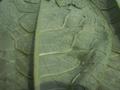
Leaf it aloneby freetimeComment: Could have been so good! This is very similar to a shot I wanted to do. Lack of focus really lets it down. |
| 07/24/2002 03:14:00 PM |
Bountyby ebrantiesComment: I can't believe you tried this! Really good job. I don't minfd the focus dropping off at the back but the soft focus at the front is a bit offputting. DOF only extends half as far in front as it does behind the point of sharp focus (except at really close up). If you'd focused on the first line instead of the seconf it would have been spot on. |
| 07/24/2002 02:52:00 PM |
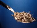
The Breakfast of Championsby lmhrComment: Good strong image. The blue background is very effective.Lacks a little in focus though. Bottom of the handle is sharp but the nails aren't. Either needs more DOF of focussing to be on the nails as they are the main subject. |
| 07/24/2002 03:03:00 PM |
Ridgesby millerComment: Love the shallow DOF on this - really works well. |
 Photographer found comment helpful. Photographer found comment helpful. |
| 07/24/2002 03:08:00 PM |
|
| 07/24/2002 03:08:00 PM |
|
| 07/24/2002 02:58:00 PM |
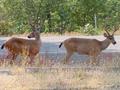
Velvet Antlersby bobgaitherComment: Well yes, they have velvet antlers but tat really isn't obvious from this picture. Focussing on the deer is pretty soft and composition could be better - they are both looking out of the frame in different directions which makes for a confusing picture and the right deer is very close to the edge of the shot. |
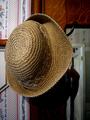
| 07/24/2002 03:00:00 PM |
hatby arippsComment: Nice shot of the hat and the lhs is great. RHS of the picture lets it down especially the shadow. |
| 07/24/2002 02:55:00 PM |
lick suckby defrostedComment: Great idea! I think 2 things could have made this better. (1) sharper focus on the skin (2) getting rid of/moving the shadow. It's very dark and quite big. A small reflector would have softened this or using natural light. Also, did you try another background? Strong blue or even orange would have set the colour off better. |
| 07/24/2002 03:04:00 PM |
|
Home -
Challenges -
Community -
League -
Photos -
Cameras -
Lenses -
Learn -
Help -
Terms of Use -
Privacy -
Top ^
DPChallenge, and website content and design, Copyright © 2001-2025 Challenging Technologies, LLC.
All digital photo copyrights belong to the photographers and may not be used without permission.
Current Server Time: 08/22/2025 03:56:27 AM EDT.