| Image |
Comment |
| 10/13/2003 05:54:20 PM |
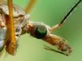
Deranged DPC Photographer on the Looseby OneSweetSinComment: Hi --
This picture has some eerie effect to it. I like it! Very original.
Framing was great also.
A great attempt on being a stand out from the crowd.
This reminds me a a television intro used around 10 years ago. I was always intrigued on how they produced this effect.
Great work --
Sandy |
 Photographer found comment helpful. Photographer found comment helpful. |
| 10/03/2003 03:11:28 PM |
Have you got my best side?...by pinbackComment: Wow, a pretty amazing photo. I do like the background color and the different perspective for the side (I hope) instead of head on. For these critters, you did a great job (but I still hate bugs).
Regards,
Sandy |
| Photographer found comment helpful. |
| 02/09/2003 10:28:32 PM |
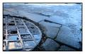
Circle of squaresby vjozComment: Hi vjoz --
I am responstible for CC critique this week on your photo.
Photo -- the camera
I like what is done with the slower ISO speed. The photo has been is really sharp and defined. I am guessing that because of this the moisture on the man hole cover appears glossy. What a wonderful effect.
Photo -- post camera work
This is where I am not quite sure what you have done, but I do like the overall effect. Pushing the color levels strongly to the blue. Great job on colors here.
Compostion
I like the simple approach you have taken. It is a sure winner. This is proven by your higher score. The only reason that you didn't get a ribbon this will was because you chose a natural composion as appposed to arranging items in front of the camera.
In general, I prefer your approach to this competition. You only are a week or so away from getting a ribbon.
Good luck in your next challenge.
shohn
|
| Photographer found comment helpful. |
| 02/04/2003 06:30:20 PM |
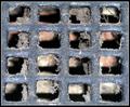
Fresh Air Vent?!by MonaComment: Hi Mona --
A great picture. I can see why it did so well.
Technical -- the camera.
This macro shot is really good and close. I can see those fibers of dirt clinging to the iron grate. I also like that we can see a hint of what is there beyond the grate, but it is mystified by the dof which leaves us to our imagination.
Technical -- post processing.
I think that you have done a great job of cropping this photo and keeps with the sqauare theme well.
Compostion.
You have so well fulfilled the challenge theme this week. It's amazing what you have come up with so close at hand. I'm glad this isn't my "clean air vent".
Congrats on doing such a great job. The clean and simple approach works well on this site.
-- shohn Message edited by author 2003-02-05 21:12:11. |
| Photographer found comment helpful. |
| 02/03/2003 05:48:57 PM |
Three Square Meals a Dayby ClubJuggleComment: Hey CJ --
Err, I was running late.
Wow, what a great picture. It will be a real pleasure to critique this picture.
Technical - camera.
I can't fault you there. Your skills are great. Color is good. The range of colors that you are showing here is wonderful. The focus is good.
Tehcnical - post processing
The colors of food is very hard to get right. You have come very close. Definitely much better than most restaurants who dare to put pictures of their food in the menus.
Composition
I really do like this arangement.
All the work that obviously went into this picture. I looked all over for these square dishes and couldn't find them. Good for you.
I think that it would have been voted higher if you had taken this picture from directly above looking down. It would have lent strength the square arrangement and it would have given more impact upon the voting public.
Once again what a pleasure to critique your photo.
shohn
Message edited by author 2003-02-04 07:53:09. |
| Photographer found comment helpful. |
| 01/26/2003 05:43:46 PM |
Rouge Riverby MorganComment: This is a good picture. I would be very satistied if my photos looked this good.
Composition.
The downed tree makes this picture a natural. I like that you picked the river scene. It reminds me of the cold and snowy weather up there.
Technical
I can find nothing out of place.
Challenge fitness
It represents the challenge nicely.
Congratulations.
-- shohn/CC
|
| 01/20/2003 07:57:33 AM |
|
| 01/20/2003 07:42:12 AM |
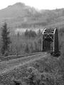
Crossing by timj351Comment: Tim --
Overall, this is a great picture. My test of a picture is "would this photo look good on my home's walls?" Yes.
Composition.
The bridge placement in your frame is perfect in my opion. I am bothered with the clear cut in the background, but that is only being true to the present environment in this area.
The clouds sort of counter balance the whole picture nicely. It gives a fanciful aura to the scene.
Technical
The track on the left side is doing something to your picture on my LCD. I can't judge if it is my monitor or your picture that is causing this minor negative. I have seen this happen due to requirements of the lower pixel count.
Focus is perfect (in my view)!
Challenge fitness
Some people might have judged this slightly down because your picture was in portrait mode. I, myself, think that this adds interest to the overall composition.
This is a wonderful picture and a real pleasure to critique. Congratulations.
-- shohn/CC Message edited by author 2003-01-21 02:02:03. |
| 01/17/2003 03:24:25 PM |
The Roseby autoolComment: Hey Autool --
Wow, you even looked up the verse. Real work. Of course, that makes more personal. It's such a shame that we can't add comments for judging, it makes a big difference to me. I'm thinking that because the title of your photograph is so simple, it passed by a lot of people's heads that there actually was a song called, "The Rose".
This is such a wonderful picture. There isn't much needed to go from 5th to First.
Technically this picture is good. I only have two comments here. There is one pixel that seems out of place in the lower left corner just below where the bottom thorn. A minute white spot.
Secondly, the picture seems a little soft around the edges especially where the rose comes in contact with the background.
Composion.
Great work here. No way would I be able to suggest anything different than what you have done.
I would think that there would be some value to doing a whole personal study of roses with differnt vases, backgrounds, rose colors and rose types. My first take on this was that I wanted to try a rose with a cut lead crystal vase.
- shohn /CC Message edited by author 2003-01-18 20:59:18. |
| Photographer found comment helpful. |
| 01/15/2003 02:17:25 AM |
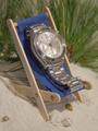
Timeout...by dltruexComment: Hey, where's the sun? Ah well, western Wastington state isn't known for that.
Good color. Great composition. I can see all of the work that went into this photo.
To me all that seems missing here is the "wow" factor. Could this picture possibly produce that? It's possible, with some artificial sun added. if you can, go back and try some different lighting. It could allow you to create sparkles off the face and band of your watch.
I really enjoyed this picture.
-- shohn / DPC-CC |
Home -
Challenges -
Community -
League -
Photos -
Cameras -
Lenses -
Learn -
Help -
Terms of Use -
Privacy -
Top ^
DPChallenge, and website content and design, Copyright © 2001-2026 Challenging Technologies, LLC.
All digital photo copyrights belong to the photographers and may not be used without permission.
Current Server Time: 06/27/2026 04:12:13 PM EDT.