|
|
|
Showing 5261 - 5270 of ~5610 |
| Image |
Comment |
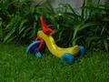
| 08/29/2002 10:01:00 AM | He left me here..by bunniesComment: Ooooh. The basic four colours of a kid's crayon set - my kidhood bedroom was these four colours (and white). I think it's very effective to restrict to such primary colours, and I like the background. The concrete wall doesn't do anything for me, but other than that, great! 6, Kavey |
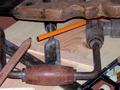
| 08/20/2002 06:47:00 AM | Passion before DPCby Frank BeckmanComment: I love the older flat wooden pencil - it's colours and form blend well with the other subject matter. I find the yellow pencil a little out of place. I look forward to seeing your outtakes, if you are one who shares them, to see if you have other compositions and arrangements of the items. Kavey |
| 08/20/2002 05:55:00 PM | chasing its tailby owennnnComment: Woo! Spooky space pencil. I like this but I don't know why, so my comment is probably useless, I do apologise. I'll come back to it if I can offer anything constructive, other than the fact that I like it! 6, Kavey |
| 08/23/2002 06:38:00 AM | Blueby DannyComment: Nice shot, and like that the blue is a third of way down. Would like it better if more accurately horizontal and if all pencils were at same angle. The one 8th up keeps destroying the repetitive pattern, for me. 6, Kavey |
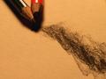
| 08/23/2002 07:10:00 AM | happy trailsby mnewmanComment: I like this a lot, though find the shadow around the pencils just a little OTT. Love the texture of the scribble and the paper and the limited colours. 7, Kavey |
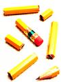
| 08/20/2002 05:53:00 PM | One Pencil, Slicedby AmphianComment: Love the cross-hatching beneath the pieces of pencil. Is this hand drawn just where we see it, or is the whole paper gridlined and the contrast set up high to get rid of it? I like this a lot, but the layout of the pieces doesn't quite gel for me. 6, Kavey |
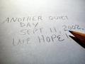
| 08/20/2002 06:27:00 AM | Hopeful Thoughtsby fsieradzkiComment: I am scoring this very low because I feel I am being asked to look at it solely on the basis of my emotions about September 11th, rather than anything else it offers. For me this feels manipulative and therefore I am scoring it down. Now, I know full well that the intention of many photographers is to manipulate the emotions of their viewers, so it's not an inherently a bad thing to aim for that. But this time, to me personally, it feels wrong. This also scores low just because I don't like the composition or lighting. Please don't take offense, and if my words upset you, please do PM me and I will remove the comment immediately. Kavey |
| 08/23/2002 06:26:00 AM | Rays of leadby CoreyComment: Striking and abstract pattern, good colour and nice rich background, generally feels a little dark. 6, Kavey |
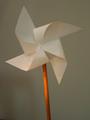
| 08/20/2002 10:30:00 AM | wind mill pencilby arippsComment: Clean and simple shapes, very geometric. A little too dim and shadowed. Kavey |
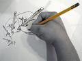
| 08/20/2002 05:56:00 PM | Hand Drawn Handsby sohrComment: This is lovely, I like the composition and the fractal pattern. How did you get the hand to look black and white with hints of colour? 6, Kavey |
|
Showing 5261 - 5270 of ~5610 |
Home -
Challenges -
Community -
League -
Photos -
Cameras -
Lenses -
Learn -
Help -
Terms of Use -
Privacy -
Top ^
DPChallenge, and website content and design, Copyright © 2001-2025 Challenging Technologies, LLC.
All digital photo copyrights belong to the photographers and may not be used without permission.
Current Server Time: 08/06/2025 04:41:20 AM EDT.
|