| Author | Thread |
Comments Made During the Challenge  |
|
|
08/25/2002 05:57:00 PM |
|
|
|
08/24/2002 10:34:00 AM |
|
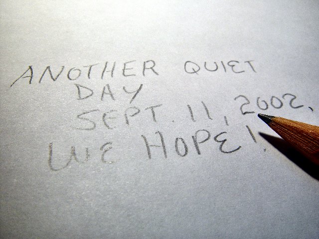
I think we all hope for that. I lost a friend in the WTC. He was on the 70 something floor in the first building hit. He was one of many still considered "missing". Brad Hoorn, Richland, Michigan 22 years old. That said, i hate to say anything at all bad about this, but the lighting on the top is a tad too bright for me. It kind of almost washes out the word "we". The angle is great and placement is good. I might have tilted it slightly to the right to make the words horizontal and taken a bit more time to line up the words. Otherwise, very powerful photo. Good luck in the challenge. |
|
|
|
08/22/2002 04:52:00 PM |
|
|
|
08/22/2002 04:02:00 PM |
|
|
|
08/21/2002 05:51:00 PM |
|
Did you want glare on the lower left letters? I think I would have liked a little more pencil. I normally don't care for black and white, but this shot might have transferred to the scheme nicely. 7 Swash |
|
|
|
08/21/2002 02:51:00 PM |
|
interesting concept :) I would have rather seen a more creative use of the pencil :) - jmsetzler |
|
|
|
08/20/2002 07:14:00 PM |
Composition: Subject Placement, Cropping, Background7,
Technical: Focus, Exposure, Lighting, Processing7,
Challenge: Does your entry meet it?10,
Appeal: Is it Interesting, Motivating, Etc.? 4,
Total Averaged Rating7. Autool
|
|
|
|
08/20/2002 03:24:00 PM |
|
Nice sentiment :) I share the hope... As per the shot, I think lighting was a problem here... The top of the paper is washed out and the glare on the word "we" was very distracting... If it had been me, I might have considered the position of the pencil again... While the 'rule' of thirds is actually only a 'guideline', I feel it could have helped here if the point of the pencil was moved to the lower right hand "third" mark... |
|
|
|
08/20/2002 01:29:00 PM |
|
i'm torn as to what rating to give you. emotionally, you tug at the heart-strings, but from a photographic point of view it's only an ok photo. there's some reflection there on sept and we that makes it a little harder to read than necessary. the placement of the pencil is good. there's a little too much empty space at the top and bottom, mayb crop this to 640x427? above all, let's hope that it will be a quiet day, and not just on sept. 11. -- gr8photos (4) |
|
|
|
08/20/2002 06:27:00 AM |
I am scoring this very low because I feel I am being asked to look at it solely on the basis of my emotions about September 11th, rather than anything else it offers. For me this feels manipulative and therefore I am scoring it down. Now, I know full well that the intention of many photographers is to manipulate the emotions of their viewers, so it's not an inherently a bad thing to aim for that. But this time, to me personally, it feels wrong. This also scores low just because I don't like the composition or lighting. Please don't take offense, and if my words upset you, please do PM me and I will remove the comment immediately.
Kavey |
|
|
|
08/20/2002 12:09:00 AM |
|
|
|
08/19/2002 06:34:00 PM |
|
|
|
08/19/2002 06:15:00 PM |
|
|
|
08/19/2002 05:12:00 PM |
|
|
|
08/19/2002 03:46:00 PM |
|
|
|
08/19/2002 02:39:00 PM |
|
Creative work...idea. The funky light is a bother to me, but I do like this. Score 6 ~Kee |
|
|
|
08/19/2002 05:48:00 AM |
|
boring boring all this sept.11 things Just write anything else and the picture would be better |
|
|
|
08/19/2002 03:23:00 AM |
|
hmmm, ...I just find bringing it up where it's not necessary to be tacky and opportunist. I don't mean it as one of those "this sucks" comments. I just think you ought to be aware of people's response to the representation. It's unlike me to post something so terse and unforgiving, but this evoked strong feelings -- unfortunately, not the ones you were shooting for. Sorry, that's my opinion. 2 because it offends me. As for the technical details, the pencil is well-lit. I like the way you've got that one gleam on the lead. Unfortunately, the lighting is a bit too harsh for the top of the paper and for the writing. Everything I already mentioned aside, I would have scored it a 3 or a 4. Unsure which. |
|
|
|
08/19/2002 02:53:00 AM |
|
A very nice thought, but a very boring photo. 4 -lennier |
|
|
|
08/19/2002 01:15:00 AM |
|
The lighting seems just a bit too bright, and I'm not sure I really like the topic -- but this is a risk you run with making touching on social issues with your photography. I think I like the picture better now for having made me thought this out so much. |
|
Home -
Challenges -
Community -
League -
Photos -
Cameras -
Lenses -
Learn -
Help -
Terms of Use -
Privacy -
Top ^
DPChallenge, and website content and design, Copyright © 2001-2026 Challenging Technologies, LLC.
All digital photo copyrights belong to the photographers and may not be used without permission.
Current Server Time: 06/28/2026 09:31:55 AM EDT.