| Author | Thread |
Comments Made During the Challenge  |
|
|
08/25/2002 10:22:00 PM |
|
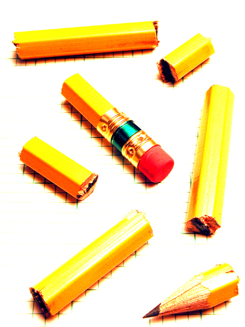
I'm so curious as to how you got the lines only on the shadows of the pieces. Please spill the beans when the voting is over! Great job! |
|
|
|
08/25/2002 12:59:00 PM |
|
Nice shadow/grid effect. Turned up the brightness a lot, or was there another trick? |
|
|
|
08/24/2002 07:34:00 AM |
|
|
|
08/24/2002 12:49:00 AM |
|
This is a pretty neat idea, and really nice placement. The focus is very nice, but the post editing is way too exaggerated, in my opinion. The pencil parts don't look natural and the lack of background except where the shadows were suposed to be is kind of distracting. I am sure you did this on purpose though, so I will hold this a just my opinion and say that if you were going for this look, then you definately did your job. Original and pretty creative. Good luck with the challenge. |
|
|
|
08/23/2002 10:23:00 PM |
|
Pretty neat. I love how the pencil shadows keep the pattern on the graph paper showing. Maybe a little too blown out and harsh looking but i like this overall. Lisa |
|
|
|
08/22/2002 08:07:00 PM |
Composition: Subject Placement, Cropping, Background7,
Technical: Focus, Exposure, Lighting, Processing6,
Challenge: Does your entry meet it?10,
Appeal: Is it Interesting, Motivating, Etc.? 6,
Total Averaged Rating7. Autool
|
|
|
|
08/22/2002 04:16:00 PM |
|
I like the over exposure on this shot. |
|
|
|
08/22/2002 12:00:00 AM |
|
Nice concept. I like the graphed paper which gives it some interest it would have lost. |
|
|
|
08/21/2002 04:09:00 PM |
|
|
|
08/21/2002 03:19:00 PM |
|
Very nice shot! Great compostion and I like the harsh brightness/contrast a lot. |
|
|
|
08/21/2002 10:41:00 AM |
|
I love the strong lighting, saturation and contrast on this photo. It's great how the grid paper pattern shows in the shadows. |
|
|
|
08/21/2002 08:45:00 AM |
|
|
|
08/20/2002 05:53:00 PM |
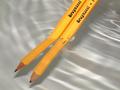
Love the cross-hatching beneath the pieces of pencil. Is this hand drawn just where we see it, or is the whole paper gridlined and the contrast set up high to get rid of it? I like this a lot, but the layout of the pieces doesn't quite gel for me.
6, Kavey |
|
|
|
08/20/2002 12:46:00 PM |
|
Well done. The graph paper in the shadows is a nice touch. |
|
|
|
08/20/2002 09:45:00 AM |
|
This is a really great shot. It's interesting and stands out. Great use of colour and light to give it a surreal texture… On merit – 10… |
|
|
|
08/20/2002 07:47:00 AM |
|
interesting effect - how did you achieve it |
|
|
|
08/20/2002 12:26:00 AM |
|
I don't know how to explain it, but this picture really pleases my eye. 8. |
|
|
|
08/19/2002 11:54:00 PM |
|
I love the "How" presented here much more than the actual end result. The process what you did though is great. And so are the clarity and sharpness. 6 Journey. |
|
|
|
08/19/2002 06:27:00 PM |
|
I think it needs a little more contrast... NOT! I like the idea though... |
|
|
|
08/19/2002 06:17:00 PM |
|
I like the way the grid shows up under each piece of the pencil, you will have to let us know how you did that! |
|
|
|
08/19/2002 01:35:00 PM |
|
You may have been trying for this effect but i think it would look better with less light. |
|
|
|
08/19/2002 01:27:00 PM |
|
I like the effect, what is it? |
|
|
|
08/19/2002 01:00:00 PM |
|
The light is way too intense, it washes out the grid, is this intentional. |
|
|
|
08/19/2002 12:51:00 PM |
|
On any other site you might get a "creative effect" comment. On this site you get a "cooked the levels a bit too much" comment. But in my opinion you get a place in my top ten this week. |
|
|
|
08/19/2002 12:25:00 PM |
Very nicely done - I love the exposure effect. Must admit, it's sort of hard to look at for a long period of time - but I love this. Great composition and detail. abstractish Excellent work 10
Ruthann One of my top 2 favorites!!! |
|
|
|
08/19/2002 03:29:00 AM |
|
Great idea, but I'm distracted my how washed out and "glarey" the pieces look. |
|
Home -
Challenges -
Community -
League -
Photos -
Cameras -
Lenses -
Learn -
Help -
Terms of Use -
Privacy -
Top ^
DPChallenge, and website content and design, Copyright © 2001-2026 Challenging Technologies, LLC.
All digital photo copyrights belong to the photographers and may not be used without permission.
Current Server Time: 06/28/2026 06:46:41 AM EDT.