| Author | Thread |
Comments Made During the Challenge  |
|
|
08/21/2002 04:19:00 PM |
|
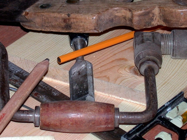
It's a great picture technically. However, I think it looks a little busy which gives it an artificial, set up look. Perhaps a few less tools would have helped. Sorry to be negative… |
|
|
|
08/21/2002 11:57:00 AM |
|
I don't understand the symbolism. |
|
|
|
08/21/2002 12:54:00 AM |
|
Great photo, the lighting is nice, and although there are many items in the photo, it doesn't look cluttered, they are very nicely placed. The yellow pencil seems a bit out of place, but I think you did that just in case someone didn't think the carpenters pencil was enough to "meet the challenge". If this were my photo, I'd take the yellow one out (not needing it to "meet the challenge") retake the photo and hang it in your shop. It looks like it would have personal meaning to you, and is pretty cool to look at. It makes me wonder what you used to make with all this. Birdhouses comes to mind. Don't know why. Anyway, great photo and good luck in the challenge. |
|
|
|
08/20/2002 07:46:00 PM |
Composition: Subject Placement, Cropping, Background5,
Technical: Focus, Exposure, Lighting, Processing5,
Challenge: Does your entry meet it?10,
Appeal: Is it Interesting, Motivating, Etc.? 4,
Total Averaged Rating6. Autool
|
|
|
|
08/20/2002 02:53:00 PM |
|
I think your lighting might have been a touch harsh, but I love the tones and textures here. |
|
|
|
08/20/2002 06:47:00 AM |
I love the older flat wooden pencil - it's colours and form blend well with the other subject matter. I find the yellow pencil a little out of place. I look forward to seeing your outtakes, if you are one who shares them, to see if you have other compositions and arrangements of the items.
Kavey |
|
|
|
08/19/2002 07:01:00 PM |
Meets Challenge Theme:yes
Technical :good dof
Composition:too busy for my taste
Creativity:fair
Remarks:I'd try a few different arrangements...maybe you did, I just am not crazy about this arrangement.
Grayce...aka...Gracious |
|
|
|
08/19/2002 12:09:00 PM |
|
the yellow one kills it for me. its too stark. |
|
|
|
08/19/2002 10:19:00 AM |
|
Although the pencil stands out nicely, it seems a little too busy. |
|
|
|
08/19/2002 10:11:00 AM |
How true! Mine was HGTV and decorating the house, and gardening....
I now have unfinished projects (curtains, blinds, etc) and weeds in the garden... (Hey! they're green though!).
Unique and refreshing idea here. Incorporates the pencil without making it the main subject. Good work! |
|
|
|
08/19/2002 01:04:00 AM |
|
Home -
Challenges -
Community -
League -
Photos -
Cameras -
Lenses -
Learn -
Help -
Terms of Use -
Privacy -
Top ^
DPChallenge, and website content and design, Copyright © 2001-2026 Challenging Technologies, LLC.
All digital photo copyrights belong to the photographers and may not be used without permission.
Current Server Time: 06/28/2026 08:27:50 PM EDT.