DPChallenge: A Digital Photography Contest You are not logged in. (log in or register
 
Browse Settings
Currently viewing:
Registered Userstephan

Show comments:

Per page:

Order:

Comments:


Comments Made by stephan
Pages:   ... ... [53]
Showing 341 - 350 of ~528
Image Comment
Hard No. 2
08/25/2002 07:13:00 PM
Hard No. 2
by TomNTexas

Comment:
Wow! Sexy! Excellent use of light. Composition and focus are good, too. Nice approach to the challege. If I would be a pencil producer I would use your photo for my advertising ;-)
-stephan
Morning Harvest
08/18/2002 04:47:00 PM
Morning Harvest
by puppet10

Comment:
Beautiful photo! I love the light in the background. The vegetables make a good subject. Creative interpretation of "something new".
-stephan
Bouquet for the drawing artist
08/17/2002 10:55:00 AM
Bouquet for the drawing artist
by sylk

Comment:
Congrats to a very nice photo and my condolences that you shot this photo one week too early ;-)
The lighting would be better if not only coming from the right side. There is a strange shadow in the background. Maybe a lamp illuminating the left side would have helped. I like the DOF.
-stephan
Monetary Reforms
08/19/2002 08:35:00 PM
Monetary Reforms
by stephan

Comment:
Many thanks to all who commented on my photo. I'll answer to some in detail:

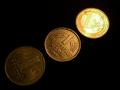
rocco22: You do know that the 1 is bad and 10 is good, do you? ;-) I'm sorry but the hot spot was intended.

jasonmccarthy: I did it on purpose ;-)

hbunch7187: I placed the coins that way on purpose. See below. I see what you mean with your "pringles" (yes we have them here in good ol' germany) and it's a good suggestion. I had only one lamp and to create a deep contrast I had to place it fairly low. But I also wanted to have the reflection on the Euro, so I had to use this particular angle.

courtenay27: *grin* actually the other way around of what hbunch7187 suggested. So see above why I used this angle. I tried the domino-like position but it didn't work out very well.

Remie: Sadly I kept only one Mark which was in a good shape. Silly me still hopes it will be worth someting someday. Who could know that I someday will use it in a photography? (Who could know at this time that I'll start with photography at all ;-) On the other hand I was not able to find a totally blank Euro.... *grgs*

jkiolbasa: Your comment was the most helpful to me (not implying that the others we not helpful at all). And you're right. The negative space just makes the photo empty and does not add anything. I think a different composition of the coins could have avoided that.


Overall I'm pleased that my idea with the different lighting showing old to new came across (mostly). It encourages me to make more photos that way.
But all of you missed one thing: I placed the coins that way so that the figures form a growing curve, like the optimistic market analysts love to do. But I didn't expected that anyone noticed _that_ ;-)

Thanks again,
Stephan
untitled
08/17/2002 09:44:00 AM
untitled
by mikeysbistro

Comment:
Modern art really is "something new". The curve makes the photo interesting. The lighting could have been better, so that its more visible that the letters are engraved. Especially the M. Also I would like a more uniform lighting here. There are reflections in the upper left corner while the right side is much darker.
-stephan
Cherry Tomatoes
08/18/2002 04:44:00 PM
Cherry Tomatoes
by shedonist

Comment:
In my eyes it would have been the bet photo of this weeks green tomatoes, if there was not this distracting pole in the background.
I still like the photo because of the water drops, the good lighting and the good DOF.
-stephan
Birthday Presents
08/17/2002 11:53:00 AM
Birthday Presents
by Gordon

Comment:
To me this looks a bit too weird. It looks like the rings are falling down the table. Strange balance.
Other than that I like the red vs. metallic color. DOF is a bit too narrow.
-stephan
New Match
08/18/2002 04:21:00 PM
New Match
by Remie

Comment:
Excellent photo. Very creative! I like the simplicity yet it's also interesting. Technically I don't see anything I could improve.
This photo is one of my two 10's this week.
-stephan
I Want a New Life....Please!
08/17/2002 10:44:00 AM
I Want a New Life....Please!
by Martin

Comment:
This photo emotionally touches me. The gorilla looks very sad. I interpret the title as a statement that you don't like that the gorilla is caged. Personally, until now I avoided going to the zoo, because I somehow feel that I would support the imprisonment of the animals. And despite there are people who care about them, I think they suffer. Just as an explanation why I am very touched by this photo.
Technically the photo is also above average. The composition is very good. The tight cropping creates a very intimate feeling. Focus and lighting arte also good. Only distracting thing is the glare on the glass between you and the gorilla.
-stephan
Brand New Office Building
08/17/2002 09:34:00 AM
Brand New Office Building
by john22132

Comment:
Nice geometry. Only thing which is distracting is the other building in the upper left corner. Cropping it out would have improved the photo in my opinion. I like how the clouds are reflected in the windows. Unfortunately only the title is the only thing which gives a hint that this is "something new".
-stephan

Pages:   ... ... [53]
Showing 341 - 350 of ~528


Home - Challenges - Community - League - Photos - Cameras - Lenses - Learn - Help - Terms of Use - Privacy - Top ^
DPChallenge, and website content and design, Copyright © 2001-2025 Challenging Technologies, LLC.
All digital photo copyrights belong to the photographers and may not be used without permission.
Current Server Time: 08/14/2025 09:01:42 AM EDT.