|
|
|
Showing 171 - 180 of ~611 |
| Image |
Comment |
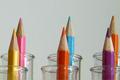
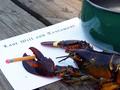
| 08/21/2002 12:22:00 PM | Chemistryby jaxxComment: I very much like this idea.The angle is good as well as composition. IMO - the lighting needs adjustment and the background, if supposed to be white, needs adjustment as well. If the grey was unintentional, i suggest manipulating the white balance (if possible) on your camera. Or perhaps with a black background. Personally, I have found that the white background is difficult at first, but with many many trial and errors, I think that I've gotten much better. Actually, when I first started - I didn't even realize it. I thought my photo was just fine, until someone pointed it out to me - then I compared the photo to my subject and realized that the entire coloring of the image was off. I'm say this in the assumption that this was not intended. I can tell that you had a vision - visualization. I like the way the shot is setup. good lines. Great job and effort. 7 Ruthann |
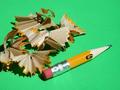
| 08/23/2002 10:33:00 PM | Stubbyby npageComment: Very interesting (Running out of steam for commenting - so being brief) I like the green background - this is very bright. good work 8 Ruthann |
| 08/20/2002 02:04:00 PM | Noneby manoloComment: SUCH EXCELLENT WORK!!! I think this is great. I wouldn't change anything - but might wonder what one little bit of color would do (of course, not allowed if PS in) Great work! 10 Ruthann |
| 08/23/2002 10:25:00 PM | Bloomingby puppet10Comment: Really Great. (Running out of steam for commenting - so being brief) great idea, composition, lighting, color, dof - all great for this image! I can see a lot of time, effort and skill in this image. Great work 9 Ruthann |
| 08/19/2002 10:24:00 AM | |  Photographer found comment helpful. Photographer found comment helpful. |
| 08/23/2002 10:11:00 PM | |
| 08/23/2002 10:28:00 PM | Fandangoby myqylComment: Really cool (Running out of steam for commenting - so being brief) nice lines, detail, composition, cropping, colors - great for this. Although I know that construction paper is not very bright - I wish the colors were more vibrant - doesn't matter though - great time, effort and work 8 Ruthann | | Photographer found comment helpful. |
| 08/19/2002 10:14:00 AM | I'm positive it's #2 officer!by dpatteeComment: Cute and creative - made me chuckle. IMO (not to offend) it's a little too grey and dismal (although I'm sure a line-up is that way) I can't tell if the 2 soft images are reflections or from a slower shutterspeed - not understanding why they're there. I think I would have made it brighter, with the light source coming from angle from the bottom (as if being interrogated) and the white very white. This is just my opinion. Nice work and effort. 5 Ruthann |
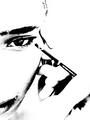
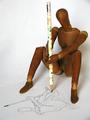
| 08/19/2002 10:07:00 AM | Creativity Toolby stephanComment: Really great! So soft and gentle (I'm sure you're getting a lot of-focus could be better) - very artistic work. The technique goes right along with the image that is being sketched. Love how the pencil is illuminated. Wonderful job 9 Ruthann | | Photographer found comment helpful. |
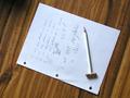
| 08/20/2002 03:23:00 PM | Need Ridilinby lmurray13Comment: I like the idea behind this very much. (Being honest - not to offend) I think this could've been done a little more effectiveley (also just for the record, and not sure if it was intentional, but it's Ritalin) Being someone with ADD, I can respect the intent and can imagine something more for this - the shot is too set up...or organized, yes that's the word...the word people with ADD do NOT know. I think I would have added some more misc things in disarray - things that didn't have anything to do with anything...or some tears in the paper...or put the pencil through one of the paper holes. As for the photo, I would crop it more, I don't think that so much of the desk space is necessary. I may have also come at it from a different angle, a little lower perhaps. Sorry to go on and on, just that this one hits home, so a creative idea. I was just thinking...for someone with ADD, they see the wold go faster than most, would be cool if there was a slight blur in the image...but you know it would not go over well here lol. One more quick thing, the lighting does not do much for this - it's not setting a mood - but not sure what to suggest.....but I just had another idea - peal some of the pencil, as if done with a finger nail...yes that would enhance the idea of needing ritalin - that would put more emphasis on the pencil and not relying so much on the what is on the paper. Alright, sorry to go on and on. If you give this another shot, I'd be interested in seeing it. Still great effort. Ruthann |
|
Showing 171 - 180 of ~611 |
Home -
Challenges -
Community -
League -
Photos -
Cameras -
Lenses -
Learn -
Help -
Terms of Use -
Privacy -
Top ^
DPChallenge, and website content and design, Copyright © 2001-2025 Challenging Technologies, LLC.
All digital photo copyrights belong to the photographers and may not be used without permission.
Current Server Time: 08/20/2025 02:03:49 PM EDT.
|