| Author | Thread |
|
|
08/26/2002 05:23:00 PM |
|
I thought this one would do much better too. Congrats on a great photo! |
|
|
|
08/26/2002 10:32:00 AM |
Felicidads, tío! Muy buena foto. Merecía más...
Un saludo desde México,
LM |
|
|
|
08/26/2002 12:33:00 AM |
|
This photo im my opinion should have done much better. My top pick for the week. Good job and keep up the good work. |
|
Comments Made During the Challenge  |
|
|
08/25/2002 11:35:00 PM |
|
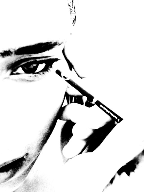
This is a really good photo, and focus appears to be good, and the angle and frame placement are good, but there is really too much bright spot to say much else about it. looks like quite a bit of post editing here and makes it hard to tell anything about lighting. it seems like half the photo is missing. this is just my personal preference. I like good lighting and color. good luck in the challenge. |
|
|
|
08/25/2002 10:47:00 PM |
|
great idea but I don't like the way the hand turned out. maybe a different finger position to let the light hit them differently. |
|
|
|
08/25/2002 06:30:00 PM |
|
wow--awesome. this is beautiful--i love contrasty shots. 10 for you! |
|
|
|
08/25/2002 06:29:00 PM |
Wow! Very creative. I love the style of this photo. Good composition and lighting. The overexposure is great. I also like that it's a bit fuzzy. Only thing I don't like is that I can't really see what's going on with the hand. I know she holds the pencil but I can't really make out where the fingers go. It's a bunch of "something". But it's still a great photo and I really like it.
-stephan |
|
|
|
08/25/2002 05:28:00 PM |
|
Nice use of high contrast. |
|
|
|
08/24/2002 08:34:00 AM |
|
COuld you tell me what you did to this exactly? 8 |
|
|
|
08/23/2002 09:08:00 PM |
|
Very nice...dramatic. My only complaint is that the pencil tip is washed out a little too much. Great job! Lisa |
|
|
|
08/22/2002 05:26:00 PM |
|
Beautiful and original... I'd love to know how it's done afterwards. |
|
|
|
08/22/2002 03:28:00 PM |
|
|
|
08/22/2002 10:16:00 AM |
|
|
|
08/22/2002 01:49:00 AM |
|
This is a great image. Very artistic. Love the strong contrast. Particularly love the "lines" that aren't visible anymore, such as at the top finger. A great example of "less is more". 10 Journey |
|
|
|
08/21/2002 10:46:00 PM |
Composition: Subject Placement, Cropping, Background7,
Technical: Focus, Exposure, Lighting, Processing9,
Challenge: Does your entry meet it?10,
Appeal: Is it Interesting, Motivating, Etc.? 7,
Total Averaged Rating8. Autool
|
|
|
|
08/21/2002 09:31:00 PM |
|
Good use of effects for this image. I think that even more, the composition really makes this image. Very good job! |
|
|
|
08/21/2002 04:49:00 PM |
|
There is at least one other with a similar idea, but I like this one better because of the abstract treatment. If I had any criticism it would be that it's just a little to blown out |
|
|
|
08/21/2002 03:10:00 PM |
|
Perfect composition and love the extreme use of brightness and contrast. - 10 |
|
|
|
08/21/2002 11:39:00 AM |
|
Interesting effect. This is one of those pictures that you either really like or really dislike. I liked it. Focus looks good. Lighting is "special". Subject matter is good. |
|
|
|
08/21/2002 10:55:00 AM |
|
This is one of my favorite shots of the week. Beautiful and well-executed photograph. The mood it creates is stunning. |
|
|
|
08/21/2002 02:21:00 AM |
|
Excellent idea for the challenge. I like the overblown effect - creates teh look of being drawn, wich I am sure is what your were going for. You definitely succeded with this image! Congrats! 10 md |
|
|
|
08/20/2002 11:12:00 PM |
|
Excellent picture. The main "subject" (the pencil) is a bit obscured though. |
|
|
|
08/20/2002 08:45:00 PM |
|
|
|
08/20/2002 07:53:00 PM |
An interesting effect, but I honestly don't like it as a photo contest entry. The subjects are difficult to view and it looks more like a Photoshop manipulation.
5 Swash |
|
|
|
08/20/2002 07:05:00 PM |
|
I like the extreme contrast in this photo, but I dont like much else about it. The subject itself to me is rather lacking. 5 -lennier |
|
|
|
08/20/2002 06:22:00 PM |
|
I like the reverse negative approach but it could be l little more in focus. |
|
|
|
08/20/2002 05:30:00 PM |
|
Great idea. Reminds me of one of my own. |
|
|
|
08/20/2002 03:04:00 PM |
Beautiful! Great framing and terrific use of black and white. The only thing I find distracting is that you can't see any of her nose. (I realize it was probably intentional, but it looks a little weird to me.)
|
|
|
|
08/20/2002 02:23:00 PM |
|
|
|
08/20/2002 02:04:00 PM |
SUCH EXCELLENT WORK!!! I think this is great. I wouldn't change anything - but might wonder what one little bit of color would do (of course, not allowed if PS in)
Great work! 10
Ruthann |
|
|
|
08/20/2002 01:58:00 PM |
|
Beautiful use of white and black. Very artistic, very beautiful. |
|
|
|
08/20/2002 11:19:00 AM |
|
Not a huge fan of major desaturation. sorry. |
|
|
|
08/20/2002 10:30:00 AM |
|
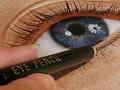
I love this photo. I couldn't quite work out what was happening at first, but I see it's an eyeliner pencil. Very nice high contrast work. It suits the subject well, emphasising the dark outlines around her eyes. 10 from me! - lisae |
|
|
|
08/20/2002 06:23:00 AM |
|
Love the high contrast and the composition. I am surprised that, as a woman, this interpretation of "Pencil" never occurred to me ! Nice work. lhall |
|
|
|
08/20/2002 06:13:00 AM |
I love the high contrast of this - it's very very striking. The only thing I am finding is that because it is so high, I can't figure the hand and fingers out and so this bit of the image isn't clicking for me. But the face and pencil are just incredible.
8, Kavey |
|
|
|
08/20/2002 12:16:00 AM |
|
My number one pick this week. 10. ;) |
|
|
|
08/19/2002 09:38:00 PM |
|
Very striking. This person's eyes really draw you in. |
|
|
|
08/19/2002 09:18:00 PM |
|
very cool post processing on this. The lower right is a bit unclear/ cluttered though |
|
|
|
08/19/2002 08:16:00 PM |
|
Something disturbs me about this picture, but I get it. I would have like to see some color in it, and I think the picture could do fine without the mouth (makes the lack of nose in this picture far too obvious) |
|
|
|
08/19/2002 06:25:00 PM |
|
I loke the hole contrast thing. Idunno if it's too much but I like it. |
|
|
|
08/19/2002 05:53:00 PM |
|
|
|
08/19/2002 02:46:00 PM |
I love shots like this, and this is such a great take on the challenge.
Can you post or email me the original so that I can see what your lighting was like? I'd appreciate it. Muckpond. |
|
|
|
08/19/2002 02:38:00 PM |
|
|
|
08/19/2002 02:17:00 PM |
|
|
|
08/19/2002 02:05:00 PM |
|
I love how this photo also looks like a drrawing..... extra points for creativity! |
|
|
|
08/19/2002 12:43:00 PM |
|
Nice but the center of interest should be the point of the pencil where it meets the eye and because of the contrast it is lost, When the challange is over and you can cheat, fix up that point and you'll have a nice image/ |
|
|
|
08/19/2002 12:36:00 PM |
|
This is a very neat concept and I really like the image. I also believe that post processing can be used to significantly enhance a photograph. My personal problem (not yours) is that I try to draw a line between what is digital art and photography. This photo crosses that line for me. The post processing on this image gives me the impression of a pencil or charcoal sketch rather than a photograph. This image has great artistic merit and really do like it. I'm giving it a 9 rather than a 10 because of this twisted view I have of what is photography and what isn't :) Great work! = 9 - jmsetzler |
|
|
|
08/19/2002 12:06:00 PM |
|
Good photo if not a bit washed out. I like it!! |
|
|
|
08/19/2002 10:36:00 AM |
|
this is a very artsy b&w photo, well done. i would like to know the meaning behind the title. |
|
|
|
08/19/2002 08:28:00 AM |
|
|
|
08/19/2002 06:40:00 AM |
|
nearlt got ot right, u needed a small back light to give more definement to the models head |
|
|
|
08/19/2002 02:05:00 AM |
|
It's clear that you desaturated as a choice; it leaves the image almost like a charcoal sketch instead of a photo. I didn't think I liked it at first and rated it a 4. But something in it strikes me and 4 seems unwarranted. 6 |
|
|
|
08/19/2002 01:43:00 AM |
|
Would love to know how you did this....I've been playing with my camera for months trying to accomplish this....Can you share with me how you did it? Thanks. |
|
|
|
08/19/2002 01:02:00 AM |
|
This is beautiful. I'm interested to know how you did it - overexposure? I'm sure that quite a few folks will take off points for not using a writing pencil, but I think it's a great entry. |
|
Home -
Challenges -
Community -
League -
Photos -
Cameras -
Lenses -
Learn -
Help -
Terms of Use -
Privacy -
Top ^
DPChallenge, and website content and design, Copyright © 2001-2026 Challenging Technologies, LLC.
All digital photo copyrights belong to the photographers and may not be used without permission.
Current Server Time: 06/27/2026 04:23:32 PM EDT.