| Image |
Comment |
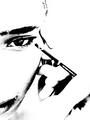
| 08/19/2002 02:05:00 AM |
Noneby manoloComment: It's clear that you desaturated as a choice; it leaves the image almost like a charcoal sketch instead of a photo. I didn't think I liked it at first and rated it a 4. But something in it strikes me and 4 seems unwarranted. 6 |
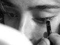
| 08/19/2002 12:58:00 AM |
Saturday Nightby eloComment: Original. I like the idea. I find myself wanting to push the mirror away so I can see the rest of her face. Also, there's a tad bit too much grain for me. Still I like it. |
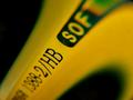
| 08/19/2002 02:50:00 AM |
Bloomingby puppet10Comment: Not sure about the title, but the photo is original. 7 |
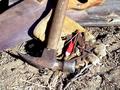
| 08/19/2002 03:30:00 AM |
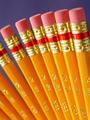
Tools of the Tradeby tee tahComment: I like the bright red pencil amidst the earth-toned tools. I think it would be nicer if not centered. 6 |
| 08/19/2002 03:25:00 AM |
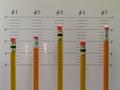
Fire Lane: a pencil of a ho[r]seby antonabayaComment: UPDATE: Okay, so given all of the hullabaloo on the forums about pencil-dicked horses, I now see the error of my thinking. So, despite the fact that I still don't think this meets the challenge, I thought I would offer some thoughts on the composition: both the sign and the red/white strap pull my eye away from the "pencil" -- so much in fact, that I didn't even notice it upon first viewing. The sign is unfortunate. That happened to be where the horse stopped. The strap could maybe have been avoided by crouching for a slighly lower upward angle. I would also like to see the horses tail in the photo, but of course there may be other stuff cropped out with it. Sorry, score was unaffected by my enlightenment. ORIGINAL: I looked and looked and looked, but I just don't see it. 3 |
| 08/19/2002 01:33:00 AM |
Fandangoby myqylComment: In this case, literally paper's mate. Nicely composed. I like the way the lines draw your eyes in opposing directions. 7 |
 Photographer found comment helpful. Photographer found comment helpful. |
| 08/19/2002 02:37:00 AM |
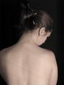
Utilitarianby indigo997Comment: Concept: very good. Execution: could use a little help. Things that distracted me from your photo: her shoulder is cropped out, it appears accidentally -- I see no strong reason for it. The shadows across her back are distracting. Would have lined her chin up a bit more creating a nice line with her spine; it would also have been nice to see just down to the small of her back. The sepia tone is nice. 6 |
| Photographer found comment helpful. |
| 08/19/2002 02:46:00 AM |
|
| 08/19/2002 02:37:00 AM |
|
| 08/21/2002 03:55:00 PM |
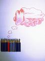
Sigh...by lisaeComment: She got sun-burned just thinking about it! LOL. Very original. The drawing is GREAT. The photo is pretty good. The concept is sellable. I could see this idea reproduced as an ad for crayons or colored pencils. Out of curiosity (and not as a complaint) why did you limit yourself to blue and red? 7 |
| Photographer found comment helpful. |
Home -
Challenges -
Community -
League -
Photos -
Cameras -
Lenses -
Learn -
Help -
Terms of Use -
Privacy -
Top ^
DPChallenge, and website content and design, Copyright © 2001-2025 Challenging Technologies, LLC.
All digital photo copyrights belong to the photographers and may not be used without permission.
Current Server Time: 08/02/2025 05:45:59 AM EDT.


![Fire Lane: a pencil of a ho[r]se](https://images.dpchallenge.com/images_challenge/0-999/29/120/Copyrighted_Image_Reuse_Prohibited_4684.jpg)