|
|
|
Showing 1851 - 1860 of ~2328 |
| Image |
Comment |
| 09/11/2014 05:38:52 AM | pphun_4975by Pixel PeteComment: Critique Club Comment:
This is a very striking image, and I am having a difficult time finding something to say that hasn't already been said. The backlit profile is very well done. I could possibly wish for a little more light information in the back of her head to the bottom of her braids. Ultimately where this fails is in the crop - her face is just too close to the right edge. With the current 800px vertical I needed to go to about 600px wide before it no longer looked tight. But as is, she's just too close to the edge for the image to look comfortable. It bothered me enough that I gave it a 5 originally. A touch more light in the back and a better crop and this is easily an 8 for me. |
| 09/10/2014 06:39:51 AM | Grand Tetonsby jgirl57Comment: Critique Club Comment:
Ah, the Grand Tetons. On my bucket list, for sure.
It's a lovely scene, and as has been pointed out, a very blue one. Probably too blue for me, but obviously others like it. Perhaps a color balance or hue/saturation adjustment to the Blue channel to pull them back just a tad. It's also a little dark for me. Seeing you use Photoshop I'm wondering if you do a levels adjustment as a part of your workflow? As it stands now, the White end of your histogram has about 30 points of unused space, and just bringing that marker over to about 225 from 255 gives you a lot more pop and definition in the dark areas of the mountains. You're also losing some details in the haze in the distance, so maybe play with some contrast curves, or better yet since you have the Nik Collection use Viveza 2 with some Control points to selectively control where you lighten and darken, and boost up some shadows and structure.
While I normally don't like a centerline horizon it works for me here. I tried playing with a different crop, but without having more sky or water to add I can't find something that would work better.
All that's not to say that this isn't a lovely landscape - it is!! I gave it a 7 originally, and with just some lighting adjustments would have scored it higher. As is it just lacks a certain "pop" that I believe you can coax out of it as you refine your post processing skills. I know you've been at this for less than a year, so these skills will come with time. You should certainly be proud of what you were able to do with this one. |  Photographer found comment helpful. Photographer found comment helpful. |
| 09/10/2014 05:22:38 AM | Defeated. .....by DeveComment: Critique Club Comment:
A very stark and honest portrait. You did a wonderful job conveying the circumstances of who he is and what his life condition is at the moment. Sometimes, when people wear their lives so openly, all we need to do is aim the camera and press the shutter button and it's all there - and I believe you were able to do just that. I am reminded very much of a series of homeless portraits done by Michael O'Brien in a book called "Hard Ground".
When shooting portraits getting the eyes sharply in focus is critical, and I find his right eye to be a little soft, likely due to the slight tilt away from the camera. His other eye is perfectly in focus. It's not enough to truly worry about, but it was enough for me to notice.
I'm not a fan of the color treatment or the lighting here. Just way too yellow/amber in the tinting. I love a good sepia or coffee toner on a B&W, but not here, and definitely not to this extent. This screams stark, plain black and white to me. And while I love the direction of the light and the shadows it creates I find that the one side of his face is just blown out a little too much. The hands on a man like this are as important as the eyes, and I think you lost a lot of important details there, from the dirt under his nails to the dryness of his skin. I would have also liked to have seen a little more detail in his eyes - more differentiation between the pupil and the iris.
I think you have a wonderful photo here, but just need to revisit the post-processing. I think with some careful rework it can be something special. And I agree with Devinder, "Defeated" is the antithesis of what this says to me. Perhaps "World-Weary"? | | Photographer found comment helpful. |
| 09/10/2014 04:25:09 AM | Bunch O' Bunnies?by JakeKurdsjukComment: Yes, jgirl57, it looks exactly like a caterpillar. Just don't pick this one up with your bare hands - the Hickory Tussock has some sort of poison on its barbs that can cause anything from a mild irritation to a pretty severe rash depending on the person. Here's what it looked like before cropping. I couldn't get much closer without narrowing the DoF too much.

Would have loved to get rid of the little bit of leaf, but worried about DQ'ing if I had. That, and I didn't want to run my finger across it. Message edited by author 2014-09-10 04:27:46. |
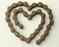
| 09/09/2014 02:01:10 PM | In memory of Robin Williams, American actor recently diedby clickodakComment: Critique Club Comment:
Interesting that I should get this as I was a huge Robin Williams fan since before anyone knew who or what a "Mork" was. That said, even while I knew he was a cyclist and had seen him on broadcast of Le Tour several times I did find the title a bit out of sync with what I would expect for a tribute image and I suspect that may have put some people off.
That said, even before I scrolled down I really liked this image for its stark simplicity. The color tonality is very basic and the off-white background works well with the color of the chain. There's not a lot else going on here, so what us there needs to be exacted perfectly and here's where I had a couple issues, ultimately giving you a 6 when I really wanted to give you more. There are really only two issues that I have - not enough depth of field and skewed orientation.
For the life of me I tried to find a reason why it would make sense to have the top and bottom out of focus, but without there being something in the center, on the chain, that would be emphasized by the lack of focus elsewhere I found the blurred sections to be distracting and would have much preferred the entire chain be in focus. The other thing is the right lean of the heart. While this is definitely not a perfect shaped heart, a 2-3 degree rotation of the image to the left gives the shape a straighter feel, and a more pleasing orientation - at least for me.
Otherwise I think that the only other thing this suffered from was being too simple in a challenge that normally shows off some wild images, so voters may have been inclined to undervalue it when held against some of the other images. Not necessarily fair, but that's the way things tend to work around here some times. | | Photographer found comment helpful. |
| 09/09/2014 09:41:51 AM | In The Florida Sun.....by Ja-9Comment: Critique Club Comment:
A absolutely lovely image, Janine, and deserving of your top 10 finish. The lovely pastel hues of the sky as it reflects against the calm water is wonderful. I would have loved it if you could have pulled out some of the pinks barely visible in the high clouds a bit more, and maybe deepen some of the oranges. Noticing you have the Nik Collection, this is where some of the Bi-Color filters in Color Efex can really make a sunset image pop. But I'm getting picky.
The composition is excellent, though it would have been better if you had been able to get beyond what appears to be the tide line of shells that runs across the bottom right. Or perhaps masked them out a little better. I can never tell if these would be considered "powerline-like incidental distractions". Regardless, it's what kept me from giving this an 8 or 9 instead of a 7.
Really a fine capture. Anything else I might find to call attention to would be a fact of nature and location and I suspect there wouldn't have been much you could have done about that at the moment. :) | | Photographer found comment helpful. |
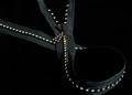
| 09/09/2014 03:46:59 AM | Binding the Edgesby LydiaComment: Nice. Would have prefered not to see the shadow under the zipper in the upper left. | | Photographer found comment helpful. |
| 09/09/2014 03:45:57 AM | Zip itby BenstedComment: A little too much blur for me. Looks artificial. Was it? | | Photographer found comment helpful. |
| 09/09/2014 03:44:49 AM | Glamby illini75Comment: Losing a little too much in the shadows on my monitor. |
| 09/09/2014 03:44:12 AM | | | Photographer found comment helpful. |
|
Showing 1851 - 1860 of ~2328 |
Home -
Challenges -
Community -
League -
Photos -
Cameras -
Lenses -
Learn -
Help -
Terms of Use -
Privacy -
Top ^
DPChallenge, and website content and design, Copyright © 2001-2025 Challenging Technologies, LLC.
All digital photo copyrights belong to the photographers and may not be used without permission.
Current Server Time: 09/03/2025 12:56:10 PM EDT.
|