Critique Club Comment:
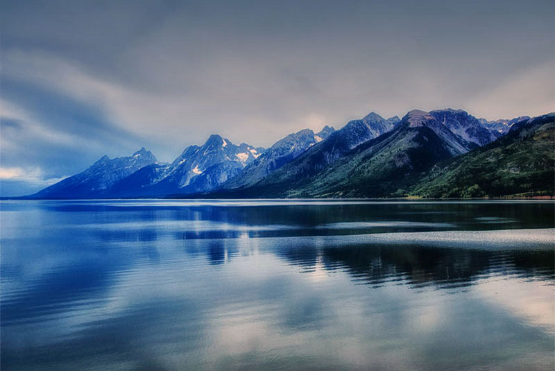
Ah, the Grand Tetons. On my bucket list, for sure.
It's a lovely scene, and as has been pointed out, a very blue one. Probably too blue for me, but obviously others like it. Perhaps a color balance or hue/saturation adjustment to the Blue channel to pull them back just a tad. It's also a little dark for me. Seeing you use Photoshop I'm wondering if you do a levels adjustment as a part of your workflow? As it stands now, the White end of your histogram has about 30 points of unused space, and just bringing that marker over to about 225 from 255 gives you a lot more pop and definition in the dark areas of the mountains. You're also losing some details in the haze in the distance, so maybe play with some contrast curves, or better yet since you have the Nik Collection use Viveza 2 with some Control points to selectively control where you lighten and darken, and boost up some shadows and structure.
While I normally don't like a centerline horizon it works for me here. I tried playing with a different crop, but without having more sky or water to add I can't find something that would work better.
All that's not to say that this isn't a lovely landscape - it is!! I gave it a 7 originally, and with just some lighting adjustments would have scored it higher. As is it just lacks a certain "pop" that I believe you can coax out of it as you refine your post processing skills. I know you've been at this for less than a year, so these skills will come with time. You should certainly be proud of what you were able to do with this one. |