Critique Club Comment:
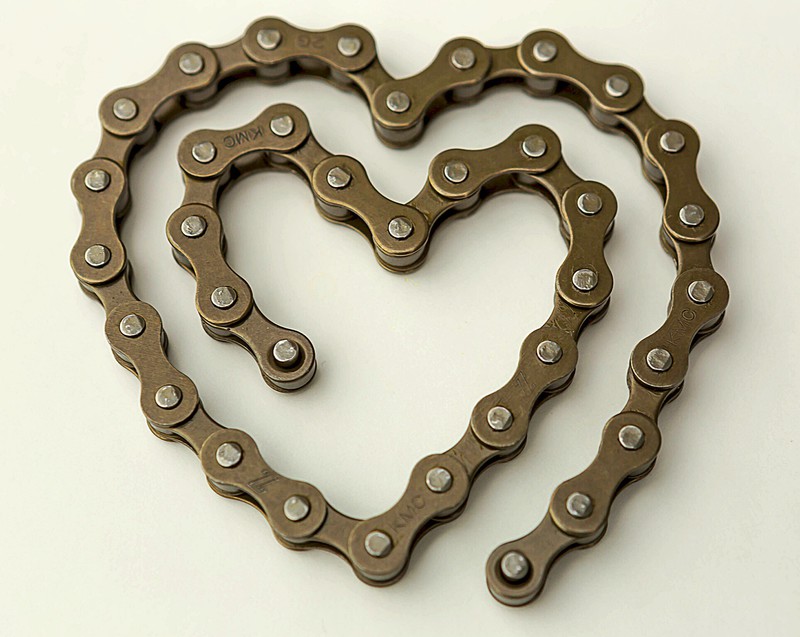
Interesting that I should get this as I was a huge Robin Williams fan since before anyone knew who or what a "Mork" was. That said, even while I knew he was a cyclist and had seen him on broadcast of Le Tour several times I did find the title a bit out of sync with what I would expect for a tribute image and I suspect that may have put some people off.
That said, even before I scrolled down I really liked this image for its stark simplicity. The color tonality is very basic and the off-white background works well with the color of the chain. There's not a lot else going on here, so what us there needs to be exacted perfectly and here's where I had a couple issues, ultimately giving you a 6 when I really wanted to give you more. There are really only two issues that I have - not enough depth of field and skewed orientation.
For the life of me I tried to find a reason why it would make sense to have the top and bottom out of focus, but without there being something in the center, on the chain, that would be emphasized by the lack of focus elsewhere I found the blurred sections to be distracting and would have much preferred the entire chain be in focus. The other thing is the right lean of the heart. While this is definitely not a perfect shaped heart, a 2-3 degree rotation of the image to the left gives the shape a straighter feel, and a more pleasing orientation - at least for me.
Otherwise I think that the only other thing this suffered from was being too simple in a challenge that normally shows off some wild images, so voters may have been inclined to undervalue it when held against some of the other images. Not necessarily fair, but that's the way things tend to work around here some times. |