| Image |
Comment |
| 02/22/2004 05:03:30 PM |
Meby MJENNIComment: Great macro, I just wish you had a bit more depth of field. I like the composition, and the negative space on the left, and bottom of the photo. |
 Photographer found comment helpful. Photographer found comment helpful. |
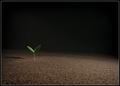
| 02/21/2004 05:33:28 PM |
Motherby casualguyComment: This photo is great, the lighting is very good. Looking at the title I autamatically thought earth which is probobly what you intnded. The leaf is offset from the middle which is very good for composition. Great job. |
| Photographer found comment helpful. |
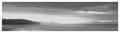
| 02/21/2004 05:31:59 PM |
Sunrise, Santa Cruzby ronnersComment: I like that you used black and white for this. The sky is great, being dark at the very top, and scattering as it gets closer to the horizon. You should have done something to get rid of that bright sunlight in the center of the frame. |
| 02/21/2004 05:30:01 PM |
Harness the Skyby QuadrajetComment: Good idea in showing wind, and the element air. To improve this you should have tried to capture some movement in the blades if they were spinning. The sky adds a lot to the photo, if it was just a plain blue sky this wouldn't have been as good. |
| Photographer found comment helpful. |
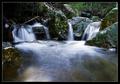
| 02/21/2004 05:27:58 PM |
Spaby rhipsterComment: There are too many dark spots in the photo, the scene is also too busy with so many branches on the top of the photo. You should have tried a different perspective and captured just one waterfall in the photo, this would make it simpler and less distracting. |
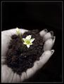
| 02/21/2004 05:25:37 PM |
Genesisby sherComment: I like how the flower stands out from everythig else because of its bright color compared to the dark, and dull bakcground. This is a great idea of showing the element earth, good job. |
| Photographer found comment helpful. |
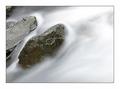
| 02/21/2004 05:24:16 PM |
Running Waterby agwrightComment: This photo stands out from the rest of the flowing river photos because of the sense of movement. You must have used a very long shutter speed to get this effect, and it works great. I also like the composition, the rocks aren't in the center, but are offset which in my opinion is good. |
| Photographer found comment helpful. |
| 02/21/2004 02:14:02 PM |
Warts and allby JeanComment: I like the texture, but you cropped in a little too close to the nose. |
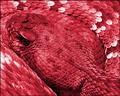
| 02/21/2004 02:13:12 PM |
Feel my skin...little babyby diegohsComment: I like the scales gives the photo a great texture. You also did a good job in filling the frame, there is no room in the photo that has no reason. The red is a little too much in my opinion, looks unnatural for a snake. |
| 02/21/2004 02:10:21 PM |
Fish Out Of Waterby qmdiComment: I like the texture of the sand, the little grains of different colors are great. You shouldn't have put your subject in the middle of the frame, offset it a little to the side, and up or down.. |
| Photographer found comment helpful. |
Home -
Challenges -
Community -
League -
Photos -
Cameras -
Lenses -
Learn -
Help -
Terms of Use -
Privacy -
Top ^
DPChallenge, and website content and design, Copyright © 2001-2025 Challenging Technologies, LLC.
All digital photo copyrights belong to the photographers and may not be used without permission.
Current Server Time: 08/04/2025 12:43:40 AM EDT.