| Image |
Comment |
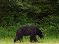
| 07/11/2002 09:50:00 PM |
Bear!by janfriesComment: I think the bear needs to be more "up" in the frame so that there is more ground in the foreground, and not quite so much greenery in the background. |
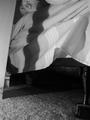
| 07/10/2002 01:32:00 PM |
Can't Sleepby JenguinComment: The proverbial monster under the bed, huh? I thought about this but couldn't figure out a way to do it. Even if I had tried, there's so much junk under there . . . Good job. I like the black and white as well. Did you try actually laying on the bed and leaning over to take the picture, like a kid checking it out? Just a thought. |
| 07/11/2002 12:48:00 PM |
Phobic?by indigo997Comment: Good capture of detail, and depth. I would suggest looking at it in the eye, but I think I'm glad you didn't do that! |
 Photographer found comment helpful. Photographer found comment helpful. |
| 07/10/2002 02:38:00 PM |
Being Aloneby CowgirlComment: A great fear of many, indeed. My only suggestion would be to frame the subject with the "open" space in front of her instead of behind. It seems to give it more balance that way. karmat |
| 07/10/2002 01:41:00 PM |
|
| 07/14/2002 07:36:00 PM |
Nightmareby timj351Comment: Very interesting use of color. I like the set up you used here. |
| 07/11/2002 12:08:00 PM |
dear fatherby magnetic9999Comment: The black and white works well. It seems a little pixelated, making me think you either a) cropped it out of a larger picture b)oversharpened or c) didn't focus well and tried to fix it later. There are other reasons, I suppose, but those are the ones I do the most often. :-) |
| 07/14/2002 07:21:00 PM |
|
| 07/09/2002 10:53:00 PM |
Drunk Driversby ronComment: this shot is a little flat. did you (or can you) play with the saturation, contrast and sharpening? i tried it and can send you a copy if you want. also, this would have been really cool on pavement, maybe over a double yellow line, instead of carpet. as far as the challenge goes, I think you have done well. karmat |
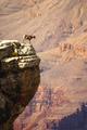
| 07/11/2002 10:25:00 AM |
Fearless by chakkobboComment: The mountain goats can have the ledges. None for me, thanks. Is this the Grand Canyon? I was there about 5 years ago, wouldn't go ANYWHERE near the edges. Awesome shot. Wouldn't change a "thang." karmat |
Home -
Challenges -
Community -
League -
Photos -
Cameras -
Lenses -
Learn -
Help -
Terms of Use -
Privacy -
Top ^
DPChallenge, and website content and design, Copyright © 2001-2026 Challenging Technologies, LLC.
All digital photo copyrights belong to the photographers and may not be used without permission.
Current Server Time: 06/21/2026 02:59:32 PM EDT.