| Image |
Comment |
| 08/21/2002 02:42:00 PM |
|
 Photographer found comment helpful. Photographer found comment helpful. |
| 08/21/2002 02:25:00 PM |
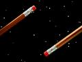
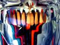
phantom colorby wheatabixComment: Beautiful. Took me a minute or two to find the pencil though. Hope that doesn't hurt you. You would think the shadow would make it obvious. Great work. karmat |
| 08/21/2002 02:24:00 PM |
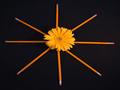
Negative Space Odysseyby FrooberComment: Can't think of anything it needs to improve. I like the "simplicity" of hte shot, and how the pencils leave the frame. karmat |
| Photographer found comment helpful. |
| 08/21/2002 02:47:00 PM |
|
| 08/21/2002 03:09:00 PM |
Hard No. 2by TomNTexasComment: Suggestive, almost, except for the pencil. Hahah. :-) I like the use of the lighting here and how the shadows are on the left side of the face. Good work. karmat |
| 08/21/2002 02:42:00 PM |
|
| 08/21/2002 02:37:00 PM |
Pencil Guardby undergroundComment: I really like the framing on this one. It is a touch dark, and I think that causes you to lose some details, but it may be this monitor. karmat |
| 08/12/2002 02:54:00 PM |
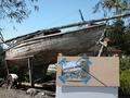
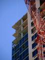
Apartment 24F just got its first windowby BeeGeeComment: I really like the colors in this, and the blue sky on the right. I don't know if it would have been possible, but if the crane could have been shown at a slightly different angle, it may have given more "movement" to the picture. karmat |
| 08/19/2002 01:22:00 PM |
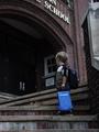
The Force Be With Youby karmatComment: Thanks for all of the awesome comments. I am pleased with my "Top 10" finish. To address a couple of comments, it was a touch dark, but lightening in postprocessing made teh colors do funky things. I left the column on teh right to make the little boy look smaller, and i didn't include the school name for a couple of reasons. Primarily because it is Canton MIDDLE School, and this kid is obviously not in 6th grade. None of the elementary schools around had teh right look that i wanted. Again thanks! |
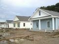
| 08/12/2002 03:17:00 PM |
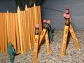
My New Neighborhoodby GuillermoComment: Nice perspective, but the colors are a little muted for me. maybe boost the contrast and/or saturation, some? karmat |
Home -
Challenges -
Community -
League -
Photos -
Cameras -
Lenses -
Learn -
Help -
Terms of Use -
Privacy -
Top ^
DPChallenge, and website content and design, Copyright © 2001-2026 Challenging Technologies, LLC.
All digital photo copyrights belong to the photographers and may not be used without permission.
Current Server Time: 06/23/2026 03:52:42 PM EDT.