| Image |
Comment |
| 08/20/2002 12:51:00 PM |
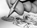
Self-portrait with pencilby GinaRothfelsComment: This is a great photo... The concept and imagination behind this shot is powerful to me :) As a possible improvement, I think that a standard yellow pencil would offer a bit of 'color candy' in this photo since it would make a better contrast with the background. I think another artistic improvement with that yellow pencil would have been to color the pencil in the sketch part of the photo yellow as well. This is just an opinion from a non-artist :) great shot... = 10 - jmsetzler |
 Photographer found comment helpful. Photographer found comment helpful. |
| 08/19/2002 12:55:00 AM |
|
| 08/20/2002 04:36:00 PM |
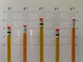
Fandangoby myqylComment: Nice setup and good use of color :) There are a lot of contrasting colors in this photo, which is good in many cases... I wonder what this would look like if the background behind the pencils was an alternating pattern of two colors rather than this many different ones? Good shot :) - jmsetzler |
| Photographer found comment helpful. |
| 08/23/2002 01:12:00 PM |
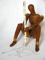
Utilitarianby indigo997Comment: very nice composition... i like the use of the pencil in this shot quite a bit :) I believe the shadows that are traversing her back diagonally look slightly awkward... I'm not sure if there was a way to eliminate that or not... :) - jmsetzler |
| Photographer found comment helpful. |
| 08/23/2002 12:19:00 PM |
|
| 08/25/2002 11:52:00 AM |
My Brother the Artistby KrazyKatComment: This is an excellent image... I love the pencil sketch part of the photo. This is creatively impressive as well... My only critique would be the harsh lighting on the tip of the pencil... this may have been caused by the camera flash? Good shot :) - jmsetzler |
| Photographer found comment helpful. |
| 08/21/2002 11:15:00 AM |
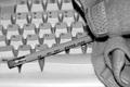
Back to The Basicsby evilbunneeComment: I believe that the lighting is slightly harsh on this photo... maybe the camera flash? I also believe, in this case, that more depth of field would be an improvement :) I'm asking myself why you chose black and white also.... I believe that a color image in this case would make the pencil stand out more since it would contrast better against the keyboard in color :) - jmsetzler |
| 08/19/2002 06:45:00 AM |
Creativity Toolby stephanComment: This is a neat photo, but I don't know how it was achieved without spot editing. Assumint that it was not spot edited for the color, I think the lighting and soft focus here is very nice. - jmsetzler |
| Photographer found comment helpful. |
| 08/21/2002 10:44:00 AM |
|
| 08/24/2002 01:40:00 PM |
Honeydewaaby psychephylaxComment: This is a very creative use of pencils for this challenge :) The lighting is also right on target here... I thought that I didn't like the pencils being cropped at the top, but that seems quite irrelevant after I look at the image a little closer... good shot! - jmsetzler |
| Photographer found comment helpful. |
Home -
Challenges -
Community -
League -
Photos -
Cameras -
Lenses -
Learn -
Help -
Terms of Use -
Privacy -
Top ^
DPChallenge, and website content and design, Copyright © 2001-2026 Challenging Technologies, LLC.
All digital photo copyrights belong to the photographers and may not be used without permission.
Current Server Time: 06/23/2026 11:26:44 AM EDT.


![Fire Lane: a pencil of a ho[r]se](https://images.dpchallenge.com/images_challenge/0-999/29/120/Copyrighted_Image_Reuse_Prohibited_4684.jpg)