| Image |
Comment |
| 05/02/2007 08:50:29 AM |
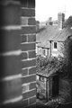
Shedby BenComment: I like the composition. Was wondering about the fact that there are two walls on the left hand side but for some reason it works. Suffers a bit in terms of the whites being blown out especially the window frame of the house and the sky around the aerial
|
 Photographer found comment helpful. Photographer found comment helpful. |
| 05/02/2007 08:48:24 AM |
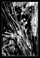
DAY 2. B&W. grass desaturated .by rozComment: Boring???? No!!!
I love the abstract feel to this. Would not look out of place on the wall of a trendy coffee shor or bar
Not usually a big fan of borders, but this one works to perfection |
| Photographer found comment helpful. |
| 05/02/2007 08:45:45 AM |
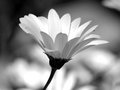
Daisyby BAMartinComment: Love the bokeh and a nice capture. Great focus although the whites on the 'inside' of the petals seem a bit blown out on my monitor |
| Photographer found comment helpful. |
| 05/02/2007 08:41:27 AM |
Day 2by daboardergirlComment: Nice composition.
I guess (and believe me if you look at my images you will realise that I am NOT one to talk about this) that I may have prefered more contrast |
| Photographer found comment helpful. |
| 05/02/2007 08:39:22 AM |
BW-pinebough.jpgby JerseyGenieComment: You want honesty.....
Well I can honestly say that I like this.
There certainly could be arguments made that it should have more tone/contrast, but I like it the way it is
Nice bokeh |
| Photographer found comment helpful. |
| 05/02/2007 08:26:50 AM |
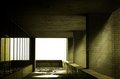
Day 1by eamurdockComment: Nice image, but for my tastes given that you are photographing a fairly stark scene then B&W emphasises that more than duotone (sorry but I do prefer the 'unsubmitted' image you put up
LOVE the blown out white at the end of the corridor
|
| Photographer found comment helpful. |
| 05/02/2007 08:23:21 AM |
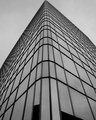
Office.jpgby weegi70Comment: Many aspects of this that I really like.
As opposed to some of the other comments I really love the tight crop at the top and there are some wonderful optical illusions going on with the window frames of the building at the side.
Areas which you might want to think about
1. I think the noise in this instance detracts a touch from the shot
2. (And I appreciate other people differ on this) would have preferred a more symettrical rather than slight assymettric crop)
I'd also be interested to see what this looks like with a crop that meant you saw no sky and the building completely filled the frame (though to be honest I am not 100% sure whether this would work)
Overall a nice start |
| Photographer found comment helpful. |
| 05/01/2007 10:02:56 AM |
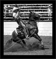
Day 1 - At The Rodeoby TDCollinsComment: Great action shot, the dirt flying up from the horses hooves is perfect. Not a crop shape I would normally go for but I think it works really well here |
| Photographer found comment helpful. |
| 05/01/2007 10:01:21 AM |
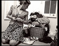
Nothing To Wearby ShannonLeeComment: Well your 'photographers comment' made be laugh out loud
Interesting cross between a posed shot and a slice of life. Maybe a little too cluttered (even given the subject matter) in terms of composition (The plug with the label on in the right of the shot draws my eyes more than it should do) and the whites on the wall seem a little bit harsh
Still a nice enough start to the next 30 days though |
| Photographer found comment helpful. |
| 05/01/2007 09:57:08 AM |
Another new kitty!by bergiekatComment: Great pose!!! Posibbly could have done with either a little more contrast to bring the cat out more (though I cant really talk about this given they my shot definitely needed more pop) or perhaps a touch of bokeh to mask the door frame |
| Photographer found comment helpful. |
Home -
Challenges -
Community -
League -
Photos -
Cameras -
Lenses -
Learn -
Help -
Terms of Use -
Privacy -
Top ^
DPChallenge, and website content and design, Copyright © 2001-2026 Challenging Technologies, LLC.
All digital photo copyrights belong to the photographers and may not be used without permission.
Current Server Time: 06/11/2026 01:24:06 PM EDT.