| Image |
Comment |
| 01/04/2009 09:29:45 PM |
|
 Photographer found comment helpful. Photographer found comment helpful. |
| 01/04/2009 11:54:19 AM |
Day 1: Haley and Abbeyby socalsteveComment: Great composition and very cute shot overall. Perhaps a bit on the dark side--it might be nice to bring out details in the black areas a tiny bit more--the girl on the left's dress, and their irises. And Happy New Year to you! (Oh, and the title at the top is not centered.) |
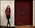
| 01/04/2009 11:52:09 AM |
Hello Woodyby incubusComment: Very cool overall. I like the high key. Only thing I see to suggest is to perhaps bring your eye/face out a tiny bit more. |
| Photographer found comment helpful. |
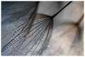
| 01/04/2009 12:15:26 AM |
Number 1 - A wing and a prayer (edited)by KelliComment: I like the improved contrast here! But I'm not as sure about the color changes -- I miss some of the blue to the sky. Maybe if going this direction, BW might be interesting! |
| Photographer found comment helpful. |
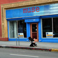
| 01/04/2009 12:13:16 AM |
Seeking One's Museby GeneralEComment: Great catch! Editing looks good, though I'd be tempted to suggest "trying" some perspective correction with this, at least to the point of resolving some of the "perceived" tilt. |
| Photographer found comment helpful. |
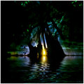
| 12/25/2008 11:43:37 AM |
Neon Spiderby NuzzerComment: Greetings from the Critique Club:
This is a very nice shot overall; I really like the "expanding" look (perspective) of the bokeh. And congratulations on your top 15 image!
COMPOSITION: As I said, I really like the composition you chose, the perspective, and the look of the bokeh, is great.
EXPOSURE AND SHARPNESS: Exposure seems to be ok. Contrast is good in the center by the spider and in the sharper areas, but overall, the photo has a bit of a flat look--I think because of the colors. If you had shifted these to more contrasting colors, it might have been more striking. Sharpness and clarity seem ok at this size, but not exceptional.
AESTHETICS: I think the photo has everything going for it in aesthetics (outside of being a shot of a spider which some people fear!). But overall aesthetics don't work for me, despite the great subject, and excellent bokeh. I believe it's the colors--they don't appeal to me (whereas they do in the shot you were emulating). Or it might be the "negative" look (whether created or somehow natural; perhaps indeed it's the colors that say negative to me).
This is of course all subjective opinion! But perhaps it will help you in trying alternative post-processing, or just for the next time you try this! |
| Photographer found comment helpful. |
| 12/24/2008 09:15:51 AM |
|
| Photographer found comment helpful. |
| 12/24/2008 01:03:26 AM |
sweepby ursulaComment: Congratulations Ursula, and welcome back! |
| Photographer found comment helpful. |
| 12/18/2008 06:44:09 PM |
Redby brownsmComment: Excellent composition and scene layout Steve! Perhaps less noise ninja would have helped--surely ou don't need it at ISO 200 on your camera! There does seem to be texture missing, but maybe even without the noise ninja, maybe not as much as would enhance the photo (you have texture where the wall and door are degraded, but not the surface textures themselves.) |
| Photographer found comment helpful. |
| 12/18/2008 06:18:16 PM |
|
| Photographer found comment helpful. |
Home -
Challenges -
Community -
League -
Photos -
Cameras -
Lenses -
Learn -
Help -
Terms of Use -
Privacy -
Top ^
DPChallenge, and website content and design, Copyright © 2001-2026 Challenging Technologies, LLC.
All digital photo copyrights belong to the photographers and may not be used without permission.
Current Server Time: 07/26/2026 01:51:32 AM EDT.