| Author | Thread |
|
|
12/18/2008 06:44:09 PM |
|
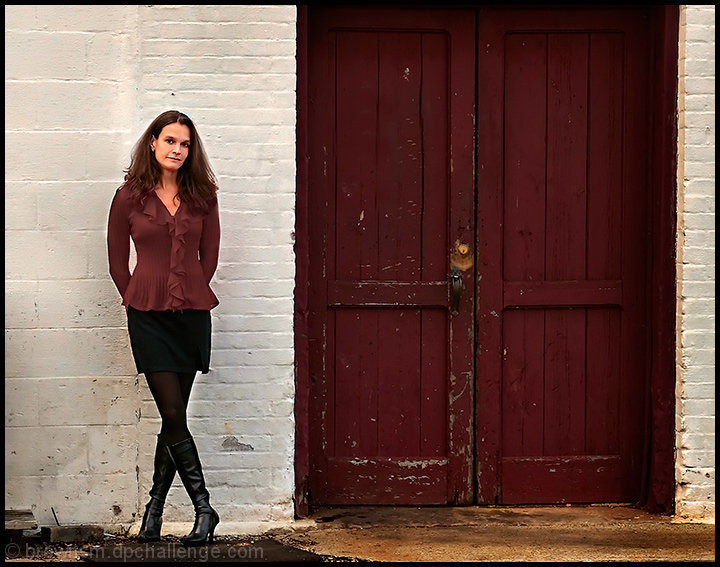
Excellent composition and scene layout Steve! Perhaps less noise ninja would have helped--surely ou don't need it at ISO 200 on your camera! There does seem to be texture missing, but maybe even without the noise ninja, maybe not as much as would enhance the photo (you have texture where the wall and door are degraded, but not the surface textures themselves.) |
|
 Photographer found comment helpful. Photographer found comment helpful. |
|
|
12/15/2008 02:28:56 AM |
|
very good complement of colors- |
|
| Photographer found comment helpful. |
Comments Made During the Challenge  |
|
|
12/07/2008 10:54:03 PM |
|
good color match, fail to see the connection. |
|
| Photographer found comment helpful. |
|
|
12/05/2008 02:50:30 PM |
|
Very nice with a good composition. |
|
| Photographer found comment helpful. |
|
|
12/05/2008 02:13:06 PM |
|
| Photographer found comment helpful. |
|
|
12/05/2008 12:01:42 PM |
|
I don't know why my initial reaction was a 9 on this...Now that I'm commenting I really can't justify knocking this off from a 10. Perhaps it was the model's facial expression, but everything else is so perfect. Great portrait! |
|
| Photographer found comment helpful. |
|
|
12/04/2008 10:34:59 AM |
|
She looks kind of nervous. |
|
| Photographer found comment helpful. |
|
|
12/03/2008 10:15:01 PM |
|
Nice photo, but your model looks like she doesn't want to be there. |
|
| Photographer found comment helpful. |
|
|
12/03/2008 07:26:43 PM |
|
Cool interesting shot. Love the composition and the matching colors. |
|
| Photographer found comment helpful. |
|
|
12/03/2008 06:04:48 PM |
|
love the recurring colors of the blouse and the door - her face looks to have a slight orange tint |
|
| Photographer found comment helpful. |
|
|
12/03/2008 02:32:13 PM |
|
nice model and lighting but nothign that really grabs me |
|
| Photographer found comment helpful. |
|
|
12/02/2008 11:46:08 PM |
|
I like that she matches in theme with the background door and you decided to separate them with the white wall. |
|
| Photographer found comment helpful. |
|
|
12/02/2008 11:26:24 PM |
|
I like how the reds match well, but otherwise it's like two different pictures, the left and the right. It seems like too much negative space. Maybe if she was in front of the left door and cropped in close, as long as she didn't fade into the door? Nice detail and old vs new. |
|
| Photographer found comment helpful. |
|
|
12/02/2008 05:54:42 AM |
|
excellent idea. something about the composition seems a bit off; i think squaring it takes it out of balance. |
|
| Photographer found comment helpful. |
|
|
12/01/2008 11:32:27 PM |
|
Nice, I like how she opposites the door with coordinating colors, nice natural pose, too. The lighting is good and even, great job technically. You must know what you're doing. :) 10. |
|
| Photographer found comment helpful. |
|
|
12/01/2008 09:38:45 PM |
|
Nice door. Your model looks a bit tight. The crossed leg pose is cute and coy, but she's a bit stiff on the upper half to pull it off. At least in my opinion. Processing is good and I like the composition. 6 |
|
| Photographer found comment helpful. |
|
|
12/01/2008 09:15:56 AM |
|
Did you change the color of her blouse to match the door? I like the limited color palette, but the color of the blouse feels a bit fake. I like the composition. |
|
| Photographer found comment helpful. |
Home -
Challenges -
Community -
League -
Photos -
Cameras -
Lenses -
Learn -
Help -
Terms of Use -
Privacy -
Top ^
DPChallenge, and website content and design, Copyright © 2001-2026 Challenging Technologies, LLC.
All digital photo copyrights belong to the photographers and may not be used without permission.
Current Server Time: 07/01/2026 04:40:03 PM EDT.