| Image |
Comment |
| 01/01/2010 03:41:10 PM |
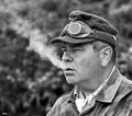
Smoke Breakby JedusiComment: Interesting subject, spot on composition and a nicely detailed image. For me, I think I'd perhaps like a 'touch' more contrast but that's just a matter of taste.
Might you be able to add the lens information too? I've been really looking forward to comparing different lenses and how people use them for portrait work. Many thanks. |
 Photographer found comment helpful. Photographer found comment helpful. |
| 01/01/2010 03:38:19 PM |
In the Eyes of a Childby denboteComment: Beautifully framed and processed image - my only criticism is that the whites of her eyes look a little pink to me, perhaps you made the white balance to ensure her dress was white or you upped the saturation of the red channel?
The deep reds elsewhere in the image are really nice though. |
| Photographer found comment helpful. |
| 01/01/2010 03:35:35 PM |
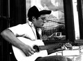
sing for your supperby JutildaComment: I agree with others - this is a portrait with a bit extra; the peri-person stuff gives a really rich environmental context. |
| Photographer found comment helpful. |
| 01/01/2010 03:33:47 PM |
Mum.jpgby SoulJanceComment: I think this is one of those very nearly there pictures - because of that the eye really notices small stuff and I become a little picky. For me I think you have a great shot here waiting to come out with a bit more cropping; I'd take away some of the excess headroom and probably crop to just below the finger tips - I think the direct front-on-ness would be emphasised.
I think the light, the conversion, the POV are all great though. |
| Photographer found comment helpful. |
| 01/01/2010 03:25:22 PM |
Freezing Coldby gsalComment: Fabulous - you are the master of this sort of work, your work is one of the things I've been looking forward to seeing in this side challenge.
This bold composition really works. |
| Photographer found comment helpful. |
| 01/01/2010 03:23:31 PM |
I Love NYby stupidcatComment: Nicely lit and good colours, the hair is particularly striking but I do agree that the focus is a little off - I tend to use around f/9 in the studio but you can get some really nice work with shallow DOFs but you have to nail the focus on a really important element of the face for it to work. Looking at your settings, a brighter light setting with smaller aperture whilst maintaining your 1/160 shutter speed would probably have helped. I also think you could have cropped the bottom up to the hand/wrist articulation. |
| Photographer found comment helpful. |
| 01/01/2010 03:18:33 PM |
Robby PennyStreetComment: A very nice image but the edit is a little strange - I'm trying to work it out... Did you select him and then mosiac the background? It is very blocky and the edge of your subject demonstrates some jaggy artefacting.
I really like your lighting but I think the eye area is perhaps a little dark - I don't know what software you have but a touch of lightening around the eyes would really help (for me).
Also (I know- enough with the critique already!!), there are a couple of key verticals, the edge of the picture and the side of the glass that make me want to rotate this image about 3 degrees counter-clockwise.
It is a really good shot though - I like the way you have introduce a great sense of depth to the image. |
| Photographer found comment helpful. |
| 01/01/2010 03:11:19 PM |
1 Ashley.jpgby ErikVComment: I agree with the other commenters - the white balance is hurting what is otherwise a delightful portrait. I think fully front on can be difficult, but this is a good one. |
| Photographer found comment helpful. |
| 01/01/2010 03:09:39 PM |
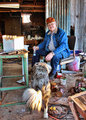
Elmerby Yo_SpiffComment: Nice candid subject - it looks a little tone mapped; is it?
There is loads to look at around your subject too which offers some added interest. |
| Photographer found comment helpful. |
| 01/01/2010 03:07:54 PM |
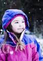
It's Snowingby BackpackRComment: Easy to have gone B&W here, so nice to see this in colour. The capture of the snow is wonderful. I do find the face to be a little bright but other than that it's a great shot.
(Would you mind adding the lens and camera information - I think that is really useful information for a side challenge like this - Thanks) |
| Photographer found comment helpful. |
Home -
Challenges -
Community -
League -
Photos -
Cameras -
Lenses -
Learn -
Help -
Terms of Use -
Privacy -
Top ^
DPChallenge, and website content and design, Copyright © 2001-2026 Challenging Technologies, LLC.
All digital photo copyrights belong to the photographers and may not be used without permission.
Current Server Time: 06/25/2026 12:49:50 PM EDT.