| Image |
Comment |
| 09/08/2007 07:48:09 PM |
|
 Photographer found comment helpful. Photographer found comment helpful. |
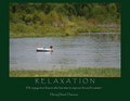
| 09/08/2007 07:46:30 PM |
Relaxationby L1Comment: For me, I wish the letter size on your header were larger and perhaps force justified along the length of the photo. I think it would give your poster a greater impact overall. I liike the green border. Good color choice. |
| Photographer found comment helpful. |
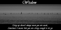
| 09/08/2007 07:42:45 PM |
Wisdomby evaComment: For me, I think if the header were larger and have that nice cursive "W" hanging into the photo itself. Also, the mis-spelled word deters from the overall impact. The photo itself seems a little flat against the starkness of the black & white text, but I like the long, almost panoramic look. |
| Photographer found comment helpful. |
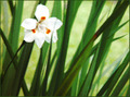
| 09/07/2007 10:10:49 PM |
In the Gardenby crikComment: Good job! This is the first image I've come across that makes me want to stop and look at for a bit. Good effects, composition and lighting. I hope this does really well in the challenge. Best of luck. 10 |
| Photographer found comment helpful. |
| 09/07/2007 10:09:26 PM |
Impressed By Life...by 777STANComment: For me, if there was a bit more saturation or color contrast I would have scored this higher. The colors just seem a little...flat to me. |
| Photographer found comment helpful. |
| 09/07/2007 10:07:45 PM |
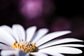
Vase with Dahliasby banmornComment: Definitely gives impressionistic, maybe a bit overboard, but not badd. I like the background contrast against the color of the flowers. |
| Photographer found comment helpful. |
| 09/07/2007 10:05:36 PM |
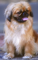
Princeby karenkComment: The filter effect upon the tongue makes me laugh. It looks like Prince has a square tongue! Lol I like the impressionistic impression though - good job and good luck in the challenge. |
| Photographer found comment helpful. |
| 09/07/2007 10:03:55 PM |
Springby darnokComment: Nice composition and lighting. I like it. |
| Photographer found comment helpful. |
| 09/07/2007 09:57:28 PM |
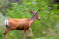
Strolling Deerby WriteHeartComment: Interesting image. My eyes keep going back to that front leg. The blur makes it look kind of bell-shaped. I also wish all of the hooves were showing, rather than being cut off. |
| Photographer found comment helpful. |
| 09/07/2007 09:55:11 PM |
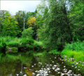
On a Sylvan Pondby Dr.ConfuserComment: For me, its a little impressionistic, but not quite enough. My favorite part is the bottom third of your photo. I like the white stones - they provide a good contrast to all the green. |
| Photographer found comment helpful. |
Home -
Challenges -
Community -
League -
Photos -
Cameras -
Lenses -
Learn -
Help -
Terms of Use -
Privacy -
Top ^
DPChallenge, and website content and design, Copyright © 2001-2025 Challenging Technologies, LLC.
All digital photo copyrights belong to the photographers and may not be used without permission.
Current Server Time: 06/27/2025 07:45:51 PM EDT.