| Image |
Comment |
| 06/03/2005 03:23:11 AM |
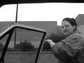
I dont think I should be riding with you...by tolovemoonComment: LOL! Yes, a definite decision in this shot! Good use of b/w removed distractions from the background and draws attention to the subject by way of the texture in her shirt. There is a lot of unused space between the subject and the car's roof. I'm not sure if the roof is an integral part of the shot, but cropping just above the subject's head might have aided the composition. |
 Photographer found comment helpful. Photographer found comment helpful. |
| 06/03/2005 03:14:52 AM |
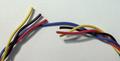
blueby emeelComment: A nice simple shot, bordering on the abstract. Good use of bold primary colours make for a very energetic composition.
Well done! |
| Photographer found comment helpful. |
| 06/03/2005 03:04:18 AM |
|
| Photographer found comment helpful. |
| 06/03/2005 02:50:15 AM |
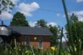
Hmmm... Where to go ?by ApeeComment: Try cropping out the left and right portions of the image. The subject will be more prominent and you'll get rid of most of the bright sky which is a bit of a distraction. Other than that, I think it is a nice photo, in focus with some great colours. Well done! |
| Photographer found comment helpful. |
| 06/03/2005 02:45:02 AM |
He Loves Me, He Loves Me Notby marmalade1121Comment: A nice shot. I think I would have left the image without any border decorations, but otherwise a good composition and the subject well in focus.
Just as final suggestion - try cropping out the top third and left third of the image. I think that you'll end up with an even more dramatic image :)
Good luck! |
| Photographer found comment helpful. |
| 06/03/2005 02:39:18 AM |
life or deathby pcodyComment: A good b/w shot. The grain in the fence in the background is good, but I'm finding that the pickets in the front a bit too 'glaring' for my liking. I love how sharp the image is though. |
| Photographer found comment helpful. |
| 06/03/2005 02:31:47 AM |
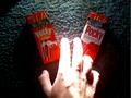
Which will please the senses?by SebiComment: You clearly show your choices, but I find the lighting somewhat distracting. Just my opinion, but I think it would have turned out better if the hand wasn't so bright. |
| Photographer found comment helpful. |
| 06/02/2005 04:26:23 AM |
I think it's going to break right...by northrop4Comment: Nice composition of the golfer, but I find the background (fence / trees) a bit distracting.
It's just a suggestion, but I believe that standing up and taking a shot looking down at more of an angle might have given you a shot with mostly grass in the background, removing most of the distractions. |
| Photographer found comment helpful. |
| 06/01/2005 04:34:50 AM |
undecidedby charliebakerComment: Personally, I would have perhaps done a 16:9 or 3:2 crop to accentuate the nuances evident in your subject matter.
:-P |
| Photographer found comment helpful. |
| 06/01/2005 04:23:06 AM |
|
| Photographer found comment helpful. |
Home -
Challenges -
Community -
League -
Photos -
Cameras -
Lenses -
Learn -
Help -
Terms of Use -
Privacy -
Top ^
DPChallenge, and website content and design, Copyright © 2001-2025 Challenging Technologies, LLC.
All digital photo copyrights belong to the photographers and may not be used without permission.
Current Server Time: 08/01/2025 09:01:35 PM EDT.