| Image |
Comment |
| 08/27/2002 11:06:00 PM |
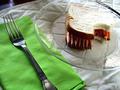
Yes, sir!by stephanComment: I think there may be a tad too much white space here, and the lighting is almost too bright - especially on the buckle. These are the sort of memories I try to block out, but it fits just the same. Nice job posting a controversial shot. |
 Photographer found comment helpful. Photographer found comment helpful. |
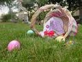
| 08/27/2002 11:37:00 PM |
Early Morning Huntby SonifoComment: I like this one a lot, but I think it could have been composed a little better. The basket and eggs are great though the candy in the grass is hard to make out. The background is what bothers me. The left side seems much fuzzier than the right, and just what is that thing on the right - a house? Just a little improvement and this could be a great pic. Nice idea. |
| Photographer found comment helpful. |
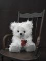
| 08/26/2002 01:51:00 PM |
With love from Grandma, on my 4th.by HBunchComment: I like the selective use of color. The chair seems to blend in too much with the background though. Perhaps more lighting on the foreground could have separated the two or you could go the opposite way and use a lighter background. Either one could show off the chair better. I'm also a little unsure about the crop. The chair is just barely cut off on the left and just barely inside the frame on the right. Maybe a different angle or perspective could help. There's quite a bit of empty space above the chair, but the bottom of the frame is cropped all the way up to the seat. Maybe there is some way to compose it so that the chair seems smaller - more to a child's scale. Overall, lovely picture with a few technical issues. Nice focus & exposure on the bear. White fur is often hard to shoot. ~indigo997 |
| Photographer found comment helpful. |
| 08/19/2002 01:18:00 AM |
Hanaby muckpondComment: Beautiful! This is almost identical to mine, but I like yours better. The blue works well, and your lighting is superb. |
| Photographer found comment helpful. |
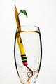
| 08/20/2002 12:08:00 AM |
Ticonderoga Cutting by mcmurmaComment: This is excellent! great idea. well executed. simple and direct. no distractions. only suggestions would be to crop lower on the glass maybe and try a little less exposure. it seems a bit bright. |
| Photographer found comment helpful. |
| 08/19/2002 01:29:00 AM |
|
| Photographer found comment helpful. |
| 08/19/2002 01:48:00 AM |
Lunchby millerComment: My 11-year-old brother actually had this idea. He'll be very proud that someone actually did it :o) Nice job with the bite. |
| Photographer found comment helpful. |
| 08/20/2002 12:14:00 AM |
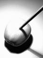
Shadow and Lightby LanSnakeComment: This is cool. After looking at so many illustrations, I was really expecting that the apple would be a drawing. Works well with the overexposure - adds drama. |
| Photographer found comment helpful. |
| 08/20/2002 12:24:00 AM |
|
| Photographer found comment helpful. |
| 08/19/2002 02:02:00 AM |
The Force Be With Youby karmatComment: My niece just started kindergarten as well. This was my idea, but I never got around to taking it. You did an excelellent job. Congrats. |
| Photographer found comment helpful. |
Home -
Challenges -
Community -
League -
Photos -
Cameras -
Lenses -
Learn -
Help -
Terms of Use -
Privacy -
Top ^
DPChallenge, and website content and design, Copyright © 2001-2025 Challenging Technologies, LLC.
All digital photo copyrights belong to the photographers and may not be used without permission.
Current Server Time: 09/04/2025 05:08:15 PM EDT.