| Author | Thread |
|
|
08/26/2002 09:36:00 AM |
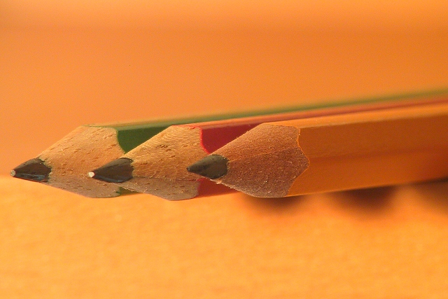
thank you all for your comments, as usual. the three pencils are lying on the upper shelf of my desk at home, sticking over the side of the shelf, hence those shadows. i liked the way the yellow pencil fades in with the background, but realize from the comments that people either love it or hate it. oh well. i have taken a couple of shots with a white background and having the pencils enter diagonally into the shot, but it just didn't work as well for me.
it was pretty dark, so i hand-held a desklamp, that was all the light i could muster at that time of night. hence also the reflection on the pencil tip (which i noticed only after uploading the pictures).
lastly, i included the yellow pencil (rather than going just with primary colors) because i still had this yellow pencil thing in my head from the initial challenge description, as well as because it did blend so much with the background ... i wanted it that way! ;) |
|
Comments Made During the Challenge  |
|
|
08/25/2002 07:32:00 PM |
Very good use of the narrow DOF to focus on the pencils. The shadows below the pencils are a bit distrating because it's not visible if the belong to the pencils or something else.
-stephan |
|
|
|
08/25/2002 10:16:00 AM |
|
very well done... love the colors and the apparent suspension of the pencils... i'm so-so on the orange bkgd 6 sjgleah |
|
|
|
08/25/2002 10:11:00 AM |
|
Very nice dof...I like the orange color but it tends to make the colors of the pencils flat somehow. |
|
|
|
08/25/2002 01:14:00 AM |
|
Composition, sharpness are good. It's simple and direct. The shadow is nice. Maybe it's just me, but there seems to be too much yellow. A different color in the background would probably make it more appealing to me and make the subjects "jump" out a little more. Not white---but something with less yellow. |
|
 Photographer found comment helpful. Photographer found comment helpful. |
|
|
08/23/2002 02:07:00 PM |
|
I like the variety of colors, the subdued background, the hint of shadow. It's sharp without being over done. In short, striking and dynamic. well done. 9 |
|
|
|
08/23/2002 07:06:00 AM |
Simple and warm. Love the shadow shapes.
7, Kavey |
|
|
|
08/23/2002 06:23:00 AM |
|
Nice composition and I like the effect of the DOF. Would have like to have seen the colors of the pencils "pop" out from the background a little more - perhaps a tiny bit more light on them. lhall |
|
| Photographer found comment helpful. |
|
|
08/22/2002 05:03:00 PM |
|
Very nice photo. Composition is simple, but effective. Color focus, exposuere, and etc. are great. |
|
|
|
08/22/2002 10:03:00 AM |
|
I like the over-all orange. |
|
|
|
08/22/2002 01:54:00 AM |
|
nice shot. i like the warm orange tone of the photo. very sharp. (6) ~mcmurma |
|
|
|
08/21/2002 11:01:00 PM |
Composition - quite good
Technical Aspects - quite good
Meets Challenge - yes
Visual Impact / Originality – high
Other suggestions – did you try a whiter background? Probably would have set pencils off better.
Jim msp
|
|
|
|
08/21/2002 05:26:00 PM |
|
Simple but very nice. The clarity is great on those tips. I like how it fades away with the green one in the back. Lighting is great and the colors are very nice. I was kind of wondering though, why you used 2 primary colors and 1 secondary color? yellow, red and blue would be the logical combination of colors, but maybe how you have it, it was a better visual combination. I wasn't saying it was a bad thing, just wondering if you did it that way on purpose or not. Great photo and good luck in the challenge. |
|
| Photographer found comment helpful. |
|
|
08/20/2002 04:38:00 PM |
|
I enjoy this shot but I think the background color is somewhat distracting. Don't get me wrong -- I'm a fan of backgrounds. But the color of this one is just too similar to the yellow pencil...I think it detracts from the focus of the shot. muckpond |
|
|
|
08/20/2002 03:18:00 PM |
|
|
|
08/20/2002 02:07:00 PM |
|
Freat photo, I love the composition. I love photographs that look at objects from unconventional angles. |
|
|
|
08/20/2002 09:05:00 AM |
Composition: Subject Placement, Cropping, Background10,
Technical: Focus, Exposure, Lighting, Processing8,
Challenge: Does your entry meet it?10,
Appeal: Is it Interesting, Motivating, Etc.? 8,
Total Averaged Rating9. Autool
|
|
|
|
08/20/2002 07:41:00 AM |
|
Lovely warm, neutral colours. Good focus and shallow DOF. Great lighting. |
|
|
|
08/19/2002 07:26:00 PM |
Excellent! This image is so smooth - great choice of colors, lighting, composition. 10
Ruthann |
|
|
|
08/19/2002 06:38:00 PM |
|
Great idea, but to me, it would look better with brighter and more vivid colors. |
|
| Photographer found comment helpful. |
|
|
08/19/2002 01:54:00 PM |
I love the rich colors and complimentary DOF and background.
Aug 19, 9:45pm PST - upgraded from =8 to =9 syamjonimi |
|
|
|
08/19/2002 01:38:00 PM |
|
Wow...excellent focusing! The only thing is that it looks like there is a little bit of a reflection off of the point of the center pencil which is a bit distracting. Maybe play around with the order of the pencils as well..the yellow being in front along with the yellow background perhaps is not as visually stimulating as the red one being shown more for some contrast. Good job and good luck in the contest! KrazyKat |
|
| Photographer found comment helpful. |
|
|
08/19/2002 01:37:00 PM |
|
Artistic composition, very nice |
|
|
|
08/19/2002 10:55:00 AM |
|
like the idea. try making them come out from the lower corner. see how different they look... |
|
| Photographer found comment helpful. |
|
|
08/19/2002 02:38:00 AM |
|
Nicely framed shot; wish the lighting created a bit of a glare of the paint. 5 |
|
|
|
08/19/2002 01:29:00 AM |
|
white balance seems a little off, but it's a good macro |
|
| Photographer found comment helpful. |
|
|
08/19/2002 01:03:00 AM |
|
The background does not lend enough contrast to this photo ... Other than that I find it to a well composed photo ... Good Luck ... RLS |
|
| Photographer found comment helpful. |
Home -
Challenges -
Community -
League -
Photos -
Cameras -
Lenses -
Learn -
Help -
Terms of Use -
Privacy -
Top ^
DPChallenge, and website content and design, Copyright © 2001-2026 Challenging Technologies, LLC.
All digital photo copyrights belong to the photographers and may not be used without permission.
Current Server Time: 06/29/2026 08:16:20 AM EDT.