| Image |
Comment |
| 12/13/2002 01:00:56 AM |
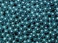
BB'sby AnachroniteComment: Very pretty. As abstract photos of inanimate objects go, this one pushes all the right buttons. The colours and tones are rich, the lighting is just right, and the arrangement of the little balls is interesting enough to keep my eyes wandering around for a while. It's not a really exciting photo, but it's techically good and I think you achieved what you set out to do. |
 Photographer found comment helpful. Photographer found comment helpful. |
| 12/13/2002 12:56:07 AM |
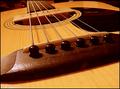
Melancholy Melodyby nards656Comment: I love your choice of camera angle. The photo doesn't grab me, but I appreciate the thought you put into it. Many people would benefit from considering angles and composition this way. I can imagine this on the cover of a book. |
| Photographer found comment helpful. |
| 12/13/2002 12:48:15 AM |
Merry Kissmas!by karmatComment: A bold experiment, but the object just isn't interesting enough, thematically or aesthetically, to make any use of all that space. The fact that the white of the "KISSES" tag blends with the background makes it confusing as well. |
| Photographer found comment helpful. |
| 12/13/2002 12:43:28 AM |
Leading the Choirby crabappl3Comment: I love it! You caught this woman in such a strong expression and a dynamic pose. It's really well framed to bring your eye right up to her face. The photo seems a touch oversharpened, or maybe you did some noise removal on it, but that's only a minor flaw. It's loaded with personality, and I like that. |
| Photographer found comment helpful. |
| 12/13/2002 12:38:44 AM |
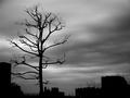
Harsh landsby NatashaComment: Cool... I like the way the completely black forms silhouette starkly against the soft, undulating grey sky. The atmosphere of the photo definitely supports your title. The overall scene is unwelcoming and bleak, and the branches on that tree look gnarled and hostile. Nice work! |
| Photographer found comment helpful. |
| 12/13/2002 12:31:08 AM |
One Man Bridge Bandby alanfreedComment: Interesting candid... but this is exactly the kind of photo that benefits the most from the rule of thirds. Placing his body further to the left and down a little would mean the direction of his gaze would lead you across the photo to look at the people passing him by, not looking at him, then down to his drums and back around, up to his face. Some work on the colours would also help, they seem a touch washed out (just increase the contrast or work on the levels). Although there is some intest in the left side of the photo because of the bridge, it's not really adding to the composition at all. |
| Photographer found comment helpful. |
| 12/13/2002 12:24:45 AM |
Flower Girlby SonifoComment: Technically a great achievement. The colours are lovely, heading towards a kind of sepia toned theme but set off by the flowers. The lighing is lovely and soft, and I really like the way you made her hair kind of unruly, and captured a smile that looks mostly real, not faked for the camera. It's not really my type of photo, but it looks good enough to be in a calendar :). |
| Photographer found comment helpful. |
| 12/13/2002 12:09:25 AM |
Portrait of a Beautyby byetkoComment: Nice portrait. I like the shadows on the bridge of her nose, especially. I get a feeling of this woman's personality, rather than just being presented with a pretty face to look at.
Whoever took the photo of the girl looking up, lit from below (I forget the title right now), should have a look at what you did here with negative space. You've left some empty space in the area of the photo that her eyes lead the viewer towards. This is a good technique, because it makes me wonder what she's looking at. That goes a long way to creating that feeling of personality and a level of intimacy with the subject of the photo that a tighter crop wouldn't have given me. |
| Photographer found comment helpful. |
| 12/13/2002 12:02:55 AM |
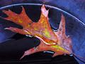
wet leafby shutterflyComment: I love it! Great colours and textures here. The water juxtaposes against the grime and decay really beautifully. The composition is spot on, and the light is soft enough to make that blue glaze on the pottery almost glow. Very nice work. |
| Photographer found comment helpful. |
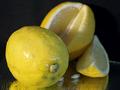
| 12/12/2002 11:44:54 PM |
Lemon DROPSby justineComment: The composition of this is pretty good, although the colours seem a little bit washed out. I like the DOF you used, bringing the eye right to the stem area of that front lemon. Thematically, though, it's a bit dull. |
| Photographer found comment helpful. |
Home -
Challenges -
Community -
League -
Photos -
Cameras -
Lenses -
Learn -
Help -
Terms of Use -
Privacy -
Top ^
DPChallenge, and website content and design, Copyright © 2001-2025 Challenging Technologies, LLC.
All digital photo copyrights belong to the photographers and may not be used without permission.
Current Server Time: 08/26/2025 05:13:51 AM EDT.