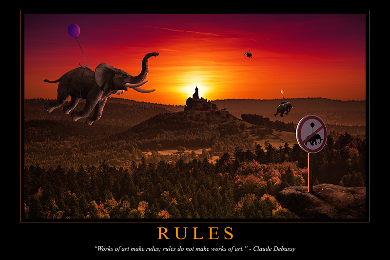
There have been several discussions recently on DPC about what is art, or what it is not. As in my picture quote, my view on the subject is that one shouldn't care much about definitions nor categories. I don't believe it is important at all how a work is called: if it is good enough, if it creates interest, rules will be stretched so that it fits in whatever box people feel it belongs to.
In that sense, I really like Dadaism. The well-known example of Marcel Duchamp's Fountain is quite interesting: a simple object ("readymade", an urinal in that case) became a piece of art for many (even "the most influential work of modern art" for many art experts), simply because it was not supposed to be one. The irony amuses me much.
Some words about my picture:
- The background is real, it is a church located in Dabo, a town in the East of France. I drove a few kilometers around it until I found an angle that I liked.
- The sky was taken the same day, a bit later: the sun was moved to the center of the scene though. If you look carefully, you will notice tree's shadows are not consistent with the sun, but I ran out of time to address that problem.
- Elephants are toys, shot at home: the photos have been textured and deformed for more realism.
- The sign was shot not far from my house, although its content have been changed from a speed limit to that more fantasist one.
- The rock, balloons and strings have been also shot in my home studio.
I didn't tweak things much, mainly colours and curves adjustments so that the different photos would fit together in a convincing way.
Finally, I had a hard time fitting the image in a 3:2 formatted poster, but I really disliked the 4:3 or more "close-to-square" ratios for it.
Thank you very much for all the great votes and comments, as usual, I really appreciate the time you take to tell me your opinion about my stuff.
Statistics
Place: 2 out of 111 Avg (all users): 7.4250 Avg (commenters): 8.9583 Avg (participants): 7.2500 Avg (non-participants): 7.5300 Views since voting: 5963 Views during voting: 527 Votes: 160 Comments: 52 Favorites: 24 (view)
Been gone and getting ready to leave again today.. but I just had to say OMG Your mind, is a work of art! Who'd EVER think of this and then pull it off to perfection! Appaluse and making it a fav! Congratulations!!!
This must be Christophe or admirer who made an image to accompany Debussy's "Prélude à l'après-midi des elephants"
or
"Et la lune descend sur le temple qui fut"
Well done illustration, like always; in a book for children would be sheer delight but for a motivational poster the graphic design should have been a touch more ambitious and daring. (No italics in white, for instance; a better marriage between illustration and text.) The thin border gives a dated look for an image that is meant to be timeless.
I have to take back my comment regarding the formatting. Sheer ignorance from my part. You created a true motivational poster, formatting and all. Should have done my homework. Oh boy, who invented this design for motivational posters? Got me thouroughly demotivated.
Well done.... plus Debussy is one of my favorite composers.
danseuses de Delphes comes to mind here.... or yver, vous n'estes qu'un villain, a choir piece which I performed.
Got to be a Gyaban entry. Probably. But since I didn't see it in the team thread beforehand, that's just a guess and I' will feel free to give it the good vote it deserves.
At first I thought "holy crap- is this going to win? maybe its too perfect and it shouldn't." and yet I gave it a 10, and coming back to it after seeing all the others, it is the best, graphically, message wise, in all aspects. If this does not win blue I will be shocked and disappointed that others don't see the perfection.
Quite obviously the winner in this challenge. Compositionally, I'd guess this is a Christophe image, but the processing is different. Irrespective, a beautiful image, great imagination and execution! Expect to see this on the front page in a couple of days!
This has to ribbon, wonderful job. Love the no elephant balloons sign. Only thing I can think to improve, is the top border looks off to me, being smaller than the sides. But that's a very minor gripe on an excellent job taking advantage of the expert ruleset.





 Rules
Rules Add photograph to your favorites
 Add photographer to your favorites

 Photographer found comment helpful.


