| Author | Thread |
Comments Made During the Challenge  |
|
|
04/21/2002 07:53:00 PM |
|
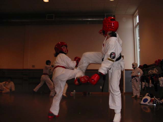
that kick is headed to a far off place |
|
|
|
04/21/2002 05:30:00 PM |
|
a little dark, but i know this is hard to catch, i've tried! nice job! maybe crop off the kid standing to the right in the background which would put the subject a bit off center, too. |
|
|
|
04/21/2002 05:05:00 PM |
|
Too dark, I would like to see her face. |
|
|
|
04/20/2002 04:17:00 PM |
|
great idea! Cropping the shot might have made a stronger image. |
|
|
|
04/20/2002 08:57:00 AM |
|
|
|
04/20/2002 04:37:00 AM |
|
Good shot. Brighter would have been nice. |
|
|
|
04/19/2002 08:33:00 PM |
|
A lot of blurring ... next time try a brighter lit subject ... sometimes not even a flash can stop motion. |
|
|
|
04/19/2002 03:35:00 PM |
|
Sure wish this wasn't so dark. It is a really good photo otherwise. What would have been neat is if you could have used the flash and gotten close enough for it to be effective--that would probably "black-out" the background and make the white uniforms really stand out. |
|
|
|
04/19/2002 09:36:00 AM |
|
too dark. try to get emotions on faces. |
|
|
|
04/19/2002 07:36:00 AM |
|
Nice action shot here. It's a little bit dark tho |
|
|
|
04/19/2002 07:22:00 AM |
|
Need more light on the subjects. |
|
|
|
04/19/2002 02:50:00 AM |
|
a bit dim. for a fight shot, could be more 'in your face'-ish. |
|
|
|
04/19/2002 01:44:00 AM |
|
Well stopped motion for such poor lighting. I would have tried standing near the window so it's light was striking the side of the people nearest to me. There's also a ton of compression artifacting, I notice that the picture is 30K when it could be saved up to 150K, you're losing a lot of detail you don't need to be. |
|
|
|
04/18/2002 08:10:00 PM |
|
If the lighting was better and you cropped in closer to the opponents, then this would be a great action photo. |
|
|
|
04/18/2002 05:29:00 PM |
|
|
|
04/18/2002 02:22:00 PM |
|
A little more light, and being a little closer would have made this picture very effective. |
|
|
|
04/18/2002 01:27:00 PM |
|
This image is so dark you can barely make out the subjects. |
|
|
|
04/18/2002 01:53:00 AM |
|
|
|
04/17/2002 05:15:00 PM |
|
Needs a bit more lighting! IMO,the composition would have benefitted from the camera being slightly more to the left, thus bringing the background fight into view. |
|
|
|
04/17/2002 05:08:00 PM |
|
sure is uneven! i wonder how you could have made it less dark? maybe get closer to the fighters with your flash. |
|
|
|
04/17/2002 09:58:00 AM |
|
Good idea, too dark, a little blurred. Nice title. |
|
|
|
04/16/2002 08:28:00 PM |
|
|
|
04/16/2002 01:50:00 PM |
|
Great action shot -- though the lighting is obviously tough to work with. Maybe experiment with different manual settings getting ready for this shot to try to get as much light as possible. |
|
|
|
04/16/2002 09:07:00 AM |
|
|
|
04/15/2002 09:56:00 PM |
|
|
|
04/15/2002 09:51:00 PM |
|
Abit dark, and some blur too. |
|
|
|
04/15/2002 08:34:00 PM |
|
I would have tried to adjust the contrast to bring out more detail in the foreground figures while trying to maintain the overall ambience, but that's just my style... |
|
|
|
04/15/2002 06:44:00 PM |
|
too dark. action is moderate |
|
|
|
04/15/2002 06:28:00 PM |
|
This is a good idea that needs more light shined on it. |
|
|
|
04/15/2002 04:09:00 PM |
|
action not fully stopped in this one. portrait shot and closer would have helped |
|
|
|
04/15/2002 01:19:00 PM |
|
Nice subject, picture is a little too dark though. |
|
|
|
04/15/2002 12:52:00 PM |
|
Could of been a little brighter..But I still like it! |
|
|
|
04/15/2002 10:46:00 AM |
|
Dynamic, but needs flash to be better exposed. |
|
|
|
04/15/2002 09:52:00 AM |
|
You could have used better lighting. Great idea. :) |
|
|
|
04/15/2002 09:29:00 AM |
|
I like the stopped motion concept of this photo but I believe the lighting needs a little adjustment. The overall photo is a little dark. I believe that this particular shot would have been better framed in a vertical photo rather than horizontal. |
|
|
|
04/15/2002 09:19:00 AM |
|
Good subject matter, wish the lighting was better though. |
|
|
|
04/15/2002 07:47:00 AM |
|
It's a shame this turned out so dark:( Maybe more focus on the subjects and brighter would have worked better for you. |
|
Home -
Challenges -
Community -
League -
Photos -
Cameras -
Lenses -
Learn -
Help -
Terms of Use -
Privacy -
Top ^
DPChallenge, and website content and design, Copyright © 2001-2026 Challenging Technologies, LLC.
All digital photo copyrights belong to the photographers and may not be used without permission.
Current Server Time: 06/28/2026 04:42:52 AM EDT.