| Author | Thread |
|
|
06/09/2004 12:15:06 AM |
|
Congratulations on your top ten finish! :o) |
|
Comments Made During the Challenge  |
|
|
06/08/2004 11:26:41 PM |
|
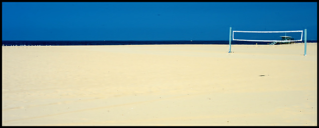
i like this very much and wish that you could have shot this without any of the people on the left of the horizon or the lifeguard house at the right behind the net. Dang old no spot editing rules. |
|
 Photographer found comment helpful. Photographer found comment helpful. |
|
|
06/08/2004 04:03:13 PM |
|
WOW! Very interesting shot! Not a lot of interesting ones in this batch, and this one stands out... very well done! This image would be absolutely killer if the dark spot in the sand could be cloned out, but that's not possible under these editing rules ;) I'm going to give this one a high rating, and I predict at least a top-10 finish, congrats. |
|
| Photographer found comment helpful. |
|
|
06/08/2004 12:16:16 AM |
|
Fantastic color and composition |
|
| Photographer found comment helpful. |
|
|
06/07/2004 11:05:42 PM |
|
|
|
06/07/2004 09:22:44 PM |
|
Nice contrast of the blues and whites |
|
| Photographer found comment helpful. |
|
|
06/07/2004 05:57:08 PM |
|
nice lines - would be a good stock piece for an advertising campaign (lots of good room for text). |
|
| Photographer found comment helpful. |
|
|
06/07/2004 04:59:25 PM |
nice use of thirds. i could imagine it on a poster...
like many of the photos submitted for this challenge, it gives a sense of loneliness, but in a nice way.
simple yet effective. well done |
|
| Photographer found comment helpful. |
|
|
06/07/2004 07:08:57 AM |
|
I love the composition here, and the contrast beween the colours. |
|
| Photographer found comment helpful. |
|
|
06/06/2004 06:12:51 AM |
|
Clean and simple. Technically good, ok composition. I think that a bright (fluor/neon) colored ball in the foreground would give that extra touch to make it perfect. |
|
| Photographer found comment helpful. |
|
|
06/05/2004 06:16:35 PM |
|
this picture is my favorite... |
|
| Photographer found comment helpful. |
|
|
06/05/2004 02:07:10 PM |
|
I like the way you used the thirds theroy. This certainly makes you feel something is missing (the players). |
|
| Photographer found comment helpful. |
|
|
06/05/2004 02:18:47 AM |
I think there is too much sand. So I think this would have been stronger if the sand/water horizon line was centered. And maybe if the had walked a couple feet and removed the lifeguard station out of the way.
Anyway, this is my favorite so far (I've gone through about 50 really boring entries so far. And this is my first score above a 6). 7. |
|
| Photographer found comment helpful. |
|
|
06/05/2004 01:56:32 AM |
OK. Read everything before reacting.
1) The border is way too heavy for this image. I really don't think you need one.
2) I would like a "tiny" bit more space between the net and the edge on the right,
3) More detail in the sand would help immensely.
4) Try the same scene with better lighting.
Having said all that - it is a SUPERB composition - just the perfect amount of blue sky, black sea and golden sand. The net is positioned in a very intriguing spot. Great use of the negative space. The slim Jim presentation is absolutely right on.
I guess what I'm saying is that this is a GREAT submission, one of my favorites, but I want to reach out and shake you for not taking it the rest of the way!
|
|
| Photographer found comment helpful. |
|
|
06/05/2004 12:17:51 AM |
|
Wow! This is great. I love the colors and the strong horizontals all the way across. |
|
| Photographer found comment helpful. |
|
|
06/04/2004 10:57:51 PM |
|
nice, good color, distraction behind the net |
|
| Photographer found comment helpful. |
|
|
06/04/2004 05:58:24 PM |
|
I like the clean simplicity of the beach scene; the small, cropped image without a strong center of interest lowered my scoring some. |
|
| Photographer found comment helpful. |
|
|
06/04/2004 05:34:23 PM |
|
| Photographer found comment helpful. |
|
|
06/04/2004 03:28:25 PM |
|
Great composition--the net could be a bit sharper, but I like it. |
|
| Photographer found comment helpful. |
|
|
06/04/2004 11:12:34 AM |
|
I would have liked to see a bit more detail in the sand. I think you could have under-exposed a bit to get that. |
|
| Photographer found comment helpful. |
|
|
06/04/2004 03:02:44 AM |
|
Wowo, very cool, nice sand. 9 |
|
| Photographer found comment helpful. |
|
|
06/03/2004 03:14:36 PM |
|
Really interesting photo. It's too bad the life saver thingy is in behind the screen. The image seems slightly pixelated (may have happened when you resampled). However, it's a very good idea. Love the colours. - 9 |
|
| Photographer found comment helpful. |
|
|
06/03/2004 11:49:18 AM |
|
Love the simplicity and the composition of the horizontal breaks |
|
| Photographer found comment helpful. |
|
|
06/03/2004 10:49:31 AM |
I keep looking at this It must be the rule of thirds and color combination
It fits theme very well 8 |
|
| Photographer found comment helpful. |
|
|
06/03/2004 07:15:01 AM |
|
Beautiful shot! Wherever this beach is, the town should use this picture in their brochure. Great job! |
|
| Photographer found comment helpful. |
|
|
06/03/2004 05:43:00 AM |
|
Good interpretation of the theme. Pleasant aestetic. |
|
| Photographer found comment helpful. |
|
|
06/03/2004 05:25:46 AM |
|
This is very impressive! Pity you didn't use more of the available file size, you could have much more detail and sharpness with 150k |
|
|
|
06/02/2004 08:17:21 PM |
|
|
|
06/02/2004 07:15:55 PM |
|
Awsome! It looks just like a painting, how do you that? 10!! |
|
|
|
06/02/2004 06:15:18 PM |
|
Stark + simple = beautiful. You can still say something even without a ball included. Lots of dust specks that, interestingly enough, enhanced the photograph by adding more texture lol. |
|
| Photographer found comment helpful. |
|
|
06/02/2004 04:34:25 PM |
Great use of negative space .
|
|
| Photographer found comment helpful. |
|
|
06/02/2004 04:12:32 PM |
|
I like this a lot, the blues are really nicely saturated. I think itd be better to see more sky and less sand. |
|
| Photographer found comment helpful. |
|
|
06/02/2004 02:44:10 PM |
|
good use of negative space |
|
| Photographer found comment helpful. |
|
|
06/02/2004 01:32:02 PM |
Excelent
Nothing mor to say
A winner
Love it
A big TEN |
|
| Photographer found comment helpful. |
|
|
06/02/2004 04:35:35 AM |
|
Thats a lot of.. Nothing. Very dramatic image. The focus on the net seems a little soft for the focal point.. |
|
| Photographer found comment helpful. |
|
|
06/02/2004 01:26:58 AM |
|
| Photographer found comment helpful. |
Home -
Challenges -
Community -
League -
Photos -
Cameras -
Lenses -
Learn -
Help -
Terms of Use -
Privacy -
Top ^
DPChallenge, and website content and design, Copyright © 2001-2026 Challenging Technologies, LLC.
All digital photo copyrights belong to the photographers and may not be used without permission.
Current Server Time: 06/29/2026 11:34:37 PM EDT.