| Author | Thread |
|
|
06/15/2004 08:19:03 AM |
|
Congrats on first place Harvey! |
|
|
|
06/15/2004 07:01:44 AM |
Excellent picture. To those people who say I would have crippoed out the white ceiling ect, did they try it before commenting? I did and your picture completely lost it's character. It was still a good shot but you lost like 20% and most of the curve.
It is perfect as it stands! Congrats! |
|
|
|
06/10/2004 05:07:27 PM |
|
Nice, clear image. i love the lines and curves, and the tones are marvelous. |
|
 Photographer found comment helpful. Photographer found comment helpful. |
|
|
06/10/2004 01:43:13 AM |
I'll Start off with "I like it". And now the tough stuff :)
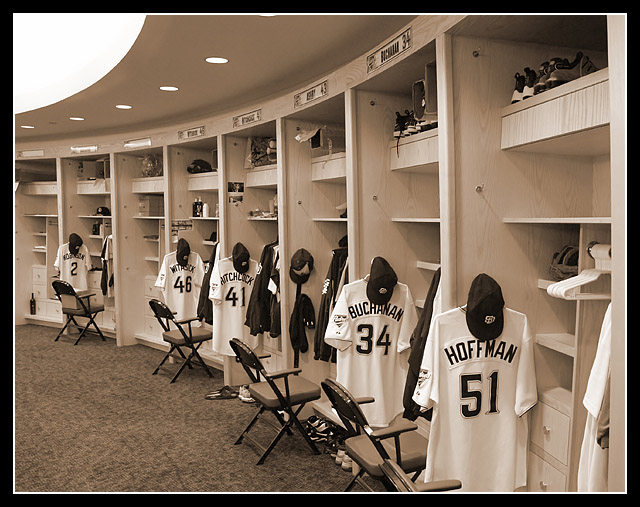
This photo has the potential to be so much better. You were right to think this was a brilliant capsilation of team without players, but you declined to take any risk with the framing. As I look at the photo I can see three things I might have chosen to be focus on, to get closer. The Jersey's, the gloves/shoes/equipment, and finally the name tags for each locker. As a viewer of the photo, I don't want to be confused about what the most important part of the photo is, I want to be up close and personal with it. This to me is a blanket photo to scene you new was momerable, but lacks the articulation of someone who know's exactly what's special to him about it. |
|
| Photographer found comment helpful. |
|
|
06/09/2004 10:41:42 PM |
Originally posted by MrAkamai:
Very nice image but I see two flaws that would have prevented me from giving this a 10. First is that big white spot in the upper left corner. That is very distracting and should have been cropped out. |
To crop it out would require either cropping the left (losing much of the sweep of the arches I was trying to capture) or cropping the top (losing the symmetry between the top and bottom of the image.
Originally posted by MrAkamai:
The second flaw is not as major but is noticeable and that the image is slightly tilted towards the left. |
I don't think there is a tilt to the left. The walls between the lockers tilt out with the top sticking out further than the bottom of the locker, giving it that tilted look. Trevor Hoffman's locker is on the end, next to the hallway leading into the locker room.
Originally posted by MrAkamai:
If you look at the right of the image I do like the duotone/sepia look and I agree that it gives it a very timeless feel. Looks nicely focused and details are sharp. I would have given this a 7. Good job overall and congrats on your ribbon! |
Thanks! |
|
|
|
06/09/2004 04:52:02 PM |
Originally posted by MrAkamai:
Very nice image but I see two flaws that would have prevented me from giving this a 10. First is that big white spot in the upper left corner. That is very distracting and should have been cropped out. The second flaw is not as major but is noticeable and that the image is slightly tilted towards the left. I do like the duotone/sepia look and I agree that it gives it a very timeless feel. Looks nicely focused and details are sharp. I would have given this a 7. Good job overall and congrats on your ribbon! |
My opinion is just the opposite. I love the white corner, I think it gives it shape and feel for the room. Also, I am not noticing the tilt either. I would have given this a 20 if it were possible. |
|
| Photographer found comment helpful. |
|
|
06/09/2004 04:30:20 PM |
|
Very nice image but I see two flaws that would have prevented me from giving this a 10. First is that big white spot in the upper left corner. That is very distracting and should have been cropped out. The second flaw is not as major but is noticeable and that the image is slightly tilted towards the left. I do like the duotone/sepia look and I agree that it gives it a very timeless feel. Looks nicely focused and details are sharp. I would have given this a 7. Good job overall and congrats on your ribbon! |
|
| Photographer found comment helpful. |
|
|
06/09/2004 11:30:04 AM |
|
Woohoo! Well done and congrats! :D |
|
| Photographer found comment helpful. |
|
|
06/09/2004 09:22:16 AM |
|
I didn't vote on this challenge, but if I had, I am sure I would have picked this for a winner! Great take on the challenge and great shot. |
|
| Photographer found comment helpful. |
|
|
06/09/2004 08:14:52 AM |
|
congrats on a great blue!!! |
|
| Photographer found comment helpful. |
|
|
06/09/2004 07:20:53 AM |
|
Great Shot! Looks like quite a step up from ol' Jack Murphy, er.. Qualcomm stadium. :-) Thinking about maybe making it a print? |
|
| Photographer found comment helpful. |
|
|
06/09/2004 05:50:12 AM |
Thanks for the PM concerning the simplicity and story behind this shot, congrats on the ribbon.
Good luck... |
|
| Photographer found comment helpful. |
|
|
06/09/2004 01:46:24 AM |
|
Harvey - Congrats! Very nicely done. I hope to see this printed out on your wall with a blue ribbon attached the next time I stop by your office! |
|
| Photographer found comment helpful. |
|
|
06/09/2004 12:46:15 AM |
|
I gave you 9 for this. Congrats!! |
|
| Photographer found comment helpful. |
|
|
06/09/2004 12:37:04 AM |
|
Congrats on your first ribbon. Very nice shot. |
|
| Photographer found comment helpful. |
|
|
06/09/2004 12:18:07 AM |
|
I assume the two ones were from disgruntled Dodger fans. :) |
|
|
|
06/09/2004 12:12:39 AM |
|
Congratulations on the bluey! :o) |
|
| Photographer found comment helpful. |
|
|
06/09/2004 12:01:25 AM |
|
Congratulations! I am so glad that this pulled through ... even with the two ones (why oh why is that?). |
|
| Photographer found comment helpful. |
Comments Made During the Challenge  |
|
|
06/08/2004 09:45:50 PM |
|
| Photographer found comment helpful. |
|
|
06/08/2004 04:49:05 PM |
|
great perspective and composition, very nicely done |
|
| Photographer found comment helpful. |
|
|
06/08/2004 11:17:10 AM |
|
This is one of my 2 10s. Amazing shot. Love the leading lines across the ceiling, and withing the lockers. Great choice of tone for the image. I'd like it better with all lockers having chairs in front of them. My question is how the heck did you get into the clubhouse? :) 10 |
|
| Photographer found comment helpful. |
|
|
06/07/2004 09:31:13 PM |
|
A very nice scene - well composed. Works vbery well in B&W (which incidently is very well rendered.) Not crazy about the border. |
|
| Photographer found comment helpful. |
|
|
06/07/2004 06:04:24 PM |
|
| Photographer found comment helpful. |
|
|
06/06/2004 07:12:55 PM |
|
I like the "ivory/black" in this shot, the repetition of stalls and the use of light. One of my ribbon picks |
|
| Photographer found comment helpful. |
|
|
06/06/2004 03:28:05 PM |
|
I like the color tone in this shot. Everything is beautifully in focus. The border does the photo some justice, too. Nice! |
|
| Photographer found comment helpful. |
|
|
06/06/2004 11:33:29 AM |
|
Clean lines. Crisp! I like the geometry of the pattern in this picture. The duo-tone adds a nice twist to the modern setting. Well done! Good luck! |
|
| Photographer found comment helpful. |
|
|
06/05/2004 10:59:42 PM |
|
Nicely composed and very well shot. Like the sepia toning to give it a sort of an old time look. |
|
| Photographer found comment helpful. |
|
|
06/05/2004 04:41:00 PM |
|
great choice, really expresses the team element well by showing the uniform clothing. The composition could have been a bit tigther in my opinion, I find the top left distracting. |
|
| Photographer found comment helpful. |
|
|
06/05/2004 09:52:44 AM |
|
Nice shot. I think this captures the essence of at least one aspect of baseball very well. I like the even lighting, and I think the sepia tones work for this shot. This is one of my top picks for this challenge. |
|
| Photographer found comment helpful. |
|
|
06/05/2004 03:02:56 AM |
Did you actually arrange the scene? It really looks great! I like the curvy perspective and tone. Great job...
I hope you're not getting one of those stupid "too designed" comments!
Good luck... |
|
| Photographer found comment helpful. |
|
|
06/04/2004 11:24:06 PM |
|
| Photographer found comment helpful. |
|
|
06/04/2004 10:41:39 PM |
|
neatest locker room I have ever seen |
|
| Photographer found comment helpful. |
|
|
06/04/2004 04:58:22 PM |
|
Great, original shot. Perfect in B & W. A classic. |
|
| Photographer found comment helpful. |
|
|
06/04/2004 12:30:13 AM |
you capture the essence of the challenge, bravo ! a10
perfect picture, i dont know about the sepia, but quite nice.... sharp ! |
|
| Photographer found comment helpful. |
|
|
06/03/2004 09:32:34 PM |
|
Really excellent shot - one of the best of the challenge. The only distraction for me is the light at the top left. I'd be tempted to crop the left 20% of the photo or just clone the white patch out. Once you've done that, this photo belongs on a poster in Cooperstown! |
|
| Photographer found comment helpful. |
|
|
06/03/2004 03:20:43 PM |
|
Really intersting shot and great sense of movement. Love it in sepia. 10 |
|
| Photographer found comment helpful. |
|
|
06/03/2004 02:08:43 PM |
The big white thing in the left corner, what is that? I consider it a bit distracting.
This photo looks really good in sepia. |
|
| Photographer found comment helpful. |
|
|
06/03/2004 01:51:43 PM |
|
Very nice shot. I like the curve of the room and the tones. Maybe a tighter crop to remove the ceiling? |
|
| Photographer found comment helpful. |
|
|
06/03/2004 01:30:00 PM |
|
Interesting use of sepia tones. I like the composition, the curves at the top and bottom really give it a nice feel. Nice Shot! |
|
| Photographer found comment helpful. |
|
|
06/03/2004 12:12:17 PM |
|
Nice. The border's a bit clunky, though. |
|
| Photographer found comment helpful. |
|
|
06/03/2004 11:54:30 AM |
|
Great leading of the image down the line of lockers with the curved lines |
|
| Photographer found comment helpful. |
|
|
06/03/2004 09:50:58 AM |
|
nice - works well in sepia. |
|
| Photographer found comment helpful. |
|
|
06/03/2004 07:58:00 AM |
|
Good Composition. Nice sephia tone. 10. |
|
| Photographer found comment helpful. |
|
|
06/03/2004 05:35:08 AM |
|
Good interpretation of the theme. |
|
| Photographer found comment helpful. |
|
|
06/03/2004 01:43:40 AM |
|
Wow! I really like the tones that you have captured here. Looks like you are in the pitcher's area of the locker room. The upper left seems a little over-exposed. |
|
| Photographer found comment helpful. |
|
|
06/02/2004 10:48:23 PM |
I thought of this shot but i fear it would not have been this good. That and I had no access. This is great. One of my favorite. The exposure is perfect.
dc |
|
| Photographer found comment helpful. |
|
|
06/02/2004 09:53:02 PM |
|
| Photographer found comment helpful. |
|
|
06/02/2004 09:00:54 PM |
|
nice shot. looks like the locker rooms in the new park are just as nice. |
|
| Photographer found comment helpful. |
|
|
06/02/2004 05:36:51 PM |
|
this I love....beautiful tones and a great depiction of the theme. I also think the border is appropriate although some may disagree |
|
| Photographer found comment helpful. |
|
|
06/02/2004 01:38:47 PM |
|
Nice photo! I wish I had access to a professional MLB locker room. |
|
| Photographer found comment helpful. |
|
|
06/02/2004 11:43:38 AM |
Great mood set here.
Excellent use of the tones. |
|
| Photographer found comment helpful. |
|
|
06/02/2004 11:27:58 AM |
|
Did you sneek in, or do you somehow otherwise have access to the Padres' lockerroom? I like how your eye is drawn around the room and also the toning of the photo. Excellent! |
|
| Photographer found comment helpful. |
|
|
06/02/2004 07:25:46 AM |
|
This works very well, like the curves to the picture. |
|
| Photographer found comment helpful. |
|
|
06/02/2004 06:30:20 AM |
|
I don't really care for Baseball, (I'm from Montreal, we know what's happening with the Expos after all) butthe total composition. The feel of this picture is very good and the tones are perfect. Nice job. |
|
| Photographer found comment helpful. |
|
|
06/02/2004 05:12:15 AM |
|
excellent DOF. Tone and border works well together. a keeper |
|
| Photographer found comment helpful. |
|
|
06/02/2004 01:44:27 AM |
|
| Photographer found comment helpful. |
|
|
06/02/2004 01:37:43 AM |
|
This is my favorite of the challenge. I love the tones, the angle and the crop. Great work! 10 |
|
| Photographer found comment helpful. |
|
|
06/02/2004 01:11:46 AM |
|
This is the best (so far) illustration of the challenge IMHO. The sepia treatment works ... gives it a nostalgic feeling like a 50s or 60s post card. Should be in the top three if not the top. |
|
| Photographer found comment helpful. |
|
|
06/02/2004 12:28:25 AM |
|
Wow, I'm impressed. Inside the the San Diego Padres clubhouse. I like the uniformity with the everything. Great shot. |
|
| Photographer found comment helpful. |


 America's Favorite Pass-time


