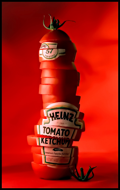
Completely inspired by the Heinz ad, which that in turn was inspired by a Turkish ketchup ad. I normally try to be and aim to be original but I took on the challenge of shooting something as complicated to setup with Basic Editing in mind. Since I'm most positive they did touchups on theirs.
I have a total of 17 frames from the shoot. Coming back to reshoot after looking at the shots on my computer, the whole thing toppled. Some labels got inky and the tomatoes were more juicy. Had no heart in meddling with the tedious details again. Tips... puttin little circles of paper towel in between each slice which had a label on it really helped. Still inked through but at a much slower rate.
Note to self: In addition to towels. Use some thin plastic to seal the layers, next time. I have more than a few nitpicks here so I'm really curious how this will be rated. If advanced editing were allowed I'd smooth out some of the lines of the background. Also wish I had a one size smaller tomato for the top 3 slices. Used two kind of sizes in the shot.
~~~~~~~~~~~~~~~~~~~~~~~~~~~~~
Yowza! never would I imagine getting a 7+ or even an 8+ for this shot. Thanks so much for the honor. I thought it'd settle at the mid 6's. As I mentioned Heinz was the inspiration so I felt sort of uncomfortable getting all the praise but this took quite some work and tinkering to get done.
If I'd re-setup the whole thing a 2nd time I definitely know how to make the labels look better. Originally had tomatoes of 3 different sizes. Someone ate the smaller ones I had prepared for the top ;) so was bummed about that but I still went ahead with the shoot. Cut out the full label from the print I prepared on the sticky paper. Which isn't as flexible as the real product labels. The middle part of the tomato has the straighest edge so...first I needed enough tomatoes, which I didn't have. But squeezed it in. Always a challenge isn't it ;)
Didnt get a chance to run by the grocery store that day so I spent at least an hour scouting the web for an image of the label. Be it to my surprise there is not a high enough res shot available for printing, and of hundreds of shots of the bottle just one was good enough to work on. I did many touchups before I printed it out. There was one commercial site that has product shots for retailers but I wouldn't get it in time.
Sorry for the long read. But hoped to cram in as much info as possible and still left out some details.
Thanks again! :)
Edited to add:
I originally wanted a background with some texture to it. I'm not sure if it added much, but feel I could've done better. I see so many nitpicks after viewing this shot again :P But spending so much time with the prep I was a little more careless with lighting than I usually am, not spending as much time shooting and more prepping.
Statistics
Place: 1 out of 157 Avg (all users): 8.3875 Avg (commenters): 8.9211 Avg (participants): 8.2308 Avg (non-participants): 8.4369 Views since voting: 39159 Views during voting: 745 Votes: 271 Comments: 140 Favorites: 68 (view)
82 10s??? GEEZ!!! HAHAHA! I must say that they are well deserved - especially when you consider this was basic editing. WOW... You are a MASTER! Beautiful work from conception to execution!
wow= this is a -great- image; i'm rather baffled by those 2's in your scoring;&and amazed and in awe of the 82 10's! and 63 9's! wow!!! (I think when people give such low scores they should explain 'why' at some point- at least privatly if not publically) this image is one of my faves! its amazing! :)
I am very impressed with this image! You knew what you wanted, and nailed the target in choice of subject, presentation, and skill in the shoot. It very much deserves to be one of the highest scoring images in the DPC files. Bravo!
I very much appreciate you sharing the details - helps the rest of us understand the meticulous nature of some these amazing shots. Congrats on the astronomical score and the almost 9 average from a whole bunch of commenters. And great shot!!
ps...I think that there are a worm on DPChallenge that added 2 "2"s to the voting for this picture..I Don't think that there are "ins--e" people that can give just 2 points to this GREAT PICTURE!!!...Congrats on BLUE!!!!
If this were ever to be an actual advertisment, I gaurantee that it would ultimetly end up being widely mocked for being so phallic. Especially with a tagline like "Freshly Squeezed". All it's missing is a few drips of ketchup around the base.
Fantastic picture! I would have thought you had stacked the slices on a spike to hold them upright, but since they fell over are they balanced? You must have used one heck of a Ginsu knife. Excellent job. I figured normally the subject and background the same color isn't a good idea, but here it works great.
We should have a survey, some exam or something and kick those guys out... It's good thing I am not Langdon.
I still wonder, who and why those people vote such a stupid numbers for photos like this one... Everyone has their own opinion is my a..s, yeah, they deserve name calling.
I'd just like to go on record as saying that this is a benchmark image, given the most recent DPC high score, and anyone who voted this 5 or less should seriously think about their own photography.
What a great image! Nicely done! Sorry to read someone ate the carefully chosen smaller tomatoes! That must have been annoying! Do you have a link to the advert this is inspired by? I've never seen it so am curious. Thanks!
You'd better get this to the marketing dept. at Heinz!! I see big things in your future!! congratulations!
(I'll take 20% per cent if you get this published! Ha)
Congrats. I gave it a 10 myself, but I would have never guessed it would be as high as an 8.3+ (and it's over a full point higher than the number two image). Wow!
Wow, really creative. The only thing I think would add to the effectiveness of the photo would be to have shaped the tomato tower into the shape of a ketchup bottle. Just an idea. I think it's a really great photo though. Well done.
The creativity in this is great and effective I get the idea that this ketchup is made fresh from your ad. I guess th only thing I'd say is that a different color or tone in the background would really make this pop.
Shot is very creative, the lable looks like it is acctually part of the tomatoes. The background is interesting too as it isnt just one color, the shadows are there as well.
The way that the tomato's are all uneven makes the tomato tower look like it is going to fall donwn, and the red background and the tomato's are almost blend together.
Now THIS is real advertisement quality !
Original & creative idea, well executed.
One minor caveat : a tad too dark.
I predict at least a top 10 finish...
Good luck !
Absolutely excellent! Love the colours, lighting, background - everything. I'm giving it the highest score of this challenge, and hope you win. It's very deserving.
Instablue! Awesome shot! This is the first one I cherry picked out of the pile after rollover and I'm in love with it. Innovative and brilliant execution - 10.
I'd say this is the blue ribbon right here but for such a slick concept, I think the lighting isn't great. The left side is perfect but the right could use some more pop. The shadow, top right is a little too dark by contrast. I love the background color you chose. Cheers and good luck!
this is incredible. the lighting is perfect, and the shape of the tomato pile resembles a bottle, which really gets the point across. One of my only 10s. :)
Voted this my No1.I don't know if this is an original idea,i live in the UK and i can't say i've ever seen it before,but if it is i hope Mr Heinz gets a look and makes you an offer,great idea and photo.





 Freshly Squeezed
 Add photograph to your favorites
 Add photographer to your favorites

 Photographer found comment helpful.


