| Author | Thread |
Comments Made During the Challenge  |
|
|
02/24/2004 10:40:15 PM |
|
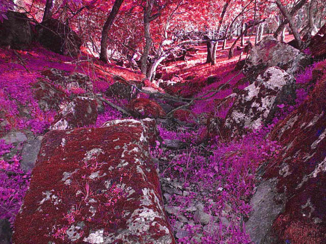
The colors captured are very vibrant.This is tough to compose because of the similar colors. Everything blends in too much so it's tough to look at the shot too long. Using some post-production software you may be able to play with hue/satuaration to make the colors more distinct. Great find, but very difficult to shoot. |
|
|
|
02/24/2004 03:44:11 PM |
|
|
|
02/24/2004 02:39:09 PM |
|
Very unique colorization. Looks like 'What Dreams May Come'. |
|
|
|
02/24/2004 09:04:49 AM |
|
|
|
02/23/2004 08:15:24 AM |
|
you will probably get ripped by the anti PS clan, but this is superb. 10! |
|
|
|
02/23/2004 07:24:53 AM |
|
Highlights are overexposed a bit. |
|
|
|
02/22/2004 03:26:19 PM |
|
|
|
02/22/2004 05:52:53 AM |
|
Surreal colors detract from the idea. |
|
|
|
02/21/2004 06:15:49 PM |
|
to me it looks like there was too much editing to bring out the red and pinks |
|
|
|
02/21/2004 05:02:28 PM |
|
is it really red? Red is cool. |
|
|
|
02/21/2004 06:31:45 AM |
|
Er wow, where is this? Looks like a scene from alice in wonderland. Great stuff. |
|
|
|
02/20/2004 11:40:15 PM |
|
Where colorblind gods play paint by numbers? |
|
|
|
02/20/2004 11:31:18 AM |
WOW! I like it!
You are happy to live near such place! - 7 |
|
|
|
02/20/2004 04:50:35 AM |
|
|
|
02/19/2004 11:37:36 PM |
|
|
|
02/19/2004 10:17:50 PM |
|
Too much about color, rather than texture. I think it would have worked better even as B&W. |
|
|
|
02/19/2004 08:50:06 PM |
|
Wild colors. I'd like to be closer to one of the many textures you used here |
|
|
|
02/19/2004 07:18:35 AM |
|
Interesting, but not entirely "texture" oriented. I would think the natural look would bring out the textures better. |
|
|
|
02/18/2004 11:21:50 PM |
|
Pink! Nothing really catches my eye about the photo except for the colors. |
|
|
|
02/18/2004 03:44:12 PM |
|
Textures are there but to me just get lost or overwhelmed by all the unusual coloring. |
|
|
|
02/18/2004 10:26:22 AM |
|
Nope, a little to much post processing. |
|
|
|
02/18/2004 09:38:16 AM |
|
Hue shift and selective de-saturation distracts massively from any texture you might have caught, to my eye. Find it very hard to get past the wacky colours to what is actually going on. It's also a trick I find over-used, a rarely to contructive effect. |
|
|
|
02/18/2004 05:21:21 AM |
[World Record Attempt]
+ Well, you have tried to be original.
- The weird colours and distoration can't really seem to hold my attention for too long.
|
|
|
|
02/18/2004 02:21:58 AM |
|
I think this has too much photoshop, unless you had some sort of filter on your camera. |
|
Home -
Challenges -
Community -
League -
Photos -
Cameras -
Lenses -
Learn -
Help -
Terms of Use -
Privacy -
Top ^
DPChallenge, and website content and design, Copyright © 2001-2026 Challenging Technologies, LLC.
All digital photo copyrights belong to the photographers and may not be used without permission.
Current Server Time: 06/28/2026 03:05:52 PM EDT.