| Author | Thread |
|
|
10/03/2002 11:04:00 AM |
|
nah. so where have you been? |
|
|
|
09/25/2002 08:53:00 PM |
|
And you thought I was gone... ahahahahahah! God... I'm annoying... |
|
Comments Made During the Challenge  |
|
|
09/22/2002 11:45:00 PM |
|
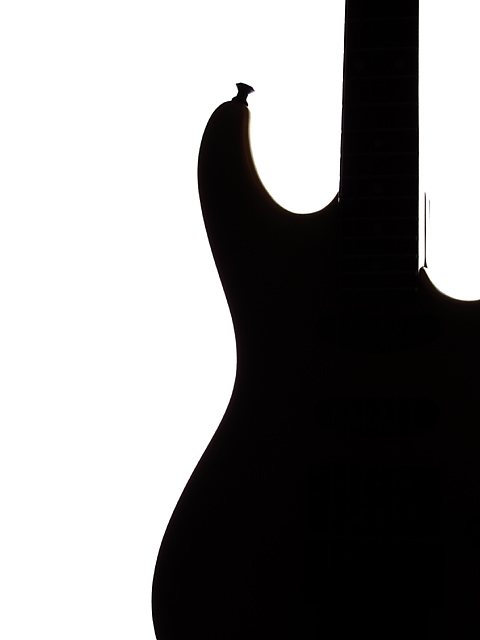
As a guitar player, I like this. As a photographer, I like this. Great shot! I would hang this in my livingroom proudly. Nothing more to say. 10 good luck in the challenge. ~hbunch7187~ |
|
|
|
09/22/2002 09:15:00 PM |
|
i love this. i have a thing for stark minimalist photgraphy and i think this represents fabulous negative space. but don't listen to me cause apparently i have no idea, hehe! great job--10. --amitchell |
|
|
|
09/22/2002 08:54:00 PM |
|
I like this shot a lot. You've got the whole ying yang thing here. Plus, let's face it, the strat shape is just... hot. I think you got probably the ideal framing here too - body, neck, but not giving too much away. My only point of improvement would be the extra stuff at the neck joint. I'm not exactly sure what's going on there, but it detracts a bit from the overall image. Nice shot, though.. 8. chrisab. |
|
|
|
09/22/2002 08:30:00 PM |
|
Very graphical approach and I like this a lot. For some reason I felt I wanted more to this shot and had you at a 8 all week..but...I couldn't say what I wanted different or anything so i changed it to a ..10...hokie |
|
|
|
09/22/2002 06:31:00 PM |
|
I really like this one. Nice subject placement too. I think it would work even if the guitar was not shown as a silhouette - 9 - Mav |
|
|
|
09/22/2002 12:04:00 PM |
|
this would be a good graphic for an ad, not a great photo on its own... |
|
|
|
09/21/2002 06:07:00 PM |
|
Very simple. Very elegant. Very sharp. 7 |
|
|
|
09/21/2002 11:32:00 AM |
think I'd like to see some surface details, maybe even the strings sidelit and nothing else ?
the curve works well though - Gordon |
|
|
|
09/20/2002 03:40:00 PM |
|
I love the curves and the composition of this. Wouldn't change a thing. |
|
|
|
09/19/2002 04:54:00 PM |
|
Great job with negative space here! This is a real eye-catcher. Kaz |
|
|
|
09/19/2002 03:24:00 PM |
|
This is a terrific outline - almost completely two dimensional. Great lighting and framing! |
|
|
|
09/19/2002 09:03:00 AM |
|
Another excellent example of negative space - invites the viewer to try to find a meaningful shape in the negative space - like the stark contrast. |
|
|
|
09/18/2002 11:35:00 PM |
|
This is a wonderful picture, but I fear it is too simple for many to understand it as good. perhaps a little bit of color might help. I hope you do well with this. I admire the simplicity, but others may not. |
|
|
|
09/18/2002 07:00:00 PM |
|
Great contrast in this shot. I like the curves. 7 |
|
|
|
09/18/2002 12:09:00 AM |
|
What an excellent pic! :o) I'm not a big guitar fan, but this is so very pop art(ish?) that it's appealing anyway. I like your choice to make it vertical. If you look too close it's not a true silhouette tho. There's still a little detail in there so I can't give it a 10. 9 is a good number anyway ~indigo997 |
|
|
|
09/17/2002 10:50:00 PM |
|
I'm not sure if it's a drawing or a real guitar, but I still love this photo. |
|
|
|
09/17/2002 09:02:00 PM |
|
excellent :) Photos with a negative subject are my favorites this week... This should be on a t-shirt with the name of a band in the space on the left :) = 9 - jmsetzler |
|
|
|
09/17/2002 03:33:00 PM |
This feels like negative and negative - without a positive. I have seen this idea in art books etc. This one just doesn't appeal to me. I do like the composition but I think I'd prefer this WITH the guitar in it...
Apologies...
4, Kavey |
|
|
|
09/17/2002 07:05:00 AM |
Composition:6 Lighting:6
Appeal:6 Total Rating 6 Sulamk
|
|
|
|
09/17/2002 05:42:00 AM |
|
At a guess, I'd say this was a Fender Strat - but the cutaway looks like it could be 24 frets, mmmm, possibly Ibanez... Great idea, great shot...(10) |
|
|
|
09/16/2002 11:03:00 PM |
|
|
|
09/16/2002 01:20:00 PM |
|
Yeah! Nice work. Good luck. Score 6 Justine |
|
|
|
09/16/2002 01:15:00 PM |
|
Good use of neg spc, but the photo, even though I do find it interesting, overall, it lacks visual interest for me. lhall-7 |
|
|
|
09/16/2002 12:52:00 PM |
|
Nice perspective. Very good photo. |
|
|
|
09/16/2002 12:01:00 PM |
Great work Great use of Neg Space. The Neg Space really outlines and enhances the subject. I like the smoothness and the simplicity. Great Work 10
Ruthann
(updated) |
|
|
|
09/16/2002 11:42:00 AM |
|
Love everything about this shot. 10 boyte1 |
|
|
|
09/16/2002 08:03:00 AM |
|
I love this contrast of color. It REALLY shows the negative space which DOES give the photo POW ! Awesome job ! = 10 Shiiizzzam |
|
|
|
09/16/2002 06:30:00 AM |
|
|
|
09/16/2002 12:39:00 AM |
|
Beautiful. Yor negative space is defined only by what we know is the shape of a guitar. I think this is what the challenge was after. |
|
Home -
Challenges -
Community -
League -
Photos -
Cameras -
Lenses -
Learn -
Help -
Terms of Use -
Privacy -
Top ^
DPChallenge, and website content and design, Copyright © 2001-2026 Challenging Technologies, LLC.
All digital photo copyrights belong to the photographers and may not be used without permission.
Current Server Time: 06/27/2026 07:10:02 PM EDT.