| Author | Thread |
Comments Made During the Challenge  |
|
|
09/22/2002 11:58:00 PM |
|
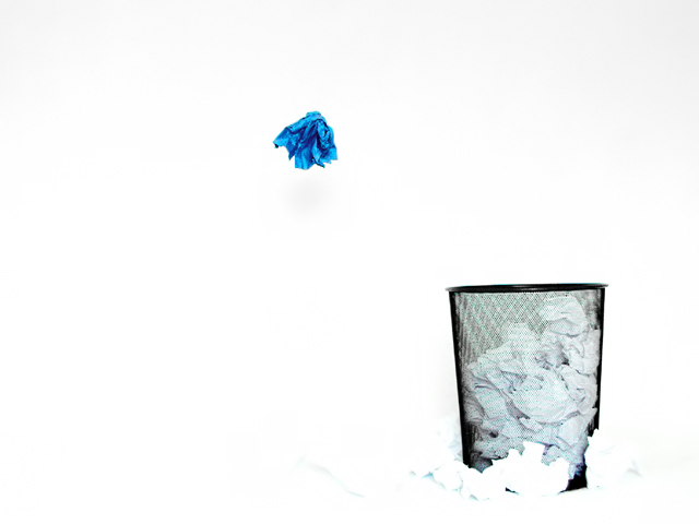
The hard to distinguish pile of paper at the base of the basket detracts from this picture - for me anyway. |
|
 Photographer found comment helpful. Photographer found comment helpful. |
|
|
09/22/2002 09:05:00 PM |
|
Cool idea! I love the paper in mid air. 8 - chrisab |
|
| Photographer found comment helpful. |
|
|
09/22/2002 08:27:00 PM |
|
great shot. felt it was a bit blown out for my tastes and that is saying something as I love blown out shots! still a very solid 8 ...hokie |
|
| Photographer found comment helpful. |
|
|
09/22/2002 06:06:00 PM |
|
Nice! Clever idea, well executed. |
|
|
|
09/21/2002 05:19:00 PM |
|
I really like everything about this photo |
|
|
|
09/21/2002 11:07:00 AM |
|
funky and stark - I'd like to see a bit more detail in the crumpled paper around the bin but other than that - very clean |
|
| Photographer found comment helpful. |
|
|
09/20/2002 08:23:00 PM |
|
I like this shot, but I think it would look better if the top of the background was pure white to match the rest of the shot. |
|
| Photographer found comment helpful. |
|
|
09/20/2002 04:28:00 PM |
|
really cool ! I wish I could say more, but I don't know what. I like this a lot though. |
|
|
|
09/20/2002 02:02:00 PM |
|
|
|
09/20/2002 12:10:00 PM |
Nice emptiness. The vivid blue is striking. I find the paper infront of the bin too blown out, and merging into the background too much for my tastes. And I'd prefer the blue paper further to the left of the frame to balance the bin, but that's just my preference.
6, Kavey |
|
| Photographer found comment helpful. |
|
|
09/20/2002 12:09:00 AM |
|
|
|
09/19/2002 11:49:00 PM |
|
did you blue your nose with that hanky? great shot 8 |
|
|
|
09/19/2002 06:43:00 PM |
|
Great use of negative space and a clever idea. |
|
|
|
09/18/2002 11:41:00 PM |
|
This is a very fun shot. Not an easy photo to catch. I hope you do well with it, I like it. Cruble of colored papers on the floor might add interest, but might take from the neg-space. |
|
| Photographer found comment helpful. |
|
|
09/18/2002 03:24:00 PM |
|
Too cool. Good effect, and great idea. I like this one. karmat |
|
|
|
09/18/2002 02:34:00 PM |
|
A wonderful shot, exhibiting creativity and a well-understood conception of negative soace. Well done! One of my top 5 this week. 9 Jak |
|
| Photographer found comment helpful. |
|
|
09/18/2002 02:08:00 PM |
|
Very nice. Love the sharp contrast. Good composition too. 8-Martin |
|
|
|
09/18/2002 07:53:00 AM |
|
Creative & nice use of the single blue piece. |
|
| Photographer found comment helpful. |
|
|
09/18/2002 12:51:00 AM |
|
I like the composition. It also works well as high-key. I think it's just a tad overdone tho. The papers on the outside of the basket are barely discernable and have no detail left. I also feel like there's just a little too much empty space. You definitely need some, but maybe not quite so much. Still, it's a fun pic to look at. You did a good job stopping the motion, and the title is cute. I like that you used one lone blue paper. ~indigo997 |
|
| Photographer found comment helpful. |
|
|
09/18/2002 12:46:00 AM |
|
I think the idea was good but it may have worked better with a darker background. I can't see the white paper around the wastebasket because it all blends in. |
|
| Photographer found comment helpful. |
|
|
09/17/2002 11:50:00 AM |
The litter around the bin dissappears, but I guess you know that.
You could get the position of the blue litter right by dangling it on a white thread from a pole. |
|
| Photographer found comment helpful. |
|
|
09/17/2002 09:28:00 AM |
|
very nice use of a high key atmosphere for your photo :) excellent job at keeping the background even as well... the darker area at the top is barely noticeable. The high key nature of this image really helps deliver a sense of anger and stress to go along with this garbage can... nice shot :) - 8 - jmsetzler |
|
| Photographer found comment helpful. |
|
|
09/17/2002 09:20:00 AM |
|
Pretty cool. Could be advertisement for something. I like it. 9 -mjcecil |
|
|
|
09/17/2002 05:25:00 AM |
|
|
|
09/16/2002 11:42:00 PM |
|
I like the blue paper. It really stands out. Did you take this in a white room? 9 |
|
| Photographer found comment helpful. |
|
|
09/16/2002 11:16:00 PM |
|
Very nice. I like the blue! - bamaster (7) |
|
| Photographer found comment helpful. |
|
|
09/16/2002 07:57:00 PM |
|
very cool use of - space :) |
|
|
|
09/16/2002 04:21:00 PM |
|
Great concept on this one. The color of the blue paper jumps out and almost makes the rest of the photo irrelevant. I like it! |
|
| Photographer found comment helpful. |
|
|
09/16/2002 02:38:00 PM |
|
howdjadoodat? 7 sgtpepper6344 |
|
|
|
09/16/2002 12:55:00 PM |
|
very cool. I would like to see what the original photo looked like. did you just max the brightness out in photoshop to get this effect? cmcvety. |
|
|
|
09/16/2002 12:46:00 PM |
Great work Great pun on words - witty. Yes, the neg space definately affects the impact of this image. (was there tweaking of the colors, I sense that the trash can area is slightly blue - this does not affect the score, more for my own learning) 9
Ruthann
(Updated) |
|
| Photographer found comment helpful. |
|
|
09/16/2002 12:27:00 PM |
|
Creative shot. The blue towel idea is super. |
|
| Photographer found comment helpful. |
|
|
09/16/2002 11:26:00 AM |
|
I like the starkness of this picture and the way the blue stands out against it. One of my favorite! |
|
| Photographer found comment helpful. |
|
|
09/16/2002 10:52:00 AM |
|
Love it.....just love it! Creative, action, great! Score 8 Justine |
|
| Photographer found comment helpful. |
|
|
09/16/2002 08:07:00 AM |
|
I love how this was done ! Negative space is used really well ! Shiiizzzam |
|
| Photographer found comment helpful. |
|
|
09/16/2002 07:21:00 AM |
|
Very nice shot. I like it. I would just have framed a 'little' more to the right, not much and ... for a very graphical picture ... the fact that the bin is not fully horizontal is keeping my eye back to that 'default' all the time. 7 |
|
| Photographer found comment helpful. |
|
|
09/16/2002 06:20:00 AM |
Composition: clever 6
Lighting: good 5,
Appeal: 5, Total Rating 6 Sulamk
|
|
| Photographer found comment helpful. |
|
|
09/16/2002 03:57:00 AM |
|
very cool, and interesting exposure |
|
| Photographer found comment helpful. |
Home -
Challenges -
Community -
League -
Photos -
Cameras -
Lenses -
Learn -
Help -
Terms of Use -
Privacy -
Top ^
DPChallenge, and website content and design, Copyright © 2001-2026 Challenging Technologies, LLC.
All digital photo copyrights belong to the photographers and may not be used without permission.
Current Server Time: 06/28/2026 03:13:11 AM EDT.