| Author | Thread |
Comments Made During the Challenge  |
|
|
08/25/2002 06:24:00 PM |
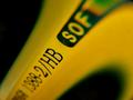
Very nice idea! I like the simple composition and the lighting. Focus is good, too. I wonder how it would look in b&w because it does not have much colour and I think it would look better when completely desaturated.
-stephan |
|
|
|
08/25/2002 04:49:00 PM |
|
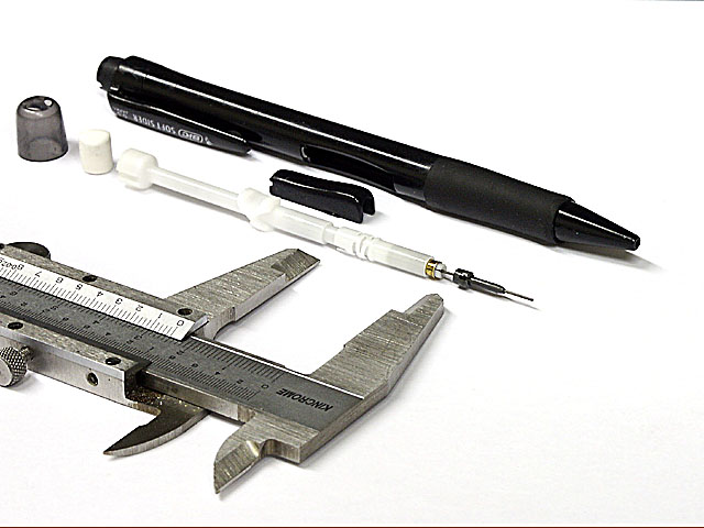
So what? Some of these pencils work this way. No excitement in this picture. |
|
|
|
08/22/2002 04:40:00 PM |
|
|
|
08/21/2002 11:00:00 PM |
Composition: Subject Placement, Cropping, Background3,
Technical: Focus, Exposure, Lighting, Processing4,
Challenge: Does your entry meet it?10,
Appeal: Is it Interesting, Motivating, Etc.? 3,
Total Averaged Rating5. Autool
|
|
|
|
08/21/2002 12:59:00 PM |
|
It's a pencil Jim, but no as we know it :o) It's a great shot; it has a clinically clean feel, it’s sharp, well composed and well lit. The only thing missing – a matter for debate since there is actually led in the picture, and technically, I suppose, a plastic pen with led in it could be construed as a pencil – is the pencil itself. I’m sure lots of others have, or will, point this out… But, it’s still a great shot. (8) Hope that’s fair, personally, I think it IS a great shot, but I can’t see a proper pencil. |
|
|
|
08/21/2002 11:48:00 AM |
|
very nice detail in this photo. I also like the diagonal view. Working on white backgrounds is not easy :) There is a very minor amount of image deterioration in the lower right corner that may be a result of level adjustments and uneven subject lighting. The caliper looks very good, but the pencil and it's elements seem a little oversharpened possibly. I'm not meaning to be picky here :) I am just pointing out some things that I see on a very well executed photo... = 9 - jmsetzler |
|
|
|
08/21/2002 10:18:00 AM |
|
Nice shot. Appears to have some post processing. Hope not. |
|
|
|
08/20/2002 05:36:00 PM |
Nice and crisp, but don't like the way that the right is within the frame but the left bleeds out of it (can't think of the word I want, bleed isn't quite it really). Like the monotone colour scheme. Is it colour and then desaturated or are the items all black white and grey really?
5, Kavey |
|
|
|
08/20/2002 04:11:00 PM |
Composition - quite good
Technical Aspects - quite good
Meets Challenge - yes
Visual Impact / Originality – high/good
Other suggestions – I'd also like to see this with a background that is not so harsh
Jim msp
|
|
|
|
08/20/2002 03:31:00 PM |
|
I may have liked this better with a colored background, but the concept is good and clarity is wonderful. |
|
|
|
08/20/2002 02:24:00 PM |
Very simple and elegantly done. Nice contrast, composition and interesting idea. Great use of different tones. 9
Ruthann |
|
|
|
08/19/2002 09:53:00 PM |
|
cleanly done shot, other than the upper right corner. Very technical, not very emotionally interesting |
|
|
|
08/19/2002 04:28:00 PM |
|
Interesting. At first, I thought this was a black and white. Further study though, proves me wrong. There is a gold piece in the middle of the inside part of the pen. Was the ALMOST black and white intentional? The little gold piece makes me like this even better I think. Excelent lighting and the angle is perfect. No distracting shadows or bright spots. Congrats on a great shot. Good luck with the challenge. |
|
|
|
08/19/2002 02:30:00 PM |
|
i love the contrast between the black and white. (8) |
|
|
|
08/19/2002 01:46:00 PM |
|
Interesting. Excellent lighting. Focus looks good. Edges are a bit ragged. 7 |
|
|
|
08/19/2002 12:13:00 PM |
|
the micrometer is a nice touch. |
|
|
|
08/19/2002 09:29:00 AM |
|
Interesting concept here! At a glance this stuff all looks like medical supplies! I was expecting at least one submission to go above and beyond the wood pencil and here it is! Well done! |
|
|
|
08/19/2002 03:05:00 AM |
|
Interesting deviation from the norm. Good to see some creativity. well lit. 7 |
|
Home -
Challenges -
Community -
League -
Photos -
Cameras -
Lenses -
Learn -
Help -
Terms of Use -
Privacy -
Top ^
DPChallenge, and website content and design, Copyright © 2001-2026 Challenging Technologies, LLC.
All digital photo copyrights belong to the photographers and may not be used without permission.
Current Server Time: 06/27/2026 08:51:31 PM EDT.