| Author | Thread |
Comments Made During the Challenge  |
|
|
07/28/2002 09:01:00 AM |
|
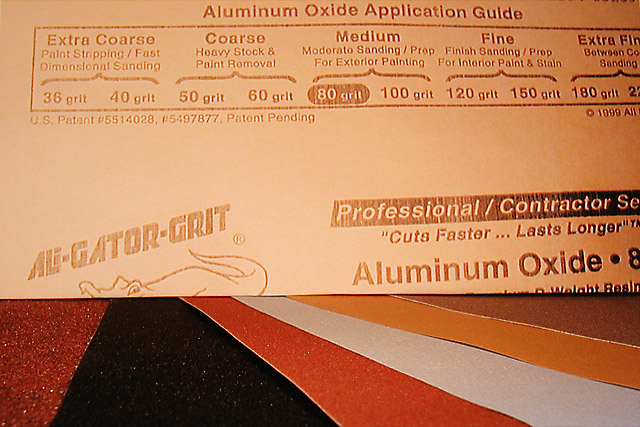
The idea here is good, and meets the challenge, but the texture isn't actually evident. It's more implied by knowing it's sandpaper. Perhaps with some side lighting. I hope this helps. |
|
|
|
07/27/2002 01:49:00 AM |
|
Yes, texture, but way too clinical... not very interesting 4 sjgleah |
|
|
|
07/26/2002 03:57:00 PM |
|
I understand why you showed the printed part, but I think it would have been better if you had shown more sandpaper and less print. karmat |
|
|
|
07/26/2002 10:19:00 AM |
|
I think your concept was pretty good...it's just the lighting and composition of this is not appealing for me. I think showing more of the sandpaper at a different angle would have helped...plus..most likely, we would have been able to tell what this was without showing the back of a piece of sandpaper above. Maybe if you had taken it at an angle from above....spreading out the pieces...It just needs some help in composition and lighting. kdjohnson |
|
|
|
07/26/2002 08:56:00 AM |
|
sandpaper could be a good choice of texture for this challenge... the arrangement of the sandpaper in the lower portion of this image is nice with the alternating colors. I think this image is severly damaged by having the back side of the sandpaper across the top and taking up most of the image space. This part of the image is uninteresting and it is covering up something that may be more interesting to the viewer... = 5 - jmsetzler |
|
|
|
07/25/2002 08:32:00 PM |
|
Interesting subject for a texture. I know what the texture is but its not from looking at the photo. The lighting isn't that well planned for staged shot, looks like its a single light of flash. |
|
|
|
07/24/2002 11:11:00 PM |
|
An interesting idea, but you don't get close enough to really experience the texture of that sandpaper. |
|
|
|
07/24/2002 02:42:00 PM |
Composition7
Originality9
Technical Aspects5
Meets Challenge5
Total Score7
For those that are just learning, like me.
Composition: Scoring in this area is based on basic composition of a picture and includes the rule of thirds, balance, cropping, and curved and diagonal lines. Subject matter that does not lend itself to the picture or otherwise unwanted is also considered here.
Originality: Scoring in this area is based on pictures or concepts that I have seen, as well as how much effort you have invested in the picture. Usually a little something that sets it aside from a snapshot. Does it make me want to come back for another look? You know things like that.
Technical Aspects: Focus, exposure, lighting, and other special effects (done by the camera), and post processing are all considered in this category.
Meets Challenge: This is based on my interpretation of if you, have/have not, met the challenge. This is fairly simple but quite important for this site.
There are many sites that can give you assistance in achieving better skills in photography, but I think the best way to learn is to take pictures and show them to other people. Believe me when it is a good one you will know it.
Good luck!
Autool
|
|
|
|
07/24/2002 01:02:00 PM |
|
This is a great idea! The chart at the top is a GREAT idea, the paper at the bottom, also great, here's the but, I would have liked to have seen more of the sandpaper. The center section of the upsidedown sheet only takes away this space, in my opinion. The sparkles in the sandpaper are a nice touch, could you have accented them more? Started with a five, talked up to a six, best I could muster! Swash |
|
|
|
07/24/2002 10:18:00 AM |
|
I don't get it. Poor lighting. |
|
|
|
07/24/2002 08:07:00 AM |
|
Nice selection of papers, but they are obscured by the boring back of the sheet labeling what I'm seeing. If you laid it out again, with the ali-gator-grit logo where the black sheet is so that the photo was converging lines of color with a snip identifying the item...I think you'd be happier with your composition. |
|
|
|
07/24/2002 06:54:00 AM |
|
Dimensional Sanding... always useful after lathing space or time |
|
|
|
07/24/2002 12:47:00 AM |
|
In Focus - 9, Lighting - 8, Color Levels - 9, DOF - 9 , Interesting Composition - 3, Interesting Subject - 3 >>> Tech Scores = 9, Subject Scores = 3, Final Score = 6, RLS |
|
|
|
07/23/2002 10:04:00 PM |
|
this is pathetic at best... |
|
|
|
07/23/2002 05:56:00 PM |
|
hehe, funny idea and funny title. however, i'm wondering if you could've just let all the different sandpaper types speak for themselves, the back of the one sandpaper doesn't really add much for texture (except maybe explain what it is i'm looking at) IMHO. -- gr8photos (3) |
|
|
|
07/23/2002 12:46:00 PM |
|
If I didnt know there was a texture to this, I wouldn't know there was any ... |
|
|
|
07/23/2002 01:59:00 AM |
|
The paper at the top has no texture and doesn't addvalue to the shot. It should not be 2/3 of the picture. |
|
|
|
07/22/2002 11:26:00 PM |
|
I know sandpaper has texture but this doesn't show it |
|
|
|
07/22/2002 10:11:00 PM |
|
clever idea and good composition |
|
|
|
07/22/2002 09:38:00 PM |
|
Did you use a flash here? The lighting is all wrong. |
|
|
|
07/22/2002 07:44:00 PM |
|
Like the top with the guide. Not too keen on the overall composition and barely can discern texture. |
|
|
|
07/22/2002 07:17:00 PM |
|
If the papers all were grit side up and the camera angle lower you could see all the different grits.As it looks now they are all about the same. |
|
|
|
07/22/2002 02:04:00 PM |
|
I think I would have preferred to see a good close-up of the sandpaper showing the variety of the textures, and leave the rest out. |
|
|
|
07/22/2002 01:55:00 PM |
.
Message edited by author 2003-09-19 03:07:02. |
|
|
|
07/22/2002 11:27:00 AM |
|
Could the lighting have been done differently? More on the sandpaper and less on the top sheet listing the different grits |
|
|
|
07/22/2002 11:19:00 AM |
|
The real texture! lol Cute idea. Kee |
|
|
|
07/22/2002 09:58:00 AM |
|
Close up on the grit side without the back would have worked much better for me. The colors could have worked very well, but my eye keeps returning to 'read' about texture instead of seeing it. But that's just me :) |
|
|
|
07/22/2002 08:25:00 AM |
|
Good idea, but the execution is very poor. Dump the App Guide, and just do the paper under an oblique light to catch shadow and sparkle in the grain. |
|
Home -
Challenges -
Community -
League -
Photos -
Cameras -
Lenses -
Learn -
Help -
Terms of Use -
Privacy -
Top ^
DPChallenge, and website content and design, Copyright © 2001-2026 Challenging Technologies, LLC.
All digital photo copyrights belong to the photographers and may not be used without permission.
Current Server Time: 06/28/2026 07:20:27 AM EDT.