| Author | Thread |
|
|
07/23/2002 01:31:00 AM |
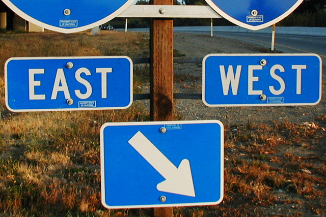
The quotation I should have referenced more directly is "East is East and West is West and the twain shall never meet."
I later figured out I should have titled it either "The Twain Meet Here" or "Twain Station." I'd also had an idea to add on a hand-lettered sign reading "Welcome Tourists!" but fogot to take the materials with me for that. If we were allowed non-standard crops I would have taken off the bottoms of the highway number signs, but I guess I was trying to "disguise" the actual location -- maybe I should have just included the whole sign.
--Paul |
|
Comments Made During the Challenge  |
|
|
07/21/2002 10:32:00 PM |
|
Sorry, not getting the joke. This looks like it could use a little sharpening to bring out a crisp focus. The bottoms of the two interstate signs at the top of the screen are distracting. Since I don't get the joke, I'm hesitant to suggest any alternative crops. |
|
|
|
07/21/2002 08:25:00 PM |
|
|
|
07/21/2002 12:39:00 PM |
|
I don't like when pictures need a name to give them meaning, the whole point of photograpy is visual expression. |
|
|
|
07/19/2002 05:31:00 AM |
?? (about the title)
Nice light, but why the top signs are not included or totally excluded? |
|
|
|
07/19/2002 03:12:00 AM |
|
Guess I need to read Kipling to figure this one out. |
|
|
|
07/19/2002 01:23:00 AM |
|
Love the concept... Think I'd like to see the route numbers... 6 sjgleah |
|
|
|
07/18/2002 08:41:00 AM |
|
|
|
07/17/2002 10:12:00 PM |
|
Hmm... I guess you are just looking south - is that so original? Sorry, but nothing there... |
|
|
|
07/17/2002 01:55:00 PM |
|
Nice crisp colors and framing, though maybe tilted a little. My only suggestion would be to crop the bottom of the interstate signs at the top out leaving just East West and arrow. karmat |
|
|
|
07/17/2002 10:13:00 AM |
|
|
|
07/16/2002 04:53:00 PM |
|
Cutting of the top signs ruined this for me. |
|
|
|
07/16/2002 03:05:00 PM |
|
I like the color in this photo but I wish the depth of field was a little more shallow to blur out the background.. I would have also attempted to shoot this sign straight on to eliminate the perspective tilt... = 6 - jmsetzler |
|
|
|
07/16/2002 01:55:00 PM |
|
Funn, The color seems to be off a bit, Maybe the contrast. |
|
|
|
07/16/2002 11:08:00 AM |
|
The bottom of the signs at the top need to go, other wise nice pix. |
|
|
|
07/16/2002 10:47:00 AM |
|
Funny. I wish they had allowed for different image dimensions for this. I'd like to see the top partial signs cropped out. 5 Lisa |
|
|
|
07/15/2002 08:52:00 PM |
I dont get the Kipling was wrong title. also I dont look at the title when judging the pictures. its afterall the picture that is being judged.
Since the title obviously ties it together and though I read alot kipling isnt a favorite. the extra chopped portion of the shields at the top is a distraction |
|
|
|
07/15/2002 05:18:00 PM |
|
Creative shot. Well done, I like it. Kee |
|
|
|
07/15/2002 04:18:00 PM |
|
|
|
07/15/2002 04:14:00 PM |
|
|
|
07/15/2002 03:40:00 PM |
|
Well taken photo. Joke notwithstanding, low interest, but very good focus, etc. 5 Swash |
|
|
|
07/15/2002 08:11:00 AM |
|
|
|
07/15/2002 03:28:00 AM |
|
I havent really read Kipling, so I dont understand the title. Interesting shot in any case. |
|
Home -
Challenges -
Community -
League -
Photos -
Cameras -
Lenses -
Learn -
Help -
Terms of Use -
Privacy -
Top ^
DPChallenge, and website content and design, Copyright © 2001-2026 Challenging Technologies, LLC.
All digital photo copyrights belong to the photographers and may not be used without permission.
Current Server Time: 06/28/2026 01:24:57 PM EDT.