| Author | Thread |
Comments Made During the Challenge  |
|
|
07/21/2002 01:08:00 PM |
|
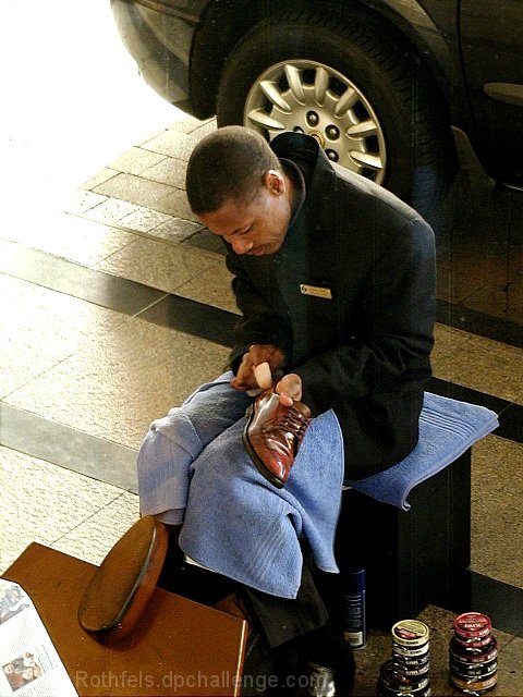
the burn on the top left corner works perfect. |
|
|
|
07/20/2002 05:19:00 PM |
Most of the left side looks too bright. Still looks good
-7 |
|
|
|
07/19/2002 05:23:00 AM |
|
Good, I like the way left part is burned out. |
|
|
|
07/19/2002 12:48:00 AM |
|
Too bad the left upper corner is blown out. |
|
|
|
07/18/2002 11:39:00 PM |
|
Good photo depicting a sector of the job force. Man and his craft, you might say. I don't like the washed out portion in the upper left. I still like it though. |
|
|
|
07/18/2002 03:58:00 PM |
|
I wish the car behind him wasn't there - what's with the paper in bottom left? The photo is too busy (IMO). If someone is sitting there, I wish we could see the shoe shiner working on 'them' instead of the single shoe. This has great clarity and I like the lighting. good job. 6 cthenk |
|
|
|
07/18/2002 02:38:00 AM |
|
|
|
07/18/2002 02:20:00 AM |
|
Only thing I don't like is the overexposure in the upper left, although I'm not claiming anything could have been done... |
|
|
|
07/17/2002 06:49:00 PM |
|
I'd have tried this one in b/w or sepia tone to give it a different affect, I'd also crop out the paper, cropping that might also cut out some of the glare in the upper left corner as well. Otherwise a great shot, showing something thats getting harder to find. |
|
|
|
07/17/2002 02:49:00 PM |
|
looks like the upper left corner was editied out, see the very sharp demarcation between the light and the stones, not a gradient like it is in other places. |
|
|
|
07/17/2002 12:59:00 PM |
|
good portrait. The glare on the left is effective, but maybe just a touch too much glare. Overall, the photo works well, though. |
|
|
|
07/17/2002 04:13:00 AM |
|
anoter fine example of a wel-used blow-out, i realy like how he's framed by... well, nothing really, on the left. |
|
|
|
07/16/2002 11:49:00 PM |
|
Good color and detail, I like the light in the top left corner. I know some people wont like it. |
|
|
|
07/16/2002 10:07:00 PM |
|
Great storytelling. You did an excellent job of capturing this moment. The lighting is very good and complimentary to the subject. |
|
|
|
07/16/2002 09:46:00 PM |
|
The bright light on the left is a little too harsh. I wonder if you could have gotten a better picture from the left of your subject. Other than that...great picture! 7 Lisa |
|
|
|
07/16/2002 04:06:00 PM |
|
Lots of character in this picture. Well done. |
|
|
|
07/16/2002 01:06:00 PM |
|
I really like this shot. It does lose its impact a little wiht the car in the background, because the composition is otherwise very interesting. |
|
|
|
07/16/2002 08:12:00 AM |
|
too bad abokut the car wheel in the background and the hard light in the upper left. The rest of the portrait is very nice. I like the light across his shoulder and the sheen on the shoe. |
|
|
|
07/16/2002 02:38:00 AM |
|
interesting subject, and nice colors. it might have worked better if you had changed the angle to cut out the car wheel. Are you shooting through glass? |
|
|
|
07/16/2002 12:38:00 AM |
|
This is one of my favorites... Subject 10, Focus 10, Framing 10, Lighting 9 = 10 RLS |
|
|
|
07/15/2002 09:20:00 PM |
|
Good shot... the only thing I'd do is crop a bit tighter on the shoe shiner. We dont really need to see so much of the car behind him. |
|
|
|
07/15/2002 06:05:00 PM |
|
The concept of this photo is absolutely perfect ! |
|
|
|
07/15/2002 04:02:00 PM |
|
I think it's too bad about the car behind him...the overexposed left I don't mind as much as the car. |
|
|
|
07/15/2002 03:03:00 PM |
|
Nice shot, except for the left hand side. 7 Swash |
|
|
|
07/15/2002 02:04:00 PM |
|
the light in the upper left hand corner linda spoils it. |
|
|
|
07/15/2002 01:09:00 PM |
|
I almost like this shot. I'm not being silly it's just that there is soooo much going on here. The only real negitive I can say is the bright sun light on the left that's a distraction and looks fried. The car bothers me but I love the cans stacked on his left. Hummm, I'll have to go with a six here. Kee |
|
|
|
07/15/2002 08:48:00 AM |
|
Badly overexposed in the upper left. |
|
|
|
07/15/2002 06:32:00 AM |
|
I think this particular photo would hold more impact if shot from a lower angle... The overexposure in the upper right is not adding any impact for me.. = 5 - jmsetzler |
|
|
|
07/15/2002 05:53:00 AM |
|
Nice light on the shine of the shoe, but looks quite digital (patterns and pixels) |
|
Home -
Challenges -
Community -
League -
Photos -
Cameras -
Lenses -
Learn -
Help -
Terms of Use -
Privacy -
Top ^
DPChallenge, and website content and design, Copyright © 2001-2026 Challenging Technologies, LLC.
All digital photo copyrights belong to the photographers and may not be used without permission.
Current Server Time: 06/29/2026 10:12:54 PM EDT.